Hello! There has been a sublte change in my miro user experience. Before, you could hover a mouse over an item on your board, click on it and change its position without the item being highlighted. It looked neat and satisfying, as if you are dealing with real life 2d objects. Now, you hover your mouse, click on the item to replace it, and the item gets highlighted, it literally ruins the whole experience for me! why is that suddenly a thing? how do i turn this off?
- Home
- Community overview
- Questions & Ideas
- Ask the Community
- Can no longer quickly move object without it showing as selected and context menu appearing
Can no longer quickly move object without it showing as selected and context menu appearing
- August 7, 2024
- 31 replies
- 813 views
- New Here
Best answer by Eca
Hi Miro Community,
Thank you for your ongoing feedback. After reviewing your input, we’ve decided to address the distraction caused by menus overlaying content when dragging a single object on the Canvas.
We launched an update today so the widget menu won’t appear during mouse-up when moving an object while still highlighting a selected state. This strikes a balance between highlighting the moved object during moving and removing your encountered distractions.
Please try this out and share any feedback you have in the thread. Thank you!
31 replies
- Active Contributor
- August 8, 2024
Hi
Interesting - but I am not quite sure what you are describing? Any chance you can upload a screenshot?
click on it and change its position without the item being highlighted.
Whenever I have clicked on any item I have always immediately seen the outline, and it has remained selected even after the move, until I de-select it.
So, that behavior is all I have ever known. Maybe I am missing something?
Cheers, Ken
- Volunteer Community Moderator
- August 8, 2024
It’s also worth noting that this may be some A/B testing of a new experience (or a gradual rollout), so not every one will see the same thing.
I will report it to the support team and update this post as I hear back.
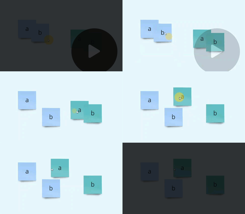
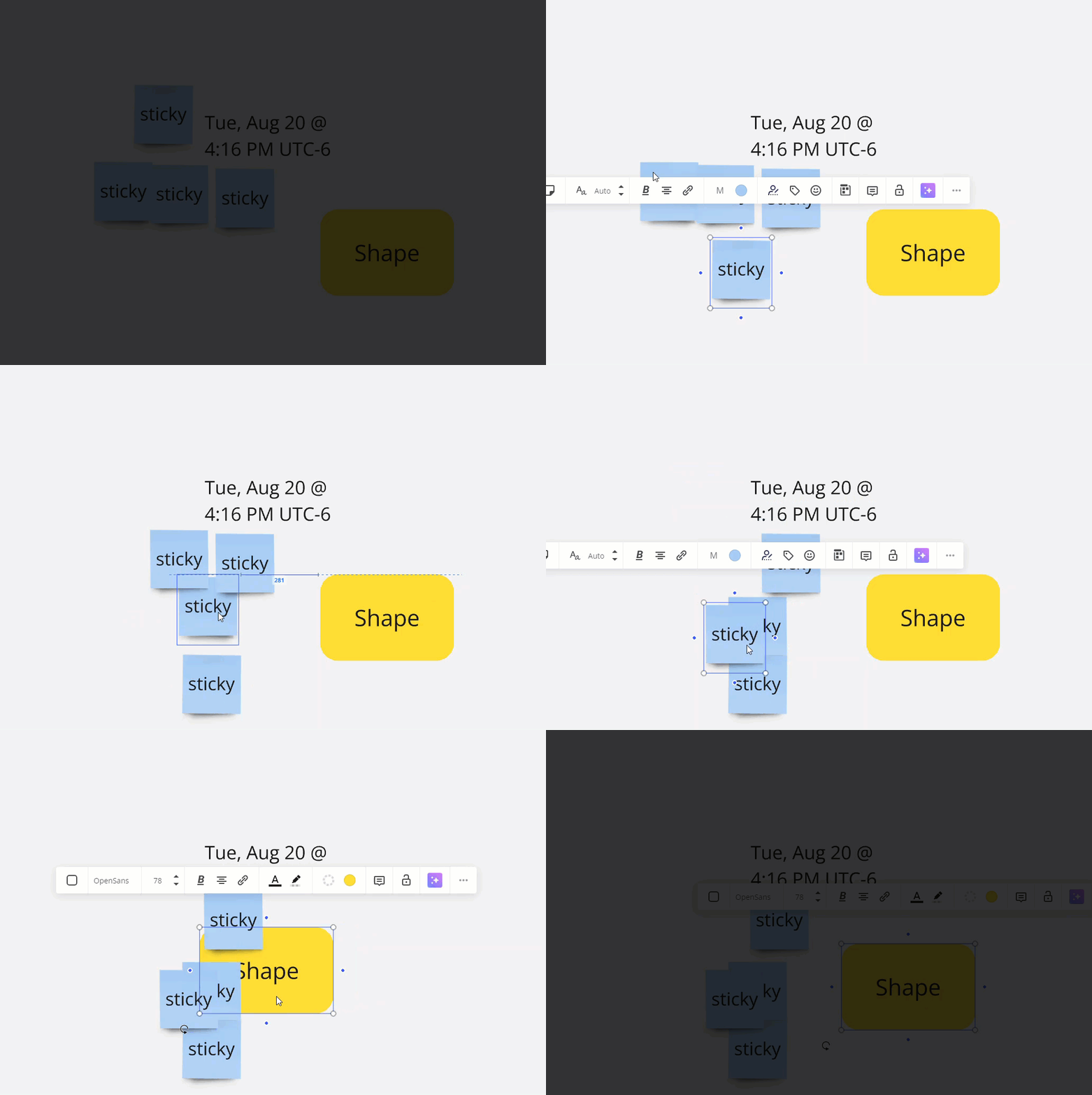
The previous behaviour:
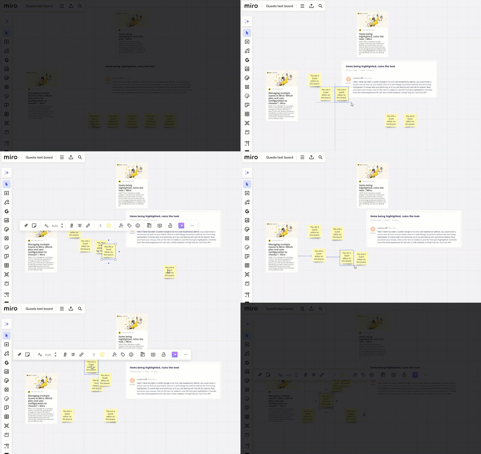
And now the context menus appear after I have stopped moving the object:
- Volunteer Community Moderator
- August 8, 2024
Update from the support team:
Thank you for contacting Miro Support and bringing to our attention that when moving objects, the context menu is appearing and blocking nearby objects. Let's take a look at this behavior!
I have reached out to our internal teams to confirm if this is intended behavior or a bug. I will update you once I hear back from them.
- Volunteer Community Moderator
- August 8, 2024
Update: I haven’t heard back yet from the support team, but the old behaviour is back (I’m not sure if a bug was fixed, or an intended changed was reverted).
- Author
- New Here
- August 9, 2024
thank you so much for a detailed breakdown of the matter and for reaching out to the support team! sadly, the original behavior is still absent on my board, what can i do to get it fixed?
- Volunteer Community Moderator
- August 9, 2024
thank you so much for a detailed breakdown of the matter and for reaching out to the support team! sadly, the original behavior is still absent on my board, what can i do to get it fixed?
You're welcome!
We'll just have to wait for an official response from the support team as to what happened and what the next steps are.
In the meantime, you could try signing out of your account, clearing your cache, and signing back in. You could also try the Miro desktop app.
- Volunteer Community Moderator
- August 9, 2024
Update from Miro support:
This is Luci with an update. Our team has confirmed that the behavior you're experiencing is intentional. It’s related to a new feature for precise selection, which causes the context box to appear when you start moving objects.
I’ve shared your feedback with our team for further improvement. We appreciate your ongoing collaboration and valuable input, which helps us enhance Miro.
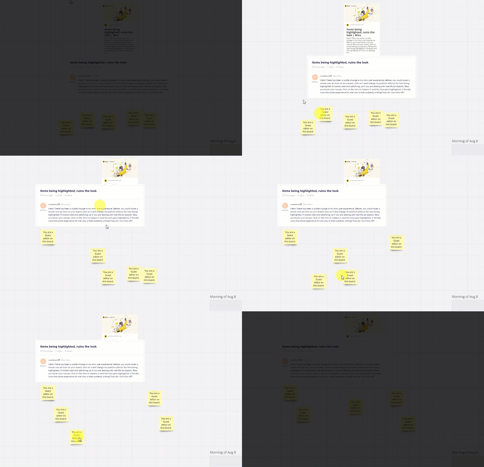
Because I have noted the change back to the old behaviour, and while not specifically communicated to the support team member, hopefully an engineer make a fix/found a way to incorporate the old behaviour into the other new changes, as I am seeing the old behaviour still today (from the same board as my GIF from yesterday morning):
- Volunteer Community Moderator
- August 20, 2024
The issue/behaviour is back. I have reopened my previous support ticket.
This experience is awful as it completely ruins the natural experience of moving something, e.g., imaging if anytime you tried to move a physical object from one location to another, it reacted with another action, e.g., a book flopped open when you just tried to move it across a table.
- Volunteer Community Moderator
- August 21, 2024
Update from Miro support:
Hope you are doing well. Thank you for following up about the context menu showing when moving sticky notes/objects.
I have reached out to our teams, this is a new change that when selecting objects on the start move will cause the context menu to show. I did leave your feedback on how this can impact the workflow.
In addition to the feedback given, you can add the idea of removing the context menu when selecting an object to move on our Wish List? This helps centralize all ideas and feature requests, offers visibility and transparency to every Miro user, ensures that our product teams review them and will allow other users to upvote this idea.
Hope this clarifies. Let us know if you have any other questions or concerns- we'll be happy to help!
- Volunteer Community Moderator
- August 21, 2024
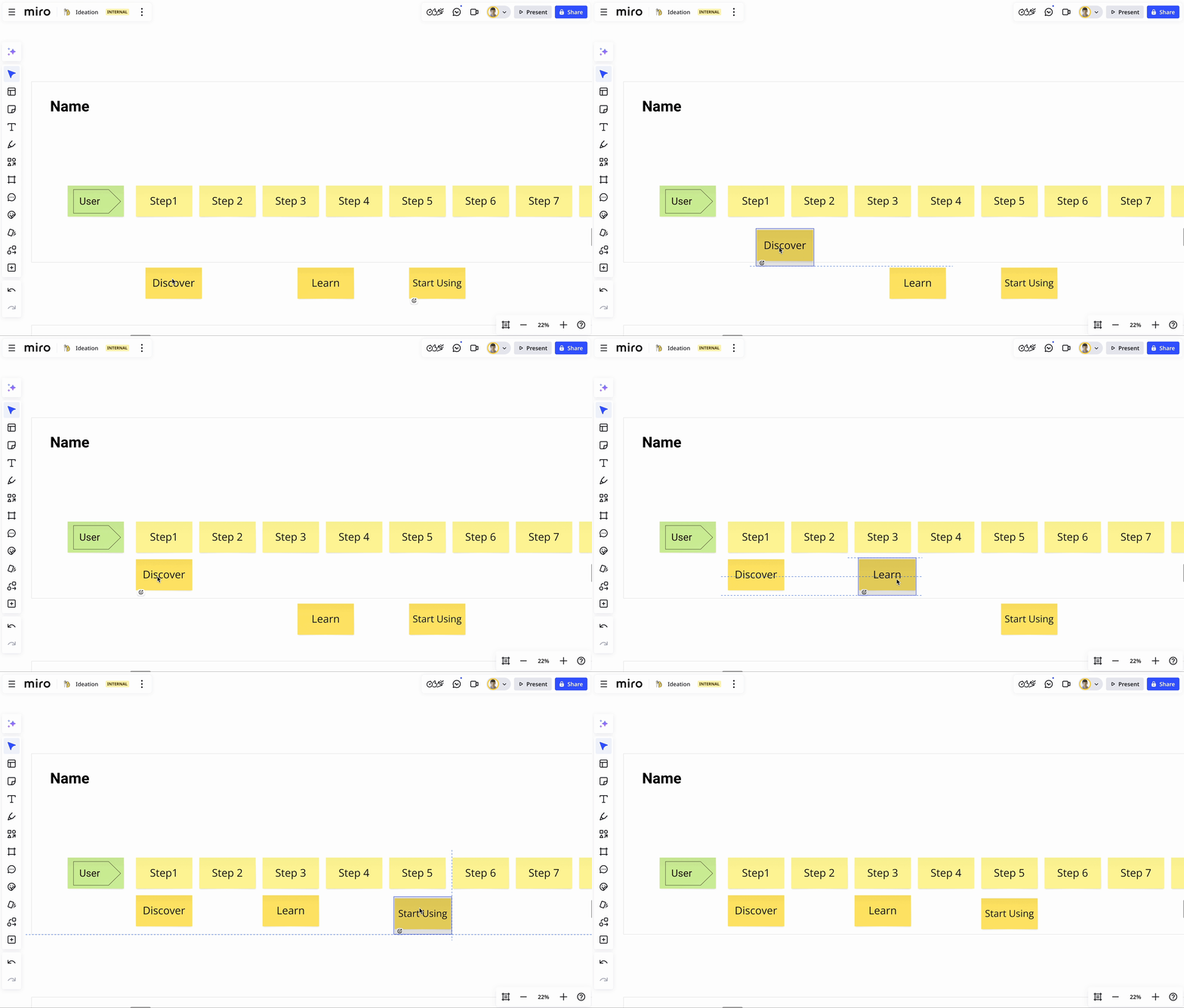
To recap, we used to have this experience:

And now we have this:

- Beginner
- August 21, 2024
This behavior change is making Miro’s use as a presentation and teaching platform very difficult. It also is impacting my students doing collaboration as the context menu pops up and blocks their view of the workspace.
I cannot imagine any new feature that would make this behavior desirable.
- Volunteer Community Moderator
- August 21, 2024
Hmm. I can see the scenario where a user wants to interact with an object immediately after a move, but as I try to think back to the times I may have wanted to edit the object after the move, it’s hard to remember those times as I don’t remember ever being annoyed that I had to give the object a quick click/tap to do so. Maybe someone has the quantitative data to show that a high percentage of folks edit nearly all of the objects that they move 🤷
Maybe this even warrants a user-level setting to toggle to Select on move ← sign me up for that beta!
Signed,
A very passionate Miro user
- Beginner
- September 12, 2024
I am also seeing this problem, which as suggested above makes it very difficult to use Miro as a dynamic tool. We use Miro extensively and the edit menu constantly popping us is very distracting and unnecessary. There needs to be a distinction between moving, which happens a lot in sessions, and editing.
- Group Leader
- September 13, 2024
Add me to the list of frustrated users. For the love of all that is sane and good with the world, make this change configurable in the user profile.
- Mironeer
- September 13, 2024
Hi everyone,
I've reached out internally to check for any updates regarding this issue. Rest assured that we are keeping an eye on it, and we will update the thread as soon as we have more information. Thank you for your patience!
- Group Leader
- September 13, 2024
Just piling on here that Hilary and I at Hiro Studio want to see this change rolled back as well. it serves no good purpose at all and only makes moving items around more difficult. If I want the menu to open on an item, I’ll just click it without moving it. I now am mashing the escape key constantly to deselect things, and this drives me nuts. Here is a Haiku showing my frustration:
When I want menu
I will click to make it show
Not when I drag please
- Volunteer Community Moderator
- September 17, 2024
I use Miro daily, and have for years. This change continues disrupt my workflow of moving objects as I share my screen. Now, rather than just naturally moving an object from one location to another, I need to take a secondary action to close a context menu, e.g., five minutes ago, as I discuss items on a board, I uses the monster hand sticker to show what I am currently discussing and had to click away from the hand every time to get rid of the context menu.
Imagine this: Every time you moved a file from one folder to another, the right-click context menu opened.
Perhaps a double-click and drag supresses the selection on move/context menu?
- Volunteer Community Moderator
- September 18, 2024
Most recent frustration with this new behaviour comes tonight when I moved something on the board, and then immediately after I wanted toove somewhere else on the board using a right-click to pan – the result: the context menu of the previously moved item kept following me around, even though the selected item was well outside of the current viewport.
- Beginner
- September 18, 2024
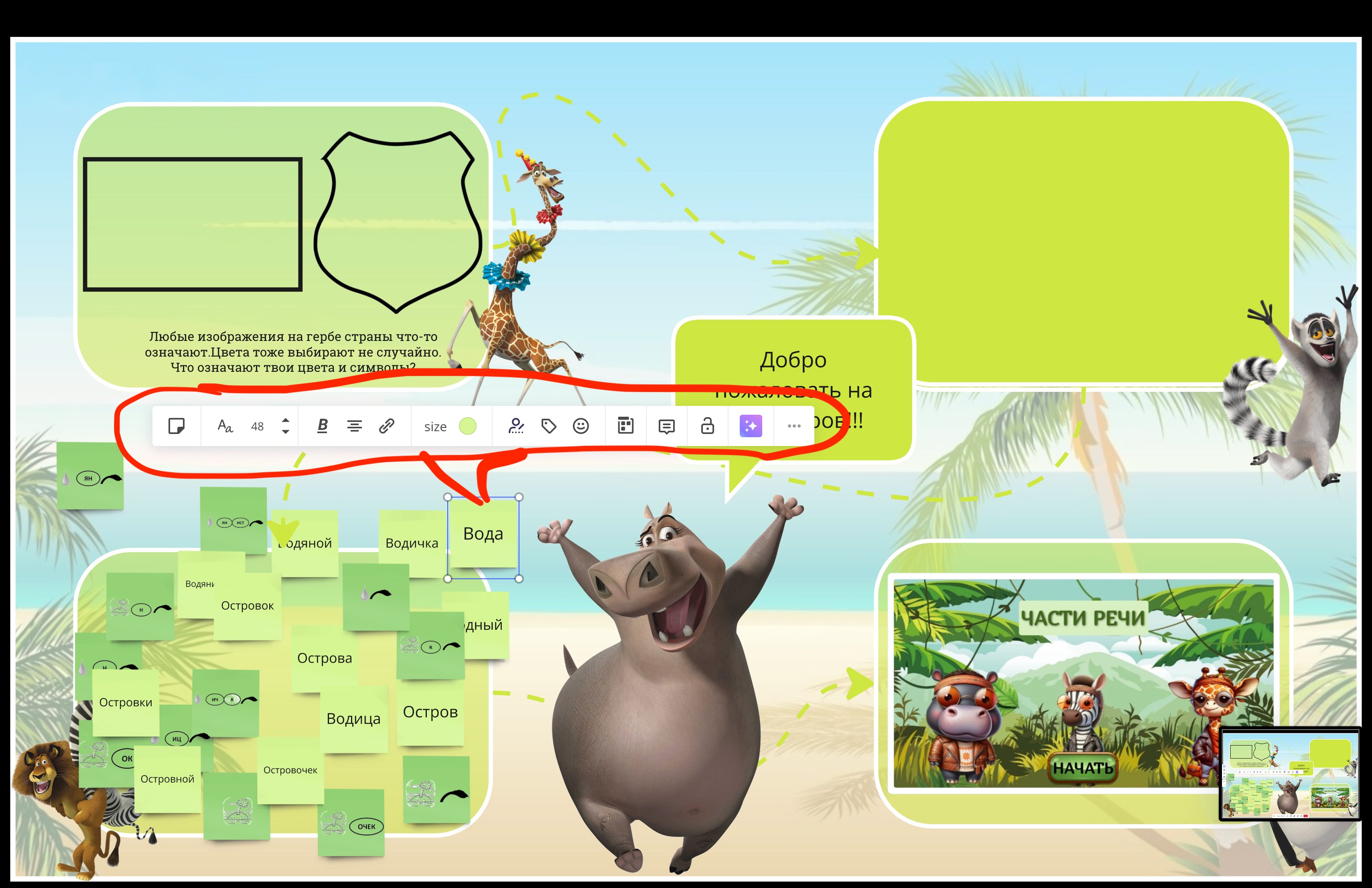
Joining the suffering club!
I see it as a huge inconvenience as working with kids mostly. My students now get distracted by the panel while trying to move even the smallest object!
I would greatly appreciate if Miro team could add the possibilty to hid this panel at leat in presentation mode!
- Miro Hero
- September 19, 2024
Shout outs to
Offering my voice in support of all the folks that commented. Not only does this forced contextual menu create additional, unnecessary actions (mouse click or escape key for every adjustment), it interrupts the delicate flow of spatial decision making. When I’m making spatial adjustments - alignment, scale, shape, margins, etc - I am looking at the objects in the composite relative to the piece that was adjusted. This contextual menu forces its presence and shifts that composite focus, snapping all attention to the moved object. It’s intrusive and inelegant; I see the drawback as a heavier weight than what’s gained by making folks more away of the menu.
- New Here
- September 28, 2024
Piling on to this. It makes Miro unusable as a teaching tool. It is distracting and blocks what we are looking at. Creating an option to remove the menu (and all other markers) from a shape once created, would solve this problem. Some kind of “preferences” setting, or even adding the option within the menu itself for each object, would be better than what there is now. I need to be able to have an opaque object that the students can move around, without any distractions, and also preferably without them accidentally (or on purpose) changing the shape/size!
- Volunteer Community Moderator
- September 28, 2024
I’m glad to see I’m not the only one who does like this new behaviour.
I've never had a problem with the context menu not opening after an item move and the comments here suggest others feel the same. The very fact that I've never been bothered by (or noticed it) suggests it was a good design:

I can’t help but compare this new behaviour to another human-computer interaction (I already mentioned about) of moving files from one folder to another, where I just want to move the files and do not expect a context menu to open up after.
As I question this design change decision, I had a look at Mural’s and MS Whiteboard’s (and Confluence’s) move experience and see that they both open a context menu after a move. Maybe that’s why I never liked those tools, and Miro’s experience of moving items seemed more “natural”.
I will also say that, through my nearly seven years of using Miro, and showing 100’s of people the tool, not once have I had someone ask “How do I edit this sticky/text/shape/etc. after I move it? I can’t figure this tool out?” And in my time on the forum – dating back to about a week after its launch over 4.5 years ago), have I seen a post where someone want the context to open after the moved an object.
There just didn't appear to a problem that needed solving. The fact that Miro has grown to 70+ millions users, and that people are commenting here to express their dislike of the new behaviour seems to support this.
Is anyone listening?
I’m sure we would all appreciate a Miro Product Manager chiming in to help us understand why this change was necessary/what the benefits are, or at least that our concerns have been heard and are being considered.
Other PMs have led by example:
- New diagramming shape packs released, but only for Business or Enterprise customers
@Turner Pijpers and@Jennifer Yzelman quickly replied, and ultimately these diagramming shapes were released to other plans!
- Comments 2.0 released
@julia_rudge promptly joined the conversation (and, again, a change was made based upon the feedback)
- Active Contributor
- September 29, 2024
FWIW I had my college database class start diagramming this past week. The fact that this little edit bar persists after an object motion is VERY bothersome for diagramming, because -- obviously -- it hides parts of the diagram.
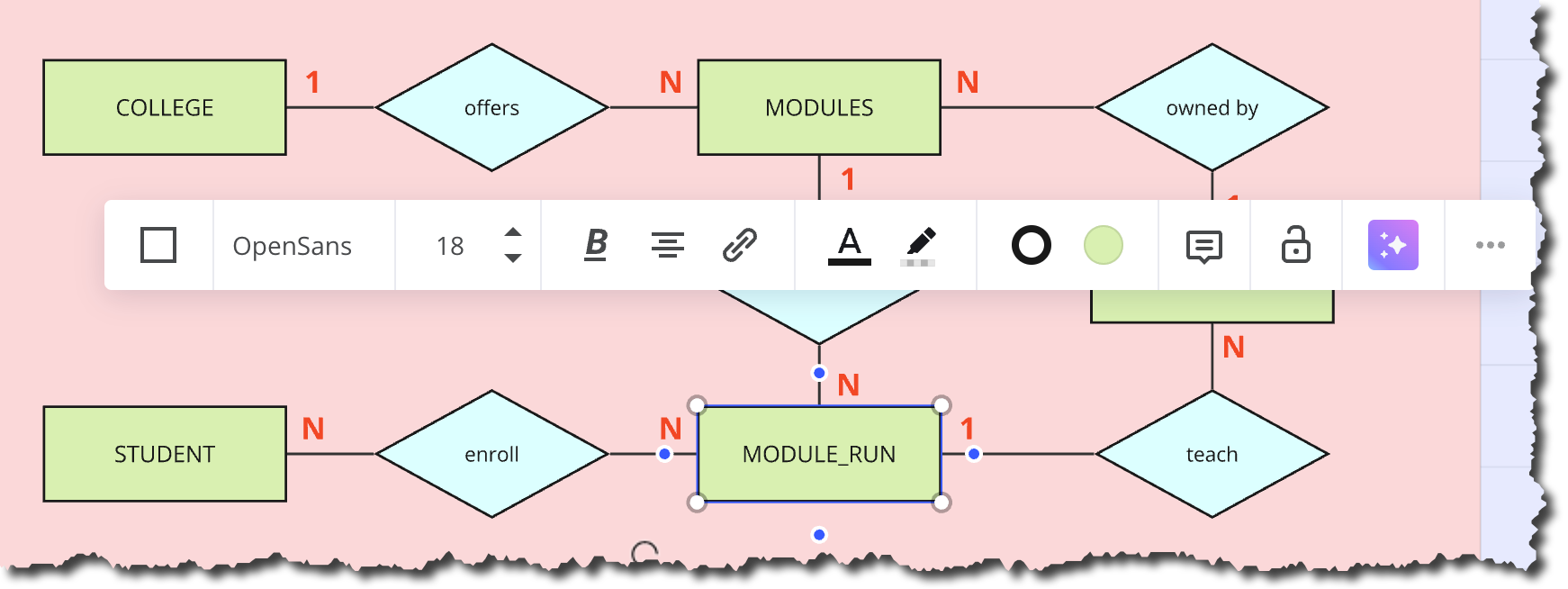
I also teach my students to use draw.io. If a new student is just starting out, I think they’d opt for that.

FWIW - as I think we all know - there is a “barrier” that newbies need to learn and overcome before they are interested in using Miro and can use if fluently. This non-disappearing toolbar - although something small - does raise that barrier just a bit higher.
- Mironeer
- October 1, 2024
Hello
I am Janani and I am representing our product teams. We are here and listening! We do feel the frustration in the thread with the context menu popping up each time when you move objects.
While we discuss with the relevant product teams, would love to get on a call with you to understand your workflows where you need to move objects around frequently. I am happy to send you a DM to co- ordinate a suitable time.
- Beginner
- October 1, 2024
Hi
I’m unlikely to be available to attend a call but I can share how we use Miro.
We mainly use Miro for running sessions for activities such as brainstorming, consensus workshops, dynamic design sessions, etc. This requires adding and moving post-its and other items to various parts of a board.
Where this problem has become most noticeable is on a board we’ve used to play a fairly complex game we’ve designed, so alongside remembering the gameplay rules etc. we also have to constantly click away from game pieces, cards and other game elements before we can move on.
We don’t just use static elements on board in these sessions, having the ability to move things around is the whole benefit of using Miro.
As an earlier poster pointed out, Miro is already not entirely intuitive for inexperienced users (there’s a level of upskilling and confidence building that needs to happen quickly for the wide variety of drop in attendees at our sessions) so there’s already a barrier and this problem makes even expert use seem a little clunky lowering the likelihood that users who come to the Miro new in one of our sessions going on to use Miro themselves.
Thanks for looking at this issue. I hope a solution is imminent!
Clare
Enter your E-mail address. We'll send you an e-mail with instructions to reset your password.
Scanning file for viruses.
Sorry, we're still checking this file's contents to make sure it's safe to download. Please try again in a few minutes.
OKThis file cannot be downloaded
Sorry, our virus scanner detected that this file isn't safe to download.
OK


