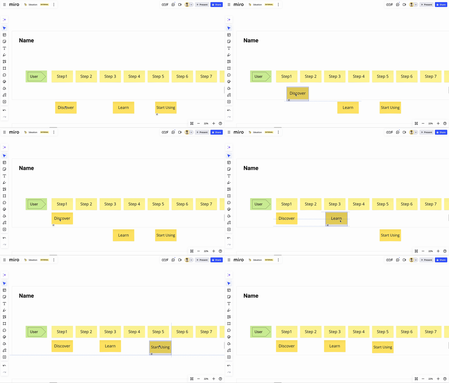
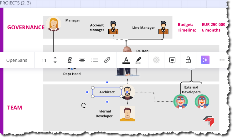
Hello! There has been a sublte change in my miro user experience. Before, you could hover a mouse over an item on your board, click on it and change its position without the item being highlighted. It looked neat and satisfying, as if you are dealing with real life 2d objects. Now, you hover your mouse, click on the item to replace it, and the item gets highlighted, it literally ruins the whole experience for me! why is that suddenly a thing? how do i turn this off?
Answered
Can no longer quickly move object without it showing as selected and context menu appearing
Best answer by Eca
Hi Miro Community,
Thank you for your ongoing feedback. After reviewing your input, we’ve decided to address the distraction caused by menus overlaying content when dragging a single object on the Canvas.
We launched an update today so the widget menu won’t appear during mouse-up when moving an object while still highlighting a selected state. This strikes a balance between highlighting the moved object during moving and removing your encountered distractions.
Please try this out and share any feedback you have in the thread. Thank you!

Enter your E-mail address. We'll send you an e-mail with instructions to reset your password.


