I would like to add custom tooltips text to any object on the board.

When the cursor is hovered over the object, the text would appear, even if the object was locked.

Example using Miro’s existing tooltips:
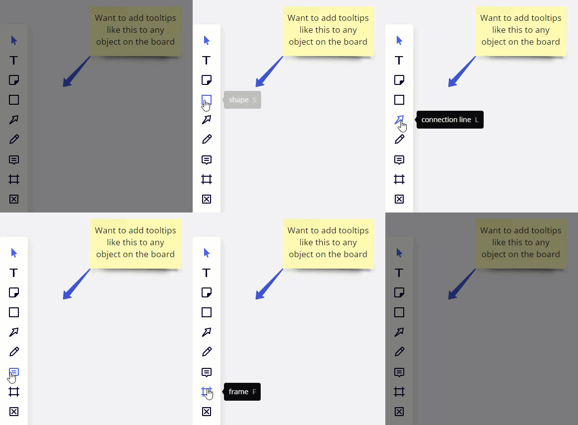
 

Use Case

This idea first came to me when I was building my 101 Miro Templates Challenge entry board. I wanted to have additional help/instructions for the user that was using my board to learn more about Miro.

Another use case would be for wireframe objects:


Great idea @Robert Johnson - this would help the usability of boards without the need to always add explicit instructions within them!

Kiron


Yes! This would be amazing and has my vote - I’m creating some onboarding workflow diagrams and adding tooltips for various parts would help folks make sense of it without adding extra visual clutter


Hey @Robert Johnson

One approach that I’ve noticed in the community, is to do this using comments.

Some go even further to colour code the comments for different functions.

See this example from TED.

Hope it helps, Kristin


I’m a relatively new user to Miro, and I was looking for this feature to add tool tips to my template, for the same reasons everyone else on this thread is describing.

I tried using the comment feature in the template, but then they do not show up when you place the template. Plus, it would be a bit weird for people to see my name on the note if they were not interacting with me.

But a more purposeful tool tip feature would be best—upvote x 10! :wink:


Here’s a use case that represents my need for tooltips.

I use Miro to produce business process diagrams. Many of the visual elements in the diagram have a glossary entry associated with them that defines the element. At present, my glossary in Miro is a “wall of text” on the surface of the canvas just beneath the diagrams. An improvement would provide the ability to place the glossary definition in a tooltip so that when a view mouses over the diagram element...voila!!!!!...the glossary definition for that element appears.


Aloha.. How many votes before this is considered viable to move to production? I’d see this as a fantastic way to show large scale prototyping in sections whilst still having the integrity of the basic structure still easy to digest by viewers.

The pop up or tooltip option here gives room to expand on business/marketing and tech processes at scale whereas now it is in one large area (overwhelming for many) or separated out which loses its cohesiveness (integrative look/feel).

It also adds an air of intrigue for users to follow along at their own pace and not be engulfed by the BIG picture to fast and can consume it in stages.

Lends itself toward a sort of gamification approach as well depending on case use which is also a fun option.

I am sure with the vast applications and numerous users on Miro, this’d be a most welcome addition, most don’t even think to ask for. :arrow_up::ballot_box:

P.s. Be interesting to have Miro post these things more often in newsletters or in the notifications so more users get input and give feedback more regularly. Have not really seen this as a focal point. :ballot_box_with_check:


Also would love to see this added!  We’re using Miro a ton now for tracking org charts, and a hover tooltip would be fantastic for micro details that you don’t need at a glance but are relevant to macro picture!


Just built a new template and agree with the comments above - it would be a huge value add to my template to add in tool tips so I can help guide the person through the template. 


Making these pop-up searchable would be amazing as well. If you are looking for a specific job description or tasks that a person completes instead of having to click through all the pop-ups.


This would be great - the problem with comments is that they aren’t preserved when you’re cutting and pasting objects (and sometimes cutting & pasting is required to get around other issues, like things accidentally embedding themselves in tables).


Echoing all replies above...  Popup text is an indispensible tool!


Seconded, but both text and images please


Adding my vote. This would be very helpful during collaboration (online and offline) to add context to:

  • Why objects are connected with lines/ (relationships, value, etc.)
  • What are the additional actions or targets associated with actions in a flowchart or
  • Adding PT LT times for Lean that can be distracting in a process box
  • Adding longer text explanations to keep the footprint of the diagram smaller/ concise

Thanks in advance!


Great idea! However it’s been asked 2 years ago! Did you get a chance to contact support directly to add this option?


@wise_mic2 

Did you get a chance to contact support directly to add this option?

There wouldn’t be much point as the support team does not make these decisions. The Miro product teams do monitor the Wish List posts. From what I heard last, they query for them and once they hit 50 votes, someone does flag the idea with a product team (which still doesn’t mean it will every be implemented).


I want this for my weekly statistics board, where we document how many downloads, email subscribes, etc. to explain the numbers and how to get them. Hover and you get the explanation. This would be so useful.


my vote here

and another usecase from my side

I’m drawing communication diagrams between services. So a client sends a request and a server returns a response. I’d like to add request and response JSONs formatted as code blocks with code highlighting but display them only when a viewer clicks on another element


I think this is a critical functionality for many of my Miro objects. We often want to create a clear, understandable diagram that also contains some deep information (when needed). Currently we are using a workaround where we cross-link from a stripped down graphic to another frame that has much more information, but that seems clunky and over complicated.


Plus one for this idea, really for any diagram that wants to be able to easily provide deeper contextual information than is appropriate in a box


Upvoting this!

It would be so nice to have a expansion view, just like the cards, where you can add a description with all the same text and formatting options that you have in the card. Should be a very easy fix I reckon, since it already exists for the cards? :-)

Hope this could be implemented soon.


Thanks so much for taking the time to comment about this feature. We understand the frustration and appreciate your patience. Our team is reviewing this idea as it continues to be open for votes and comments.


For those coming across this idea, if you feel this would be helpful for you or your business, please be sure to vote for it and leave a comment about your use case to help our team scope this request!


Thank you,

Miro Community Team


Awesome news that it’s on the radar, Miro.

I want to add that it’s a feature that could really elevate the use-case for detailed flowcharts and process diagrams. I work as an engineer in a pharmaceutical company, and my team would very much like to use this feature to create resources for workflows, but feel limited right now by using comments (which can be resolved, changed etc. and doesn’t support text formatting and hyperlinking.). This feature would make it possible to have detailed descriptions with hyperlinks to relevant resources (SOPs, protocols etc) on each shape while keeping the diagrams sleek and minimal.


I would also see this as a very useful function to have clear diagrams/pictures with additional information if you click on an item! 


I also tried multiple options to visualize this level of detail when clicking on an element, but I did not find an optimal way. This feature will bring a lot of value and help to add more details on complex flows and connections


I consider this a critical feature too.  Much like the other comments before me, it’s really important to have a level of simplicity in a diagram with a deeper-level of contextual information when required.