When Miro releases updates, I get these annoying “what’s new” popups all over the screen.  I don’t want to see them - they get in the way of me actually using the board to get work done.

How do I permanently disable these popups?  I don’t see any options in preferences, anywere.

@Aaron Katz -

I don’t believe there’s any way to permanently disable those popups, but I wanted to clarify whether you were getting more than a single one? As far as I know, there is usually a single dialog box with the details of the update and once you’ve dismissed it you shouldn’t see that again. 

Kiron


@Kiron Bondale, thanks for your response, as always!

And thank you for the feedback @Aaron Katz
Kiron is right, it’s not possible to disable pop-ups in Miro now, and we’re definitely looking into enhancing your experience with our product from this perspective.

If you’re up for it, I have a couple of quick questions for you:

  • How do you learn about Miro product updates? How do you want to learn about them? 
  • Do you have any references of great products that do user education well from your opinion (informative, yet not disruptive)?


> but I wanted to clarify whether you were getting more than a single one? As far as I know, there is usually a single dialog box with the details of the update and once you’ve dismissed it you shouldn’t see that again. 

The other day, I got several popups pointing out functionality on different parts of the screen,.  None of them appeared to be duplicates, but there were multiple popups where I had to click “got it” (or similar - I forget exactly what it was and didn’t take a screenshot) before I could get to work, because they were in the way.

There are still blue dots all over the place, that seem to be trying to draw my attention to features that I’m not interested in using.


> How do you learn about Miro product updates?

Right now, I seem to be learning about them by having my work interrupted by popups.


> How do you want to learn about them?

I don’t want to learn about them.  I want Miro to Just Work.  I want to log in, do my work, and be done with Miro.  

The only time I should get an interruption to doing my work is if there’s a critical security issue that I have to take action to resolve.

I shouldn’t get emails.  I shouldn’t get popups on the screen.  I should just use Miro to do my job.

In the scenario that I’m interested to learn what functionality might exist, or what changes may have happened, or how to perform a particular task, I want Miro to produce publicly searchable documentation (that will show on a google search). 

I want to be able to pull the information I want.  I never want information forced upon me.


> Do you have any references of great products that do user education well from your opinion (informative, yet not disruptive)?

Every on-prem product prior to (about) 2017.  They provide changelists, documentation, etc.  They never interrupted my workflow.


Thanks for your detailed answer @Aaron Katz , noted!


@Lena Shenkarenko - Here’s another perspective for you.

How do you learn about Miro product updates?

  1. Changelog Feedback section of the community forum
  2. Changelog page at miro.com → https://miro.com/changelog/
  3. From within my Miro dashboard or a board in Guide → What’s new
  4. Tooltip/toast popups in my Miro dashboard/boards.

However,

  1. these are all out of sync
  2. anyone on the forum can post in the Changelog Feedback section, so “Subscribing” to this section means that I am sometimes sent emails to posts in which I am not interested.

How do you want to learn about them?


It would be nice if

  1. there was a SUBSCRIBE TO UPDATES option at miro.com/changelog like there is on the Status page at: https://status.miro.com/
  2. and all new AND changed/removed features were posted there.


This is extremely helpful, thank you for sharing @Robert Johnson


Bumping this thread to see if there’s been any action to get rid of the popups.  Today it was 4.  Changelog, then 3 tooltips to point out new functionality in the UI, which had to be dismissed one at a time.

(also, what’s with the login functionality?  It forced me to create a new account instead of use my existing account)


Bump.  Any change?  Any ticket open to stop this annoying, disruptive anti-pattern?


@Aaron Katz - There is a known bug that started about two weeks ago. Subscribe to this post to be updated when I get an update from the Miro support team:

https://community.miro.com/ask-the-community-45/known-bug-the-mark-as-read-for-the-latest-update-in-what-s-new-doesn-t-update-3939


Please please please - no more pop-ups. Every time I log in to a board (any board) 3-4 pop ups everywhere (“See What’s New”, “How to use Miro”). Enough. I just need to get to work. TURN THEM OFF PLEASE


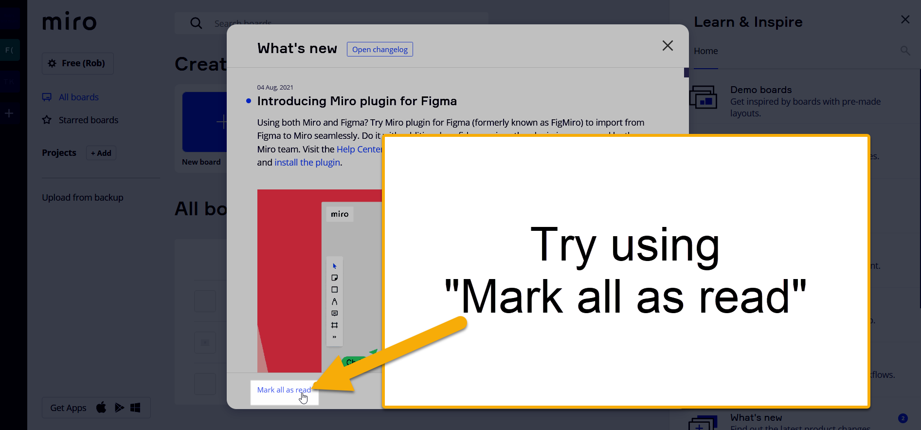
@Stefano - The Mark all as read should stop the popups:


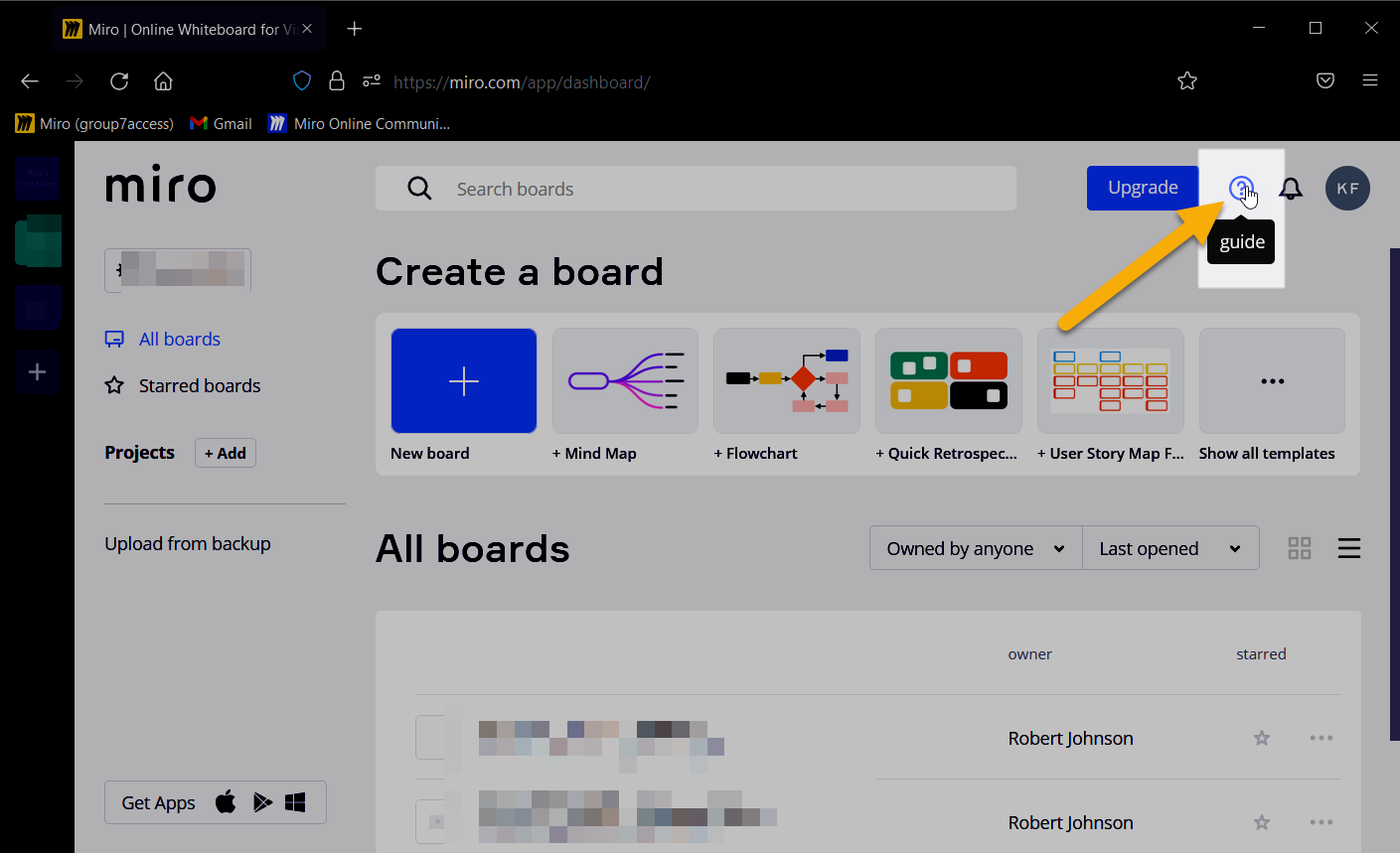
And if you need to get back to the popup to use the Mark all as read option, you can:

  1. open the Guide:
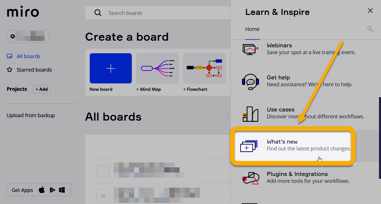
  2. and selecting What’s new:

That should get you back to the popup with the Mark all as read option.


This didn’t work for me. I clicked the Mark all as read button a week or so ago. Today when I opened Miro I saw the What’s New pop up again. It’s really annoying and slows me down.


As a follow-up, in response to some of the questions asked earlier in this thread, I’ve just looked through the most recent entries in the ‘What’s New’ popup. It seems - 

  • around 1/3 are relating to integrations with other 3rd party products and services
  • around 1/3 are about workshops
  • around 1/3 are actual product feature updates

I’ll preface this by saying this will vary for every user, but for me personally - I don’t care about workshops or 3rd party integrations, so 2/3s of the content that’s presented to me is irrelevant. If I wanted to know about these features, I would search them out - either via Google or documentation / support pages.

Of the final 1/3 that are actual product updates - only around ½ of them are features I would actually consider useful and/or worthy of an individual update notification. The others, I would say are either not important enough to be singled out individually, or are basically just bloat that add little to no value to the core product. Again, my opinion will be different to the next Miro user.

It seems this could partially be solved by intelligent product design and making these new features easily and conveniently discoverable for the user naturally as part of their workflow. I’m not a UX expert and know that’s easier said than done.

While I personally don’t want to see these notifications at all, the fire-hose approach of bombarding the user with every new piece of information regardless of their relevance is the worst possible approach. At the very least, some method to filter which new content I’m notified about would at least reduce these notifications, and probably be more valuable to me.

Another app our team uses - ClickUp - suffers from the same problems as Miro (continually adding features to give the impression of value - growth for the sake of growth - instead of just focusing on the core product, improving reliability, removing clutter and bloat). However, the key difference is, their product update notifications are sent via email - not blasted in the app itself. So I can easily ignore them, especially when I am trying to use the app for its intended purpose and get something done. I can always come back to them later when I want to read about it. And most importantly, I have the option to unsubscribe entirely if I choose to. What’s more, several features are grouped together in one email - reducing the frequency of the notifications.

It seems clear from the other responses in this thread, people’s biggest annoyance is being bombarded with messages when they open Miro and are trying to work. It’s adding another (albeit minor) step between them and completing a task. The software is getting in the way, rather than helping them complete what they came here to do.


This didn’t work for me. I clicked the Mark all as read button a week or so ago. Today when I opened Miro I saw the What’s New pop up again. It’s really annoying and slows me down.

You likely saw two popups as there have been two different What’s-new posts in the past week - one last Tuesday:

And a new item this Monday:


It’s silly that this isn’t a default-off option.

“Here’s a popup that necessarily interrupts the thing you wanted to do e.g. work on a board which you can’t opt out of because, in our conceit, we believe that every single, individual, perfect new feature you didn’t ask for is better than the existing functionality you were trying to use.”

It’s as bad as Twitter’s “See Less Often.” Just some goof in an LOB somewhere has overridden the product manager, or the product manager is a goof.


This is a paid productivity app.

It’s pretty insane that you have a pop-up first thing.

It’s unforgivable that it hasn’t been removed in a year.

What in the bejeezus makes you think we want to be educated about the status of your product changes before our workdays? 

Quietly add changes to the UI with a *NEW* badge. MAYBE a click-through demo after a major user-initiated update. Like… is this 2015? 


Day one of responding here until Miro offers a mute for what’s new! Join me!


@Sam Pottash - While I appreciate your dedication and enthusiasm, I also don’t want to replace Miro new update notifications with notifications from this post :wink:

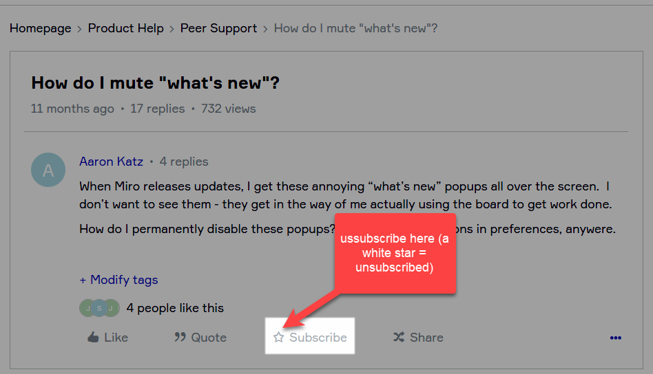
For those who wish to join me in unsubscribing from email notifications, you can unsubscribe using the star located under the original post:


Thanks. Oh, the irony. 


Day two of responding unto you can mute What’s new!


Day three of responding until you can mute “What’s New”!


Day four!


Day five of responding till you can mute what’s new :) 


Day six !! :(


Seven :(


Reply