Hello community!

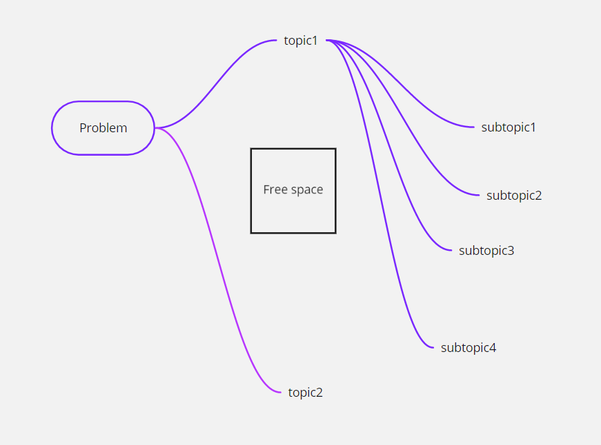
I have a problem that there is a lot of free space left using mind map. For example, when I add subtopics 1,2,3,4 to topic1, topic2 goes lower and lower, thereby leaving free space. I would not like to use simple rectangles and arrows, because it is inconvenient. If the topic2 did not move when moving under the topics, it would be more convenient.

Please give an answer how to disable this movement.

Thanks!
 

@FSK -

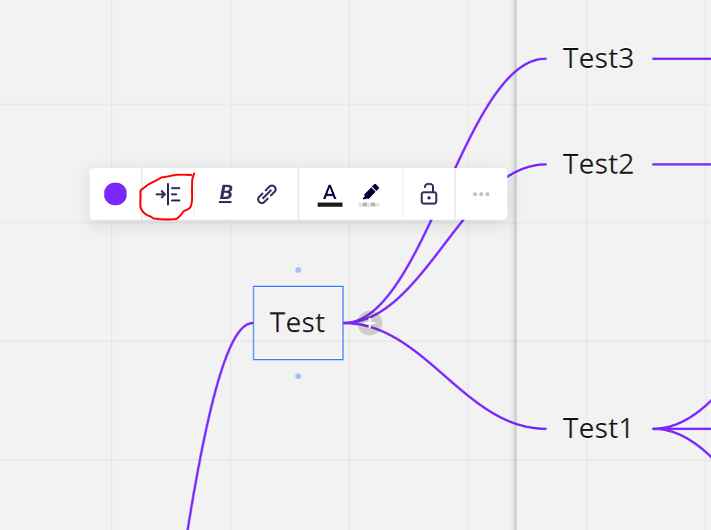
You should be able to use the align child nodes option (when you click on a parent node anywhere in the mind map) to fix the orientation of the children.


Kiron


@Kiron Bondale 

I know about it, but if there are much more subtopics (yes, this is possible), then topic 2 will still go down.


@FSK -

This is odd because the only way I can replicate the scenario you took a screenshot of above is to manually move all the subtopic nodes, and the moment I click on the topic and on the root node and select the align child nodes action it returns them back to a nice symmetrical layout with minimal “free space”.

Kiron


@Kiron Bondale “minimal free space” will often be “too much free space”. While I appreciate the overall auto-layout, it still has its limitations in complex mindmaps.

Dual-mode layout management on mind maps | Miro

Would be great to merge the features of a mind map with the flexibility of a flow chart. I don’t see the point of having features separated.

Side note: Same for card features (like adding card-specific notes) that should be transferred to any kind of “item” (shape/topic/sticky note)


I have the same issue. I’d like to request the same as OP.
I’d like to be able to lock certain elements “in-place”, so it doesn’t get moved around, when i reposition the child nodes.
“Auto alignment” is ok - it’s great, actually. But it rarely hits the result i want. I don’t mind doing it myself.


Reply