THE ABSTRACT:

Where connecting lines and arrows have been used to join stickies and shapes, it would be awesome to be able to hover over a particular object with the cursor and be able to see which other objects are directly connected to it, cutting out unnecessary noise.


THE PROBLEM:

We’ve created a really complex user journey out of stickies with connecting arrows to show all of the ways the different stages can connect, depinding on the actions a user takes. There are TONS of connecting arrows and it’s making it really hard to see what’s what.

The flow through the journey and the different paths you can take is a key part of the story we need to tell on this project What we ideally need is a way to click on an individual sticky and have just the connecting lines that relate to it stand out so they’re more visible within the mess. We’d like to use this for a stakeholder playback session but it’s too hard to navigate at the moment.


In terms of this particular project this is actually a critical feature for us as we’re either going to have to re-think how we play this back or spend time replicating our work in another programme to get the clarity we need for our playback.
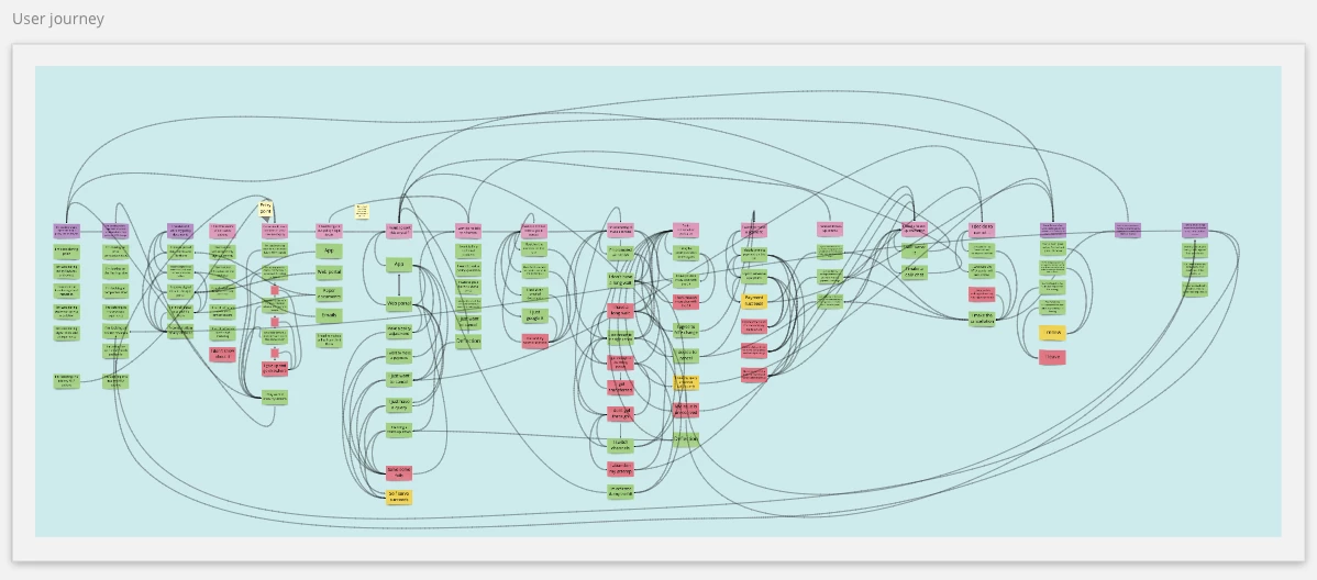
Our messy, interconnected user journey


THE POTENTIAL SOLUTION:

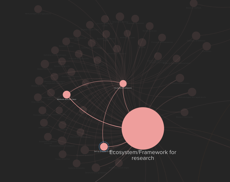
Clarity could be achieved either through highlighting the connections between selected objects or by making unrelated ubject fade into the background. I’m thinking of something similar to the way that Kumu helps you highlight individual connections in complex maps 
 

Please, would love this feature. Cannot find any other programme that can do it.

Thank you!


Still waiting - This, along with the lack of any force-based or intelligent auto-layout really breaks the value proposition of Miro for us.


Signed up to expres my vote for this specific feature. I create mindmaps to map things that are too complex to only sit in my head. I cannot see myself continuing using Miro if I cannot get a cleaner picture of that complexity from using a tool. That somewhat render its use pointless.


@Jean-Philippe Baril
As a fellow.. complexity warrior.. I thought I’d just share a few tools I’m familiar with. Chances are you will know them; if not, hope they help.

  • Y-ED (https://www.yworks.com/products/yed ) Good arrangement capabilities. No highlighting?
  • Kumu (https://kumu.io/ ) Quite fantastic force-layout and highlighting. A lot of customisability. Industry leading for a lot of things when user friendly is needed. Falls short on the back-end.
  • Obsidian (https://obsidian.md/ ) (Plus Excalidraw etc) Quite a ground-breaking tool. Highly versatile. Personal knowledge database. I still haven’t got to the bottom of it’s functionality.
  • Neo-4j + vis tools. Frankly I’ve given up on most lighter offerings and gone straight to source when it comes to graph native data storage and vis.

Best,


Looking at the comments above, it seems many people in addition to me are trying to use this functionality for planning events. As SAFE structure and PI planning even has multiple templates in Miro, it seems the need for it has grown. I’m betting a lot of the users, that actually feel the need for this sort of focused highlighting, don’t even end up in this forum or thread since even I had to test out quite a lot of search terms before I found this functionality here that actually would solve my team’s issues.

My team’s planning session get’s really complicated due to the fact that we have many people trying to plan asynchronously and at the same time manage the dependencies of different pieces starting into development in the right order and also being tested in such manner. None of the members come here individually to look for better solutions even though we all badly need it, because one person in the team is assigned to find alternative solutions - so the need doesn’t really reflect in voting numbers here.

As another factor, we have a lot of teams doing the PI planning and only two of them are using Miro as far as I know, because of different limitations. And it hasn’t grown in popularity even though the lead dependencies over all the teams are handled in Miro. I would hope that gaining this functionality would also help the other teams to be motivated to take this tool into use while seeing the pros in the main syncing board.

Could the need maybe be additionally estimated by looking at the statistical number of overlapping connections per every one connector on different user boards? For example if 10 boards have at least 6 connectors that have at least 3 overlapping connectors, then this functionality would improve the use of Miro for 10 boards? Maybe also somehow factor in the length, as tracking an overlapping connector over a big board is what makes it more difficult? As I understand that this lengthy overlapping is the main source of problem for the voters in here.


Hi @Gajali and everyone else!


Thank you for taking the time to submit your thoughts on this feature. While this feature may not be available, it helps us to hear of the various use cases to bring this back to our team.

Please continue to vote and share your use cases, as we continue to review Wish List requests.