As a paying customer, I would like the to configure the way a board appears to anyone viewing it for the first time - both signed in Miro users and non-Miro users. I want them to experience the board as closely as possible to the way I designed it.

This would apply for anyone - team members, non-team members, but mainly for anyone who does not have a Miro account (or is at least not signed in), e.g., anyone viewing the board publicly when the board’s sharing settings are set to: Anyone with the link can → View, Comment, or Edit.

Currently, things like the navigation mode, canvas grid, and which tools appear in the left-land side content creation toolbar.

My Ask

As the board owner, I want to be able to configure the following defaults for new visitors to the board:

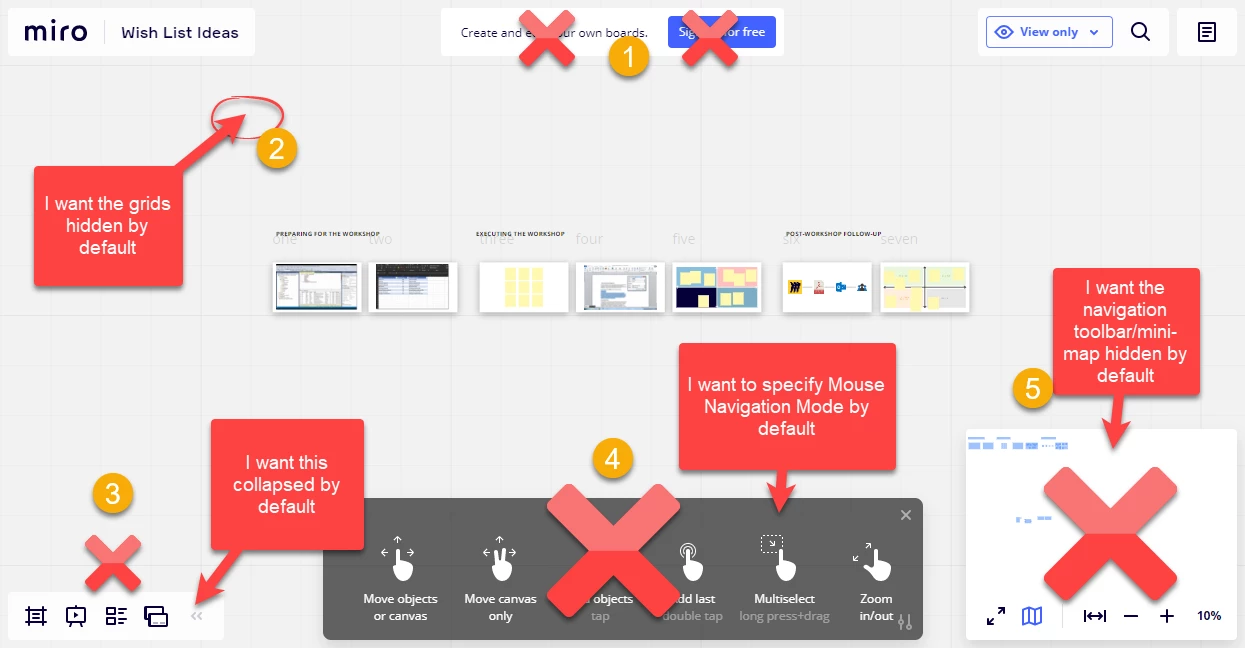
  • Canvas grids are off/hidden.
  • The bottom-left collaboration toolbar (frames, presentation mode, etc.) is collapsed.
  • The bottom-right navigation panel/mini-map is collapsed.
  • The board’s navigation mode is in Mouse mode and the bottom “navigation help” frame is off.
  • Turn off “highlighted changes”, so that users don’t have to see numerous edits that have been made on the board - I got the idea from this Idea by @Margo Johnson (vote for it!)
  • Additionally, if the board is in Edit mode, I want to specify which tools appear in the left-hand side content creation toolbar, e.g., Google Image search, @Max Harper’s Clusterizer.  
  • Collaborators’ cursor OFF by default (thanks to @amy hosotsuji and this post)
  • Set cursor default to Select mode (thanks to @Rich Nadworny  and this post)

Current State

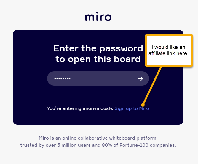
Here’s what I see as a non-Miro user viewing a board for the first time in view-only mode:
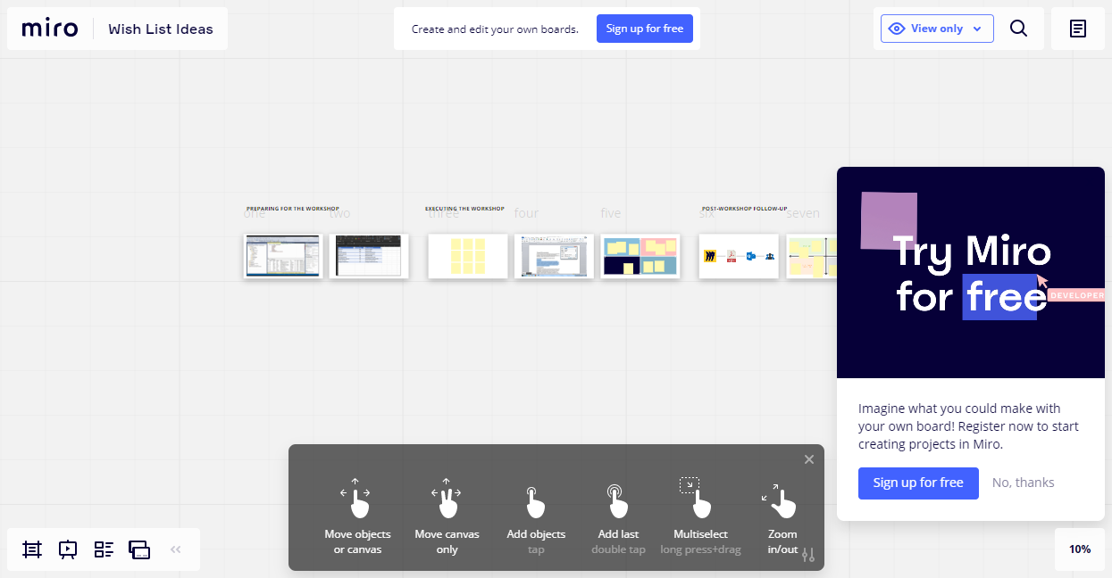
 

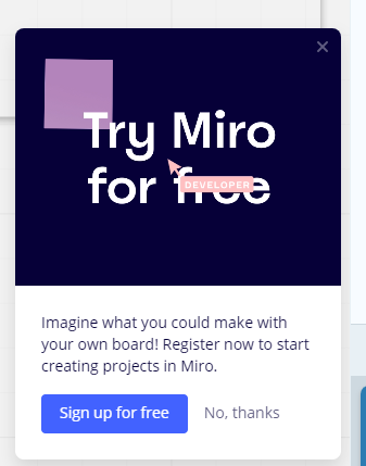
Oh, and how convenient for Miro, but annoying for me as a paid user and my board guests that the No, thanks in the Try Miro for free animation doesn’t work!
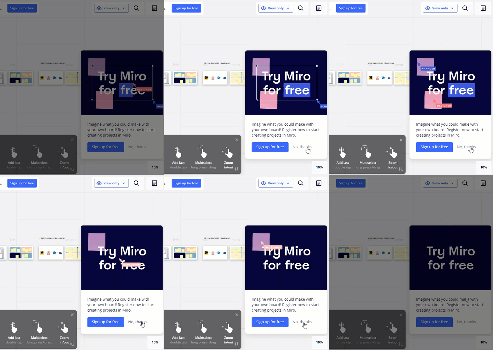
 

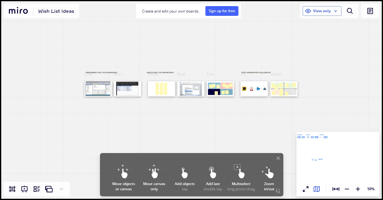
So, I’ll reload the board to get rid of it and we’re back to this ugly thing:
 

I want to get rid of:
 

With all of the above done, here is what I want a visitor to see:
 

Some use cases:

I really don’t need to go on. From my perspective, I am paying for Miro and part of what I am paying for is to share MY board and not a sales billboard for Miro.

YAAASSSSSSS.  :raised_hands_tone2: Strong support for this @Robert Johnson 


+1

I hope that young companies like Miro do a reset on how things are shared. This is not a shot at Miro (at all). I just think that companies have not had that important conversation about sharing and what we (clients) need so we can present ourselves (to our clients) instead of presenting Miro first. 

When I share something, it is to further the conversation between myself and my potential client. Companies have positioned these shares to maximize attracting new clients for themselves. I think that simply being a part of the Miro experience will lead people to sign up for an account. And, of course, the drum I beat is that I would like my affiliate link to be part of the sharing process. 

The perfect relationship between companies and users is to create a win-win for everyone: Miro, Miro users and the clients of Miro users. 


I couldn’t agree more. I am particularly angry about the aggressive marketing for my students to sign up. I love that Miro made it possible for me to work with people outside my organization by making my board available to anyone, and I understand that they want to upsell, but PLEASE, PLEASE, PLEASE let them opt-out and never see that again. It is so annoying.


Hi @Robert Johnson @Kim Roth Howe @jtk @dlamark7464 :

You can find my point here:

https://community.miro.com/best-practices-discussions-48/aggressive-marketing-for-my-training-sessions-3395?postid=14156#post14156

Michael 


I couldn’t agree more. I am particularly angry about the aggressive marketing for my students to sign up. I love that Miro made it possible for me to work with people outside my organization by making my board available to anyone, and I understand that they want to upsell, but PLEASE, PLEASE, PLEASE let them opt-out and never see that again. It is so annoying.

Not being a teacher, I have not considered this scenario you and @mlanders present. From a company perspective, I get why Miro does it. I can see investors fighting against any changes for obvious reasons. But those reasons do not fit the spirit of these companies ( I am also referring to ClickUp). It also misses on some crazy big opportunities. 

Basically, we need a conditional schema.

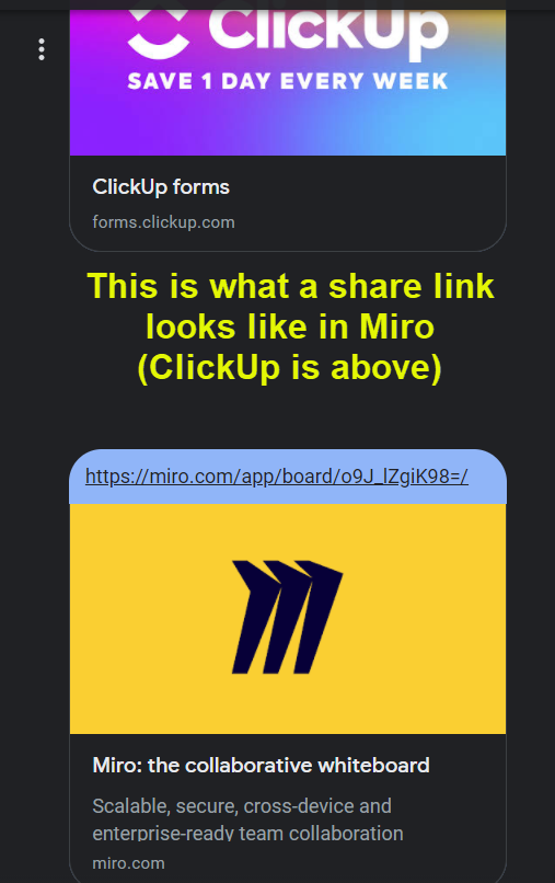
If you share a Board via text this is what it looks like:


Imagine one of your clients getting this as a text. Why are you pushing something on your client? Do you need to prep your client on what they are about to receive? 

We need a schema to add::
 

  • Our Company/Personal Name for the heading
  • Our image instead of the Miro logo
  • Our text
  • At the bottom, a small Miro logo with our affiliate link. 

Per the educators example, there needs to be a multiple choice of how (or if) the board displays Miro links. Just a few checkboxes. For my group consultations and meetings, I absolutely want it there. I just want my affiliate id to be added to the link. But I don’t want it there for subsequent meetings with clients. It takes up real estate and is an eyesore. 


Here is what happens when I share a board for the first time.


Below:
This is at the top of the board, which obviously teachers do not want. I would like the option for this to 1) have my affiliate link and 2) have the option to make it go away. 


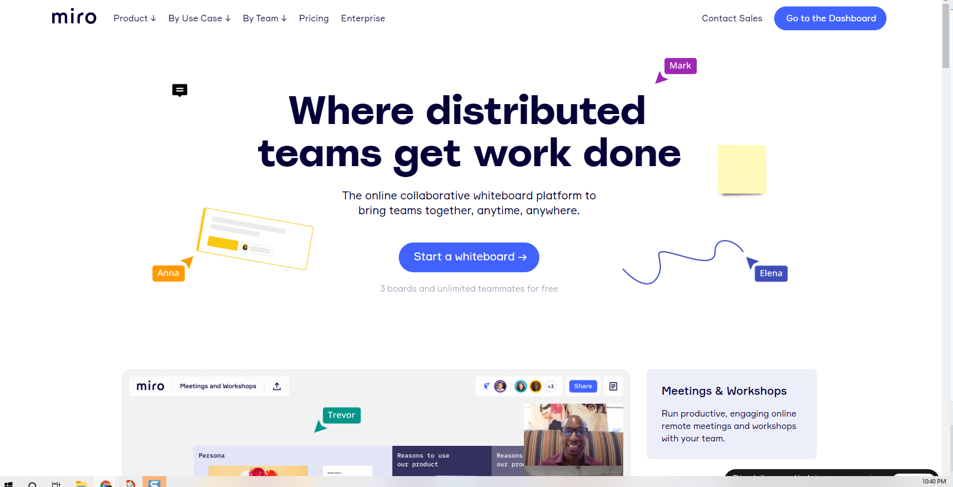
The top left Miro image is also a link. If you click it out of curiosity, you get this (which is yet another way to pull a client from a session. We need an option to prevent this. 


Then you have this that pops up in the corner.


Obviously, this is problematic if you are dealing with children/students, but all this is a pretty easy fix with a parameter page. 

I would have done everything both Miro and ClickUp did when creating their apps. In fact, I would still keep what they have as a default because many people are just not going to care so why not?

But with a great offering comes new information as the app is used in real world scenarios. Is is not ideal for teachers. It is not ideal when we text a client a link (my texting is done on my desktop via Messages btw) because what I am essentially doing is acting as an unpaid advertiser for @Miro. I want my client to see my information, not Miro’s. If we could fill out the schema information per board, how cool would that be because now we can advertise the meeting/event and people will know exactly what they are getting when they receive the text. 

When these requests are met by companies like Miro and ClickUp, they are going to see some real creativity in how people find out about them. I will create my “website” with Miro and plaster it in the description of every video I make and encourage viewers to leave comments on my board. Off-the-cuff ideas of what we can do for clients would be quick links that get a true, yet different dialog going. 

I WANT to advertise for Miro. I just want my affiliate #id attached to my creativity. These are different times with more people transitioning to work from home even after the covid epidemic is over. As an online business owner, the affiliate option is important. Sorry to add the affiliate talk to the discussion, but the answer to both these problems is under the same umbrella. Besides, if I am a teacher that tutors, as well. I want that toggle on/off option. 

These adjustments will change the way enterprising, creative people use these apps. Pushing clients to your tradition website is not the only way to do things. It is an unnecessary step that feels antiquated. And it is boring. People are only going to want to use Miro if they see reasons that compel them. All my ideas are being squashed. Why? Because I don’t work for Miro. I love it, though. 


I definitely need this: Turn off “highlighted changes”, so that users don’t have to see numerous edits that have been made on the board - I got the idea from this Idea by @Margo Johnson (vote for it!)


I completely agree with this

Miro is good enough to sell itself - and I am good enough to sell it to people I’d like to use it with. If they see all this they are put off. 
Equally if I’m running a workshop or meeting it’s often the first time people have touched Miro and their first experience is one of struggling to get in and get to functionality. In a 90minute meeting it can take 15minutes to get people up and running a through all the hurdles. That’s actually meant 4 clients that I introduced to Miro deciding NOT to work with Miro! Not exactly a sales plan that’s working then. 
Especially for consultants this needs to be totally streamlined 


People want EASY and will happily adopt the easiest thing.  If you make it streamlined, simple and easy - it will sell itself.  (And all your happy users will sell it for you!… especially if you make it EASY for us to put our affiliate links in too! :wink: ).  


Copying all the Mironeers I know are active in the Miro community!

@Marina @Anton Telitsyn @Lena Shenkarenko @Tolya Filippov @Kristin @Hollis Kool @Vicki @Lindsey Meredith @Anton Kuksin