Hello there, 

Anybody can share how you use Miro as a UX Researcher?


🎤 Next month Miro’s Researcher @Eduardo Gomez Ruiz will give a webinar on “Getting the most out of Miro as a UX Researcher”, and he’d like to show some examples from different companies to make it feel more real. 

If you’re interested and you could make a version of sections of your Miro board that obscures the details of the project and focuses on the format that other researchers could borrow, that would be great! Ideally, with a quote or a few notes into the HOW, PROCESS, or BENEFITS. Screenshots also work! 

Does not need to be fancy or super visually appealing. Our goal for the conference is not to show the tool but rather explore the ways to maximize the value for a researcher, which may entail how you engage stakeholders with your research process or findings, how you do the analysis or capture notes, how you present the findings, etc.


:bulb:  If you want to be featured explicitly during the talk (optional), please also share a portrait of you, your job title, and your company logo.

Let’s inspire all UX Researchers of the world with these crowdsourced examples!


I might be taking the lazy method. Actually, I think of it as the faster method.

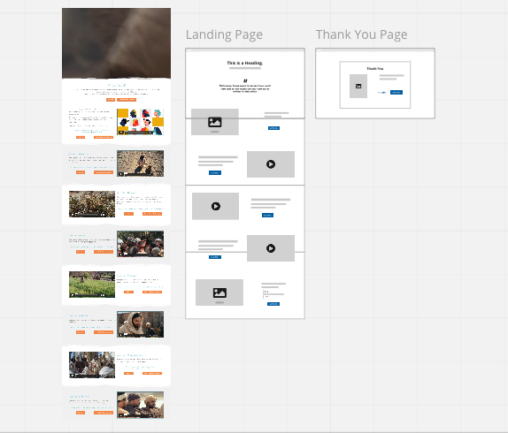
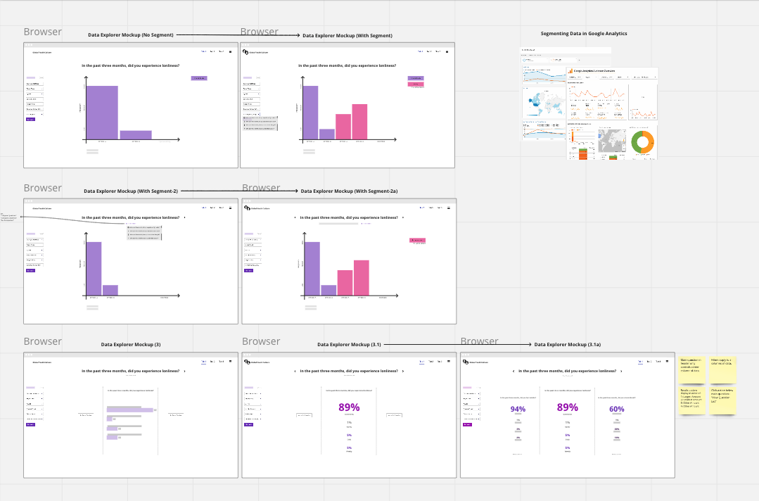
I don’t share a board with clients. We will screenshare in a meeting or I will share screenshots like the ones below. Now I’m not specifically a “UX Researcher” so maybe that’s why I don’t share a board. I simply don’t need to, because screensharing or screenshots work just fine for the web design work I do. Nevertheless, UX is at the core of the process.

I will often use the “web page capture” tool and then create a side-by-side wireframe mockup. I like to use Miro because it’s one of the quickest ways I can show the client improvements for website design. It has the basic elements needed and plenty of options to explain with sticky notes or adding arrows to specific elements.


Hope this helps @Eduardo Gomez Ruiz :grin:


Thanks @Kyle.C this is interesting! What makes you share the screen instead of inviting them to the board?


@Eduardo Gomez Ruiz I think sharing my screen involves less effort for the client. They don’t have to click a link and open a new browser tab to follow along. I can share the part they need to know about and it has never been complicated for the team. I think the majority are used to screen-share and captures instead of opening to a website they may not have heard of.

Also, I have a client or two who would prefer to tell me what to do, rather than open something for themselves :laughing:

“Can you scroll back up?” “Go back to that screen you had with the images.” etc… They know they could just go to the board or page themselves. But sometimes it’s an unnecessary click, so it ends up being faster when I don’t share the board.


Thank you.


Reply