Please Miro Gods! Almighty pros! Tell me I can define a finite space so my non-native-late-adopters can stop getting lost. I realize they can click on "me" to get back, but the stress of it all is robbing me of workshop time and the participants of a stress free experience.
Would also love to be able to lock half the features so I can introduce people to one tool at a time. Is that a thing?
Cortisol + learning curve+ more space than we need= creativity drain.
Page 1 / 1
@Vivian Vaillant I’d say let them get used to “infinite spaces” :)
On a more serious note, I typically do not have this issue. Sometimes, when I do a “webinar style” event, a participant would, 30 minutes into the event, realise that we are all in an infinite space. So these days, i actually show them the infinite space during the Miro demo.
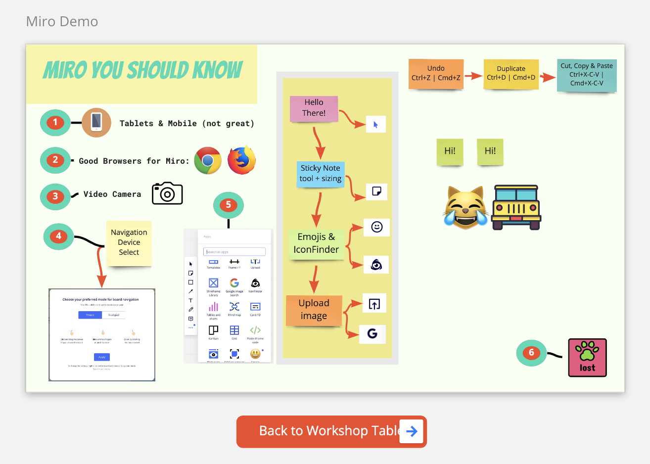
For workshops/training events, I use a ‘workshop table’ to organise the space. I ‘demo’ how they can get back if they’re lost. You can read about this method and others in the Miro blog (you can see the actual board below.)
Demo the tools that you need. In webinar/big events, I show them how to use ONLY the sticky notes and that’s it. If they happen to discover something else, then that’s bonus. Similarly, for workshops, I’d demo the tools that they need to know up front. You can always do another demo again.
I always assume that the Miro space is never perfect and people are naturally curious so things happen. The more we try to control the uncontrollable (like human behaviour), the more worried we become and the less effective we’ll be when it comes to delivering our workshop. But of course, the tips above will have to create “expected behaviour boundaries” to a degree :)
Hi @Isman Tanuri thanks for responding.
Ironically "Let them get used to infinite spaces" feels very similar to when Marie Antoinette used "Let them eat Cake". In both cases, the statement feels tone deaf to what is going on. Let me explain better.
My challenging use case is non profit. We are trying to build better Covid anxiety support groups and social connections for vulnerable, isolated community members. In the design, we are taking a community developed approach, and we have been guided by trauma informed care research.
For the age and demographic that I am trying to serve better, I know in advance that there is trauma in the room with me. New things, getting something wrong, feeling lost are initiate a stress response that can flood their brain with the stress hormone cortisol. This subconscious stress response leaves the participation unable to access the parts of their brain that are creative, problem solving, etc...
This means that if I want all participants to feel safe and comfortable to share and even attend I have to be able to meet them where they are at.
I will also see these people once for a one time session and I like the idea of leaving them with an experience that makes them more willing to try new things on line.. or come back for an ongoing group. It just isn't working to give my audience "one more thing" to get used to. I can "make it work", however I'm deeply concerned about the mental wellbeing of my participants. The platform that figures these things out first will unlock a whole new world of clientele that are still too overwhelmed by getting groceries to figure out why their stickies are still the wrong size. They don't like being Zoom tornadoes into break rooms and they don't like feeling lost online.
Many of us are actually having these stress responses to a certain degree. It's a part of how "Zoom fatigue" has become a term.
Understanding that Miro was created for high achievement design sprints and technology Davy folk that are paid to attend a meeting, it might be that my use case is just off brand and that's cool too... however...
I would love to use something like Miro to enhance the client experience beyond a video call but right now the triggering effects outweigh the benefits. I believe if I could lock down the canvas I could make some pretty great things happen for our late but still important adopters. Is there another tool that anyone has used that I would be better suited to?
Thanks!
@Isman Tanuri - These are great tips which I will definitely be adding to my toolkit!
@Vivian Vaillant - I completely get what you’re saying about how Miro can be a lot, especially for those who are less tech savvy. My suggestion would be to at least use Zoom to share your screen and Miro to present your information. Then when it comes to enhance the experience and get folks as engaged as they feel comfortable, there are a few strategies that I could suggest to try to limit the amount of moving around/creating of objects they will have to do:
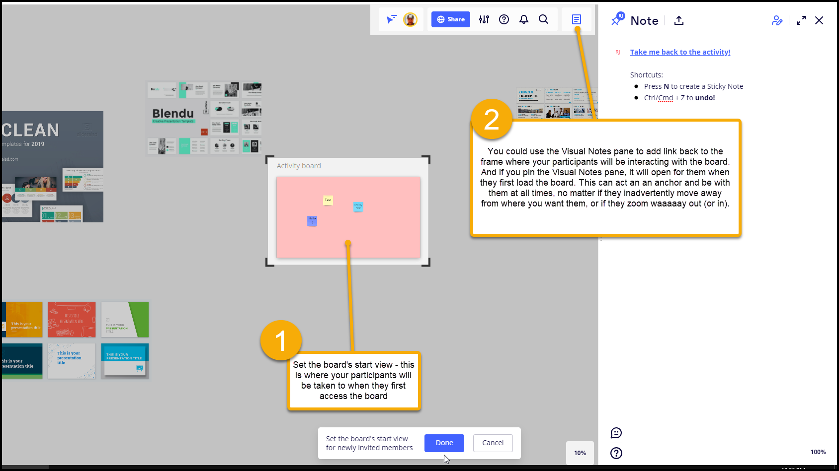
Set the board’s start view, so they will end up exactly where you want them to be.
Try to limit the space where you the activity will be (and maybe even make a frame with a rather distinct, but not overwhelming background color that highlights where they should be.
Use the Visual Notes pane as a way to anchor helpful information, e.g., handy shortcuts, a link back to the activity frame - and pin this pane, so it opens for them when they get to the board:
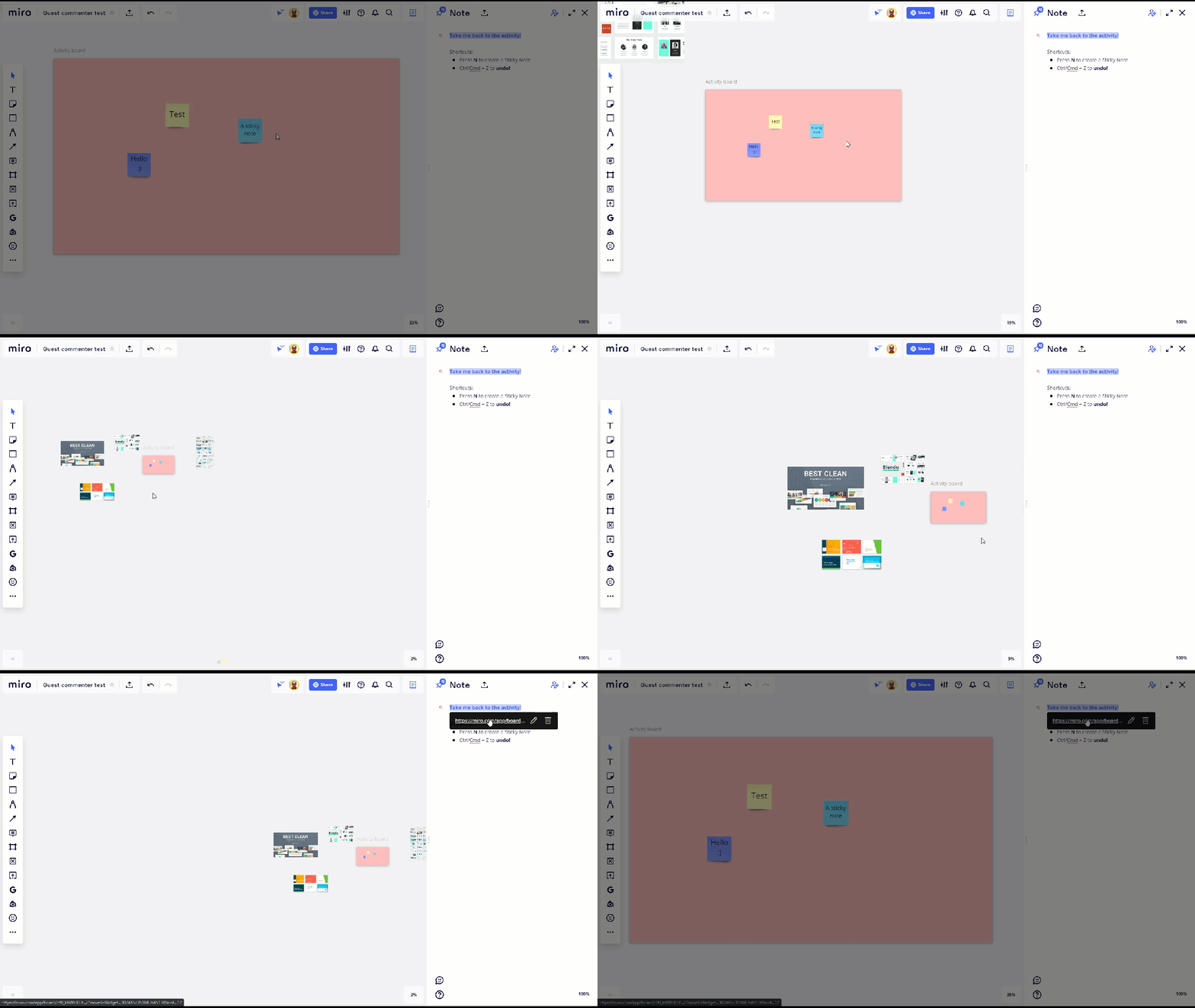
And here’s what the experience could look like for them if they were to get lost and then use the link back to to the activity spot:
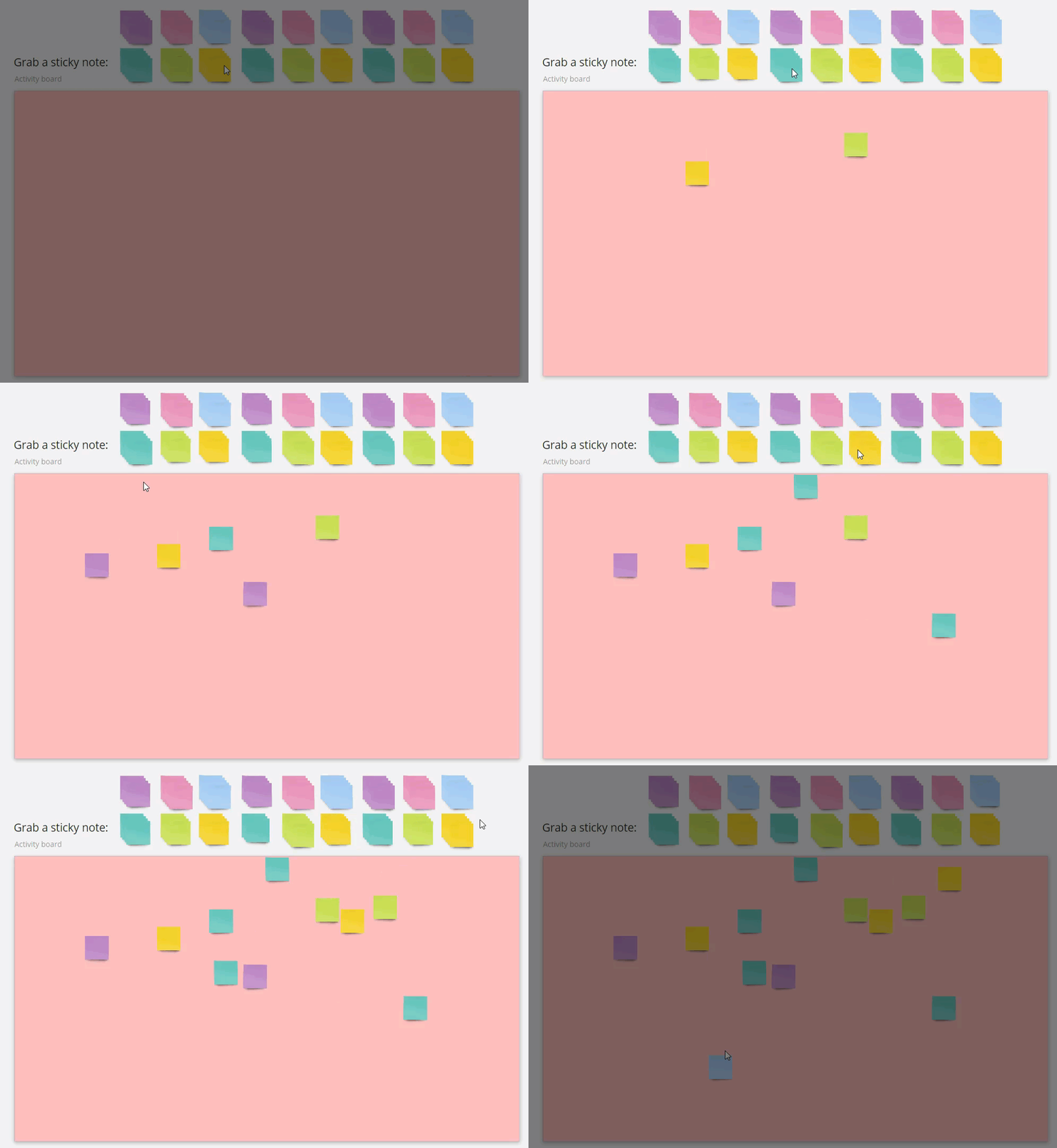
And you may want to create a whole bunch of stickies ahead of time that you can just have then grab and use:
I hope this gives you some more ideas!
@Robert Johnson Thanks. I appreciate it.
@Vivian Vaillant - Sounds like you are doing wonderful work. I empathise with this question too as a significant cross section of my workshop partcipants also can find Miro overwhelming. Depending on the format of the events taking place, I have shared my screen and had a co faciliator help copy and paste responses from the chat into the board itself. There are definately disadvantages to this but its a small baby step that can still give benefits of a easy to manipulate board to gather insights. As a next step, I agree with what Isman and Rob suggest about limiting or contrainting features initially so they dont get too lost.
Another tip is to use ‘bring everyone to me’ feature. This ensures that you pick up any stragellers who are lost
I try to use Frames @Vivian Vaillant in a Grid Layout so that New Topic/Subjects are Columns and New Content/Changes are added Rows to the appropriate Column. The analogy is the Columns represent Chapters in a Novel and the Rows are pages between Chapters.
Using the Ctrl + d to Duplicate (or even better Alt + Arrow) the First Frame you place is a quick method to setup the Grid.
Avid Miro users tend to love and advocate for the ‘infinite canvas’ feel. But it is genuinely overwhelming for many new users, casual users, one-off ‘workshop’ users. And as @Vivian Vaillant clearly states it: Stressful.
I have a client - a big corporate - that has made the decision to go with MURAL over Miro for this and only this reason: that its team members and IT leads found MURAL to be safer and more comforting to have singular, bounded, non-infinite, boards -- that are bounded by default on all sides with dark grey. The UI metaphor is clearer to the casual user of MURAL for that reason - “oh, i see, its a big sheet of paper” or “ok… so its a whiteboard.” With Miro, the metaphor is less clear or confusing… “oh… so its like nothing I’ve ever experienced… like an endless desert expanse, how inspiring, how scary… I’m pretty sure I’ll get lost in this massive savannah...” Is the whole Miro board a white board … but then what are frames…?
I mean… I, personally, 100% LOVE the boundaries that Miro breaks by not trying to be a bounded sheet of paper. But, I sincerely hope, for the workshop designers working with Miro(those constantly introducing new initiates to Miro), and for all those adopting MURAL who ought to be with Miro, that Miro builds a ‘locked bounds’ tool to contain users inside frames. Fortunately that tool will be easier for Miro to build than for MURAL to catch up and build all that with which Miro has an edge on them.
Until that time I suggest:
Do what @Robert Johnson suggests on using notes as a clickable agenda/map/event router,
Create your own bounding outline, by making 4 big grey boxes (top, R, Bottom, L), and lock them in place.
Make other large way finding features for those that zoom way out: large text over the main areas that can be read from deep zoom out, fun or helpful graphics that are legible at far zooms and not annoyingly-pixelated or too busy at closer zooms.
If you can, as @Isman Tanuri describes, preview / overview the “space” (e.g. a screen share on video call) before dropping people into the Miro board (sharing the guest link). Describe the design of the overall board, the main layout, the main chunks of space/frames/activities, and talk about the flow of space and time ( “this first hour we’ll be in the top left, then we’ll work diagonally down to the bottom right by lunch… then we’ll all celebrate this afternoon in the top right.” ( metaphor: You are the person before the conference telling people where to go to get into the building, where to get their lanyard, and then also the person at the conference center doing the house-keeping PSA describing where the coat-check, plenary, break outs, lunch, restrooms and happy hour are and when)
You can even put large-text times of day (or clock icon) next to each event of a workshop.
Generate a memorable progressive theme to the sequence/layout of your board…example:
We’re climbing this hill throughout the day … from bottom left to upper right.
We’re starting in the top left in the clouds for high level visioning and then bouncing off the ground as we discuss operational plans and then finally, we’ll zoom back out to the team building exercises in the sky to the right.
We’re starting on the ground on the lower left and then rising like the sun through the sky in the upper middle, then ending the workshop over here in the bottom right…
each teams is starting in their arch of the circle, like a ray of sunlight… and we’re all working our way through the process of discovery toward the bright common ground center.
Make sure to always teach zoom and pan as step 1. In a virtual space this means mobility, liberty, resiliency and self sufficiency.
Employing all of the above points, I find people’s spatial memory will take over and they’ll have all they need to know and navigate the space.
Related Musing 1: Video Game Generation I think the video game native generation experiences the Miro board differently than their parent’s generation… as the video game natives feel a computer screen as portal to other worlds where they can immerse themselves in the virtual space and take on magical powers. My theory is that they tend to see Miro boards more as worlds or spaces, and the paper-native generation may tend to see these tools more as paper on a desktop (the driving UI metaphor behind the design of PC’s since their inception).
Related Musing 2: Prospect/Refuge Theory An intriguing psycho-aesthetic theory that psychology researchers, designers and architects have been keying into for a half-century. Basic premise: human emotions evolved in largely hunt, gather and be-hunted-by-predators conditions. The theory is premised off field research interviewing people about their mood in different architectural environments and the findings suggest that in general people find the most safe and invigorating feeling environments elicit a combination of offense (Prospect: the view over many resources; Hill tops, water front, looking out on green pastures) and defense (Refuge: the protection from surprise attacks from the sides, back and top. The combination points at hill sides looking over valleys, cave mouths looking out at, front porches, etc.
When people arrive to a Miro board… are they to feel like prey on the endless, unprotected expanse of the whiteboard savannah? Or are there elements of refuge, coverage on the sides that make them feel safely contained and protected … Do they know what’s out there and not be scared of wandering off? Does the Miro board landscape look orderly and navigable from a simple high level glance or does it look like a thicket of thorny plants and unknown beasts? Do the colors involved inspire the right frame of mind…?
@Brandon Lee I ended up working with my husband to build my own software. I just needed something far more simple for both myself and my participants. It allows me to push out one card color at a time. No bells or whistles. Just exactly what I might have done in a live workshop. I've embedded it into the "tables" in Gather.town and can now confidently book work I feel good about with non-technical humans. You're spot on with your sharing. Thank-you.