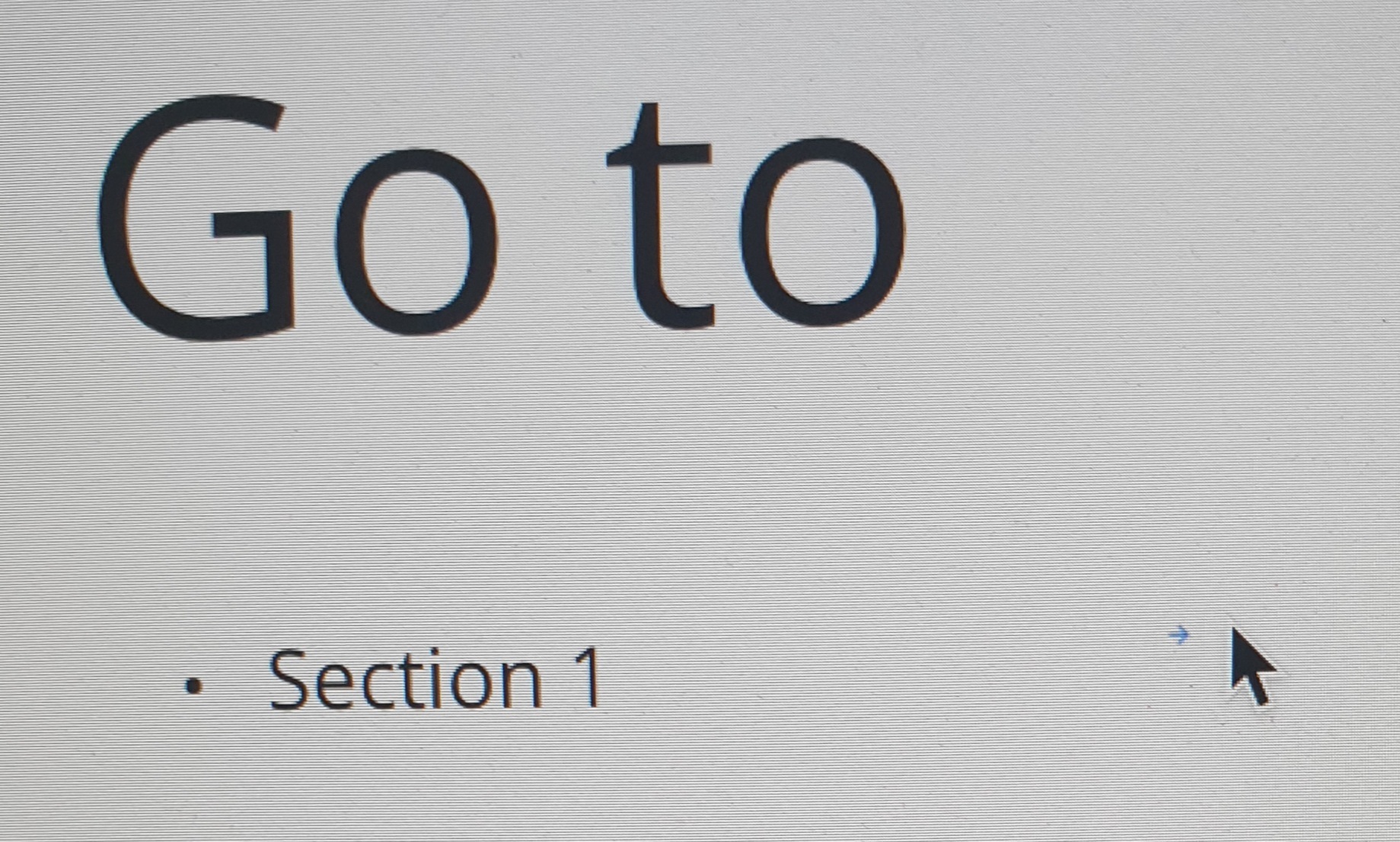
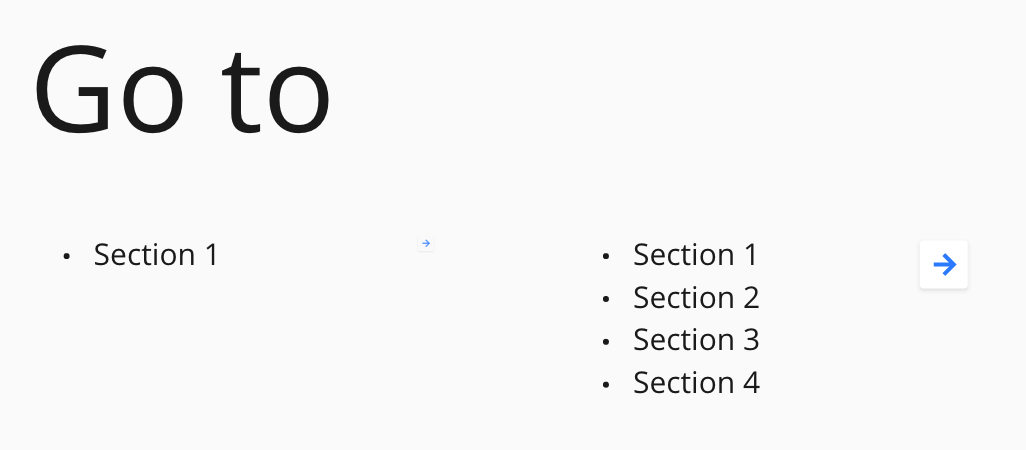
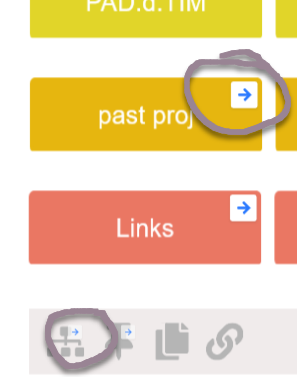
I use the Link to very often. While the current functionality of having little blue arrow at the top-right corner of an object function as the clickable hyperlink is absolutely sufficient, there are times when I could like to make the entire object clickable.

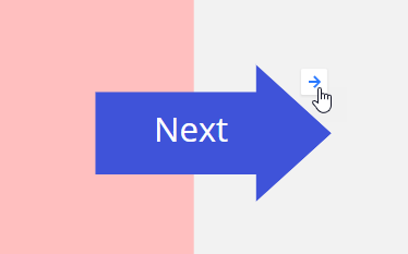
Example of the current solution using a button from the wireframe library (my use case):
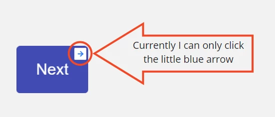
 

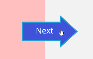
What I would like to have happen is

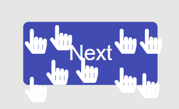
  • the cursor turns into a pointer; and
  • be able click activate the link by clicking anywhere on the object.

Example:
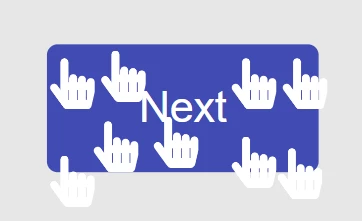
 

I would like to see this new option be available for any object to a Link can be applied.

Currently when I create a link on an object - be it a picture or a button I created using the oval shape it will display a small blue arrow on the object. If the picture is big this arrow can be tiny and participants find it hard to click on it. 

I’d like the option to have an entire object be a link - that way they can click anywhere on it and buttons actually function as buttons or that book cover I pasted in would not just have a tiny arrow on the top right corner to get to the online retailer of choice to purchase it. 


I agree. It can sometimes interfere with the look of an image to have that arrow hovering over it...In my use case, I never need the arrow...


Another example…

Instead of this:


I want this (even with a slight halo effect):


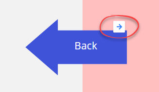
Because with the way links work right now, look what happens when I create a leftward facing arrow:

How ridiculous looking is that?!

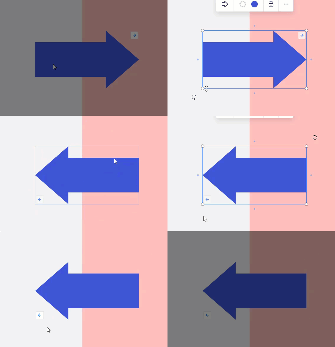
Luckily @Jonathan White show me this little trick:


Simple but effective, my favorite types of trick @Robert Johnson!

The way that little white arrow adjusts size based on your zoom level makes it hard to see the link sometimes or know what to click. Having linkable shapes is so needed.

One challenge that would exist here is people who maybe want to move or resize a linked shape, they might click the link by accident. Maybe to activate the linked shape, you have to do a long click, similar to unlocking locked items. This way, there would be much less accidental clicking and more purposeful uses of linked shapes.


I created an account only to vote this up. I wonder why it hasen’t been introduced in the very draft of Miro.

Cheers


This is a great idea.  I have a User Guide/Getting Started Board for all my users.  I’d love a section with “buttons” for them to click to move around.  Right now I have a text list with links - but as you know it’s a two click thing.


I also hope the entire button/image can be a hyperlink, not a small arrow that hardly sees and click. Was there any update regarding this so far?


+1 This feature would be a much better experience!


Completely agree with the topic.

Why not making the whole object interactive and having a “link” symbol instead of the “Arrow” one to warn about the object’s interactivity ? 

That would greatly simplify my interactive map project.  :)

I have also experienced arrow “pointing in the wrong direction” after manipulating shapes. Making the whole object interactive would deal with this problem. 

Thanks Miro ! 


Links needs to be available on all objects.
I don’t understand the limitations that exclude these from the shapes, table etc.


I think this will be useful. 

However there may be occasion(s) when we need 1 to N linkage. 


I use the frame list to navigate and a simple evolution would be to have smaller shortcut buttons based on it.

It would be lovely being able to drag your frame name on the board. In one drag you would have a clickable link. Very efficient!


Great idea! This will be extremely useful for creating invisible ‘hotspot’ objects on screengrabs and mockups too.


I would love this option. Running my first virtual workshop and trying to make it easy for people who have never used Miro before by creating easy links between facilitation boards and breakout activities, but the arrow appears so small beside the ‘click here’ object


We would need this to have an interactive process map.


I come here to submit my interest in this fundamental feature. I think there are enough evidence that the user experience will be much better. 


I up-voted this a while ago but didn’t think to leave a comment at the time, doh!

I was really pleased that someone else had put this idea forward in a much better way that I ever could :grin:

I’m curious as to what happens next in this situation, as I can see there is a good amount of people voting this up and some enthusiastic comments.

Would everyone on this thread get notified if the feature was to become available? Does anyone know if this feature is currently being developed in response to this thread? Thanks :thumbsup:


I definitely would find this helpful too. @Robert Johnson’s example with the arrows is perfect. Using shapes and text boxes for guiding people around a board is really clean and artistic, but this limited clickable area (only the arrow in the upper-right corner) makes this less effective. 


Would really find this helpfull too. Internal links are an effective way to transfer newbies or “un-guided” board visitors through your board. But this small arrows will not be seen by them.


Was just about to enter this idea, and then got suggested to come here, I see it has 88 votes, this is a must I think.

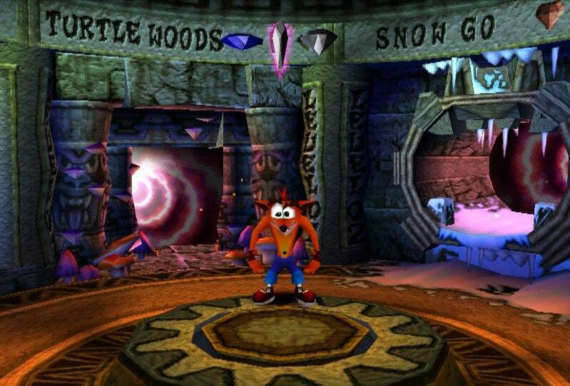
My first use case would be to create images with hyperlinks to Zoom links so that my teams can use a board as a space that would be like a digital corridor with doors into virtual rooms. Like the portal room in Crash Bandicoot!


Started using Miro today to create an asset library for the company. This feature would be very helpful as I want to create an index of all the products. Users could click the text of the product and that would take them to the assets available for that product (posters, literature, videos etc).

My current test will have users having to navigate the whole board to find what they are after.


Another rather annoying issue to add to this. This small link button gets tiny when the text box has only 1 line. Being able to click on the whole object as a link will be super helpful (Fitt’s law style).


Mobile phone image showing size difference of link button and mouse cursor


Screen grab from laptop


​​​​​​Just adding to the dire need for this request. Make it so entire objects can be clickable for linking purposes. 


I just downloaded this app, with this exact feature in mind. Even if I make a text as a hyperlink, you still have to click it twice. That is, if it even works to click it so that it can show the link. 

Is there really no way you can achive this? It’s a simple and expected feature, especially for a button…  What’s even the point if interaction is not made simple? Just imagine using your keyboard, and the only part you could press, was a tiny blue arrow in the right corner of each button.


Othervise, the software looks pretty nice. So it’s such a shame, gonna have to pass on miro for now, at least until this gets fixed.

So far, just frustration and time wasted. It’s been 1 year since this post, that’s a big red flag in itself.

I copied your picture below, added a hyperlink just to see if that works. If it does, I really hope you didn’t make this yourself. Surely not, as there’s no way you could have your priorities that wrong. Although I would find that quite hilarious ^^ Either way, if it works, please learn from this. 


The image below highlights our usability issue with the link icon.

The icon size changes depending upon the the objects size. In this case the tiny icon link is pretty much unusable.

We would like to add the link to the object so that the whole object is “clickable”