Miroverse Components/Assets


I love all the amazing templates provided by the community in Miroverse! :dancer:

One thing I’ve been thinking about that would make Miroverse even more awesome is the ability to create and share individual “components” that could be used in any board.

In my enterprise Miro account, I have a board called “Assets.” In this board, I add simple components I’ve created in Miro and share them with the rest of my organization (using the Save frame as template feature).

Two examples:

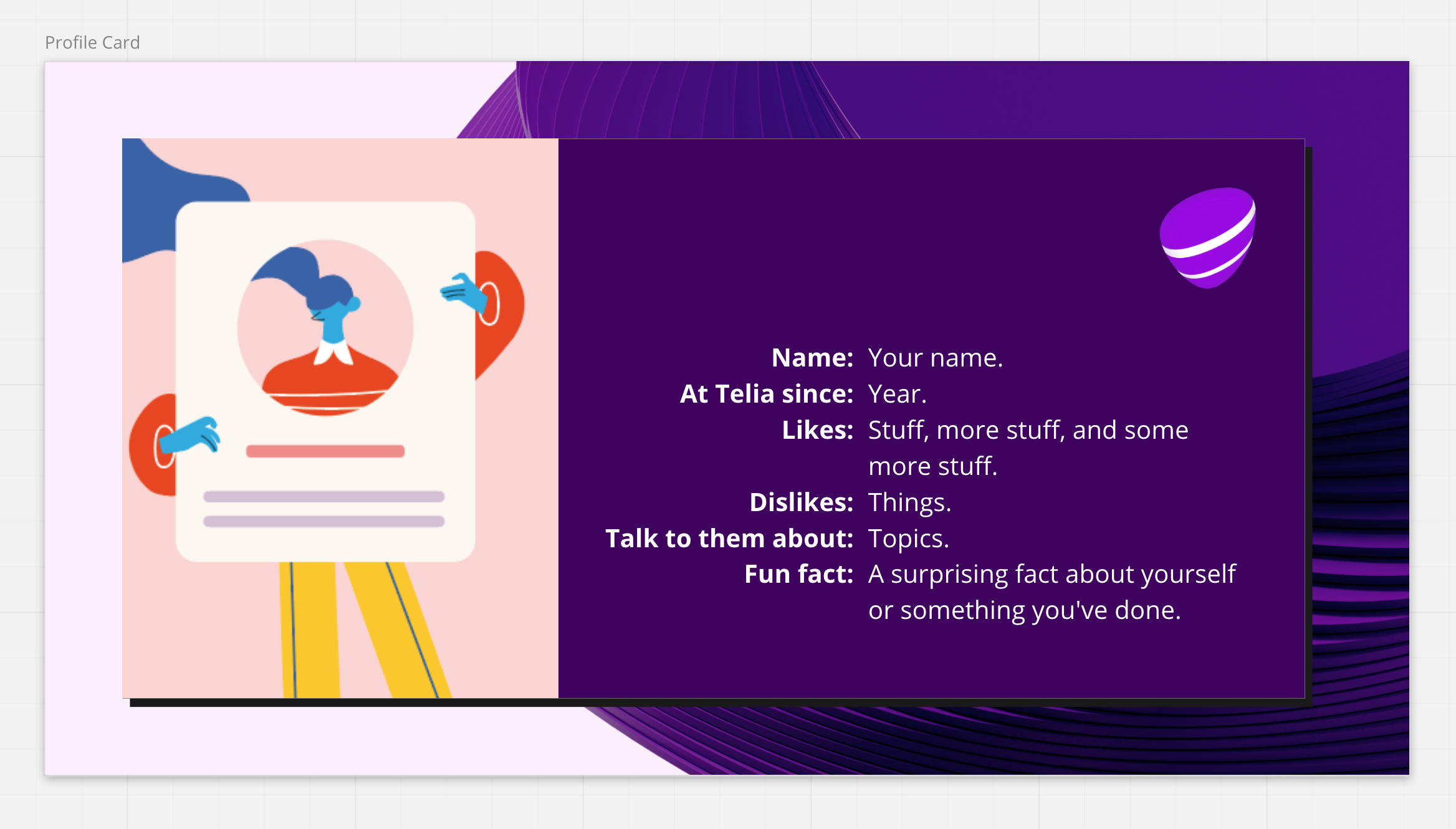
This is a profile card I made for my team members, to include in our onboarding docs. Since then, many different teams have used it to get to know each other better. :blush:

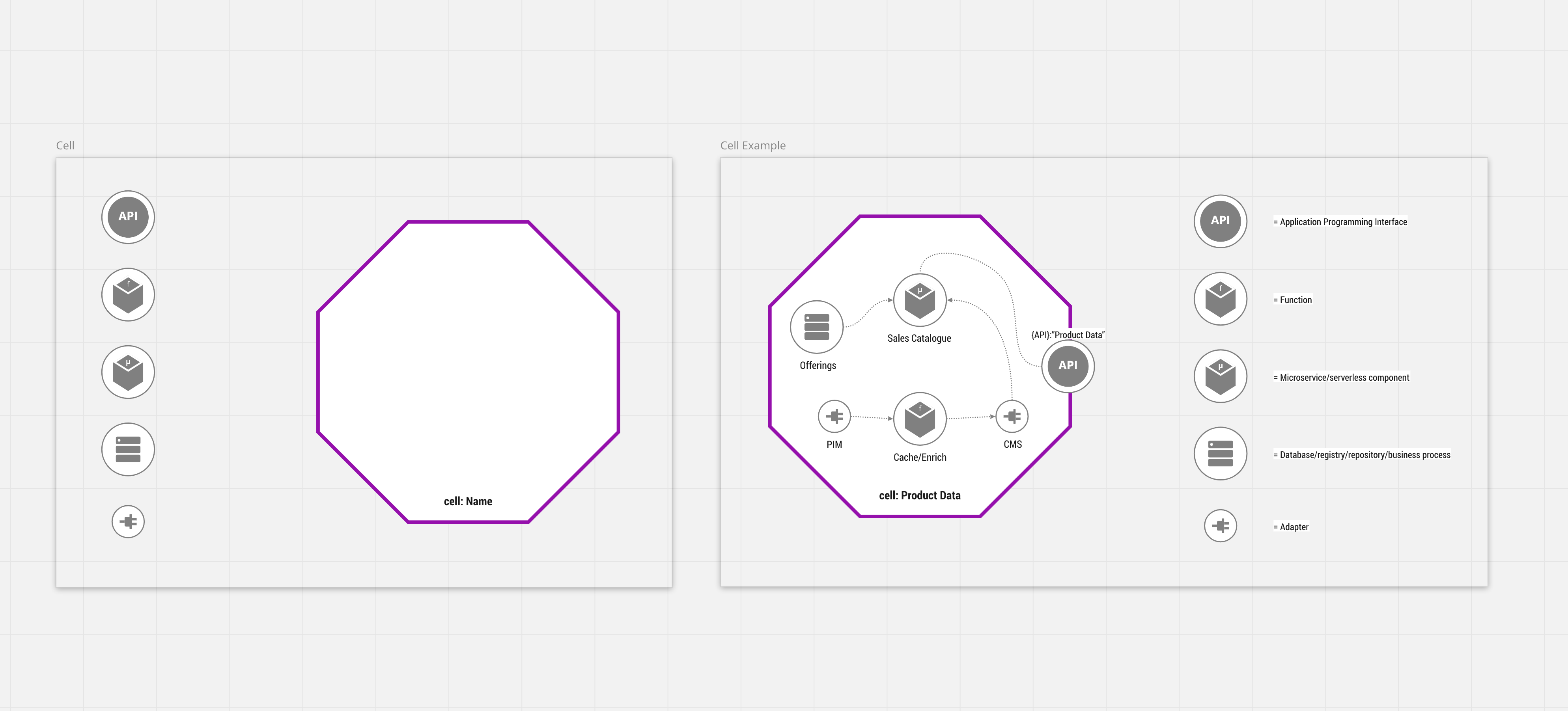
In a project I’m working with, we have introduced cell-based architecture – and we have of course created a visualization of our target architecture in Miro! For this visualization, I created these assets. It’s a basic empty cell with some component types, and an example cell (saved as two separate templates).

Imagine if we could create these kind of simple assets and publish them as components in Miroverse!

Love this idea, @Henrik Ståhl

I wonder if @Kyle Chipman has anything to say on the topic since he authored an awesome article on creating a dynamic visual hierarchy in Miro :) 


Fantastic idea. A granular sharing mechanism. I see this as allowing for two pathways for users:

  1. a way for creators to share components from within a board, without sharing the entire board. This allows for creators who may create a lot, to store their “shareables” in fewer places, and in a more organized way.
  2. A way for those who may be less creative, to have access to the creations they could only get previously by absorbing (or cannibalizing) entire boards worth of goods.

 I do see a challenge with organization / categorization, but welcome that as a bridge to cross when we need to.


Thanks for recommending the blog post @Anna Savina, it’s amazing! :star2: I really like the way you structure your work in Miro @Chrispurser, it’s very inspiring! Will definitely use your post as reference from now on. :blush:


yes @Henrik Ståhl! Ever since I witnessed the gummy bear voting by @Rachel (and @Jonathan White) at Distributed, I have been dreaming of components in Miroverse! :heart_eyes::koala:


Upvoted! 


and in case you want to see the gummies in action: 


@Chrispurser always happy to see you over here! :relaxed:


@Colleen Curtis We all love the gummy bears!! :heart_eyes:


This definitely gets my vote. Similar to what has already been said, I have a "master board" that contains all my useful bits and pieces, some of which I've setup as templates for internal use by others. The possibilities are endless here.


Thanks for inviting me into the conversation @Anna Savina! This is an invigorating thread.

@Henrik Ståhl I wanted to wait to respond til I had some interesting observations on the Cell-Based Architecture link you posted (only read the intro, was excellent), but this thread looks to be popping and it seemed more fun to jump in the conversation 🙂. Glad you liked the blog post.

Damn, I ended up writing a wall of text. I think I just got excited by other people who wanted to have this conversation.

In an overarching sense, I still think scale is the necessary first step. Keeping a consistent starting point of scale, 48pt bold mid-weight stroke, for me, has proven terrifically useful over time. Allows for micro and macro definition, creates easier cross-board population, and helps establish multiple reasonable margins for essential frame sizes (A4 and 16:19, primarily).

@Henrik Ståhl

  • That profile card looks super clean. Did you generate the underlying assets as well?
  • Out of curiosity, how did you manage the dual text justification with line breaks? Did you create two text objects, with bold prompts right-justified and responses left-justified, and leave it to the user to match up manual line breaks, when necessary? General thought, I think I’ve always pined for leading control in Miro
  • I really like that you built a Cell Example template along with your Cell template. It’s slick onboarding, to optionally show a completed version for first-time template users. Efficient!

@Chrispurser

  1. I am in favor of this approach, breaking up a single board into multiple templates. Two added benefits - it would allow designers to pull from existing core asset “banks” more quickly and reinforce consistent scale across all the various templates

Some interesting, general thoughts on this front I’ve had over the years:

  • It would be super helpful to have control of styles for pre-assigned objects at the template level (color, font, etc). This would allow not only for brand standards to be easily managed from few intake points, but also for faster, nuanced and coordinated thematic decisions. This bleeds into my thoughts around color management in Miro (I knew I wrote about it a while back; funny to see how people used the embedded board)
  • The ability to set dynamic object placement. Some kind of dedicated margin offset could be used, so that logos or text fields (or whatever) always appear at a certain position in a frame. The designer could also lean in towards specific, dominant frame sizes, make go-to versions for print or screen.
  • I have not integrated my AdobeCC Libraries in yet, have been meaning to forever. For both brand assets and client assets, it would be super helpful to make Adobe the primary point of asset management in the stack, possibly including color.
    ...
    ...ah, that’s right, I did install the app a while back, but have repeatedly gotten stuck at the “Company Accounts are not supported” screen, and then additionally forget to check if that’s some integration setting on our back-end or corporate accounts straight-up aren’t supported by Miro. Uh, I will investigate with my Director of IT this week.

Wow, @Kyle Chipman thank you so much for such a nuanced response! 


@Kyle Chipman Cell-based architecture is amazing! Combined with the capability teams philosophy (I’m an experiences vs services kind of person, even though I don’t like the “vs” part – should be experiences AND services!) it’s like being in product development heaven. :heart_eyes:

The scale mentioned in your blog post is a game changer for me. I was actually working on a new board yesterday and I adjusted it according to your recommendation (48p starting point) and it got sooo much better. Will never ever create a board again without setting proper scale.

  • Thanks a lot! The underlying asset is the “fifth element” of our new visual identity (based on the pebble shape that’s also seen in our logo). And the placeholder image is actually stolen from the internet. :see_no_evil: Since it’s only used at our company internally, I figured it was harmless. Or at least not harmful. If the illustrator ever sees this post, contact me and I will give you all the cred in the world! :innocent:
  • Yes, that’s exactly how I did it: two text boxes, bold prompts right-justified and responses left-justified. Not the perfect solution, but good enough for this particular use case. Would love to be able to do it in a more systemic way though.
  • Thanks! It’s so easy to do good onboarding in Miro. And it’s fun too!