Delivered

Keep showing individual comments when zooming out (as before)

Related products:Comments
Debruyne Adriaan
Robert Johnson
mlanders
Kiron Bondale
+96
  • Debruyne Adriaan
    Debruyne Adriaan
  • Robert Johnson
    Robert Johnson
  • mlanders
    mlanders
  • Kiron Bondale
    Kiron Bondale
  • Nicholas Brown
  • Mike Owens
    Mike Owens
  • TRS
  • Steve Long
  • Brian Fulghum
    Brian Fulghum
  • Simon.Harris
    Simon.Harris
  • Parker Albanese
  • Matthias Bastian
  • Scott Brightwell
  • Ryan Wagner
  • Eddy Tavio
    Eddy Tavio
  • David Ridilla
  • Jordan Zanier
  • Astha Parmar
  • Matthew Cook
  • Fabio Chavasco
  • Markus Pelkonen
  • Julia Randle
    Julia Randle
  • Trudy A Watt
  • Carlos Diosdado
  • Machiel Veltkamp
  • Lushmind
  • Mishal
    Mishal
  • Marcial Franze
  • Anis Khairi
  • Soumyadeep Mandal
    Soumyadeep Mandal
  • MBR
  • JamesD
  • WolfgangRathert
    WolfgangRathert
  • Moses Magro
  • Guenther Kerndl
  • Octavian_Datcu
    Octavian_Datcu
  • Ingrid van de Leemput
  • Chess Cat
  • Michael Gartner
  • Andrés Muñoz-Jaramillo
  • Jason Bolger
  • Yossarian King
  • Vlad Khmarsky
  • Davd
  • Dan Doerksen
  • PhillJones
  • Christian Gründler
  • Kasimir Suter Winter
  • realtime.design
  • JasonR
  • Brandon K
  • YDS
  • Rafa Galaz
  • David Leahy
    David Leahy
  • Matt Long
  • Jeff Heil
  • businessmanager
  • Fanny
  • Gareth Banks
  • IC_Data
  • Peter van den Heuvel
  • martin kerr
  • Jakob_
  • Evan Smith
  • Fientje Vermeulen
  • Philipp Skribanowitz
  • Ben Majer
  • Staedie
  • Véronique Carbonneau
    Véronique Carbonneau
  • Lauren Buffenbarger
  • Creative Machines
  • mrutten
  • Ralph Spandl
  • Martine Kaiser
  • gryback
    gryback
  • Alyssa Nerney
  • Kacper Kasdepke
  • Jane Lester
  • Deborah Forster
  • Angelica Guzman
  • Sarah Stern
  • Franco Sinchez Estevanacio
  • Chinese Viking
    Chinese Viking
  • Indika Jayasinghe
  • Caitlinanderson
  • Greg Richardson
  • QMS
  • StarmanStarman
  • AV Admin Account
  • Marta Viader
  • Chi Chi Cheng
  • Sara Ulius-Sabel
  • Gabi Rodrigues
  • PaulaCM
  • Viv
  • Michael Sieb
  • Duncan Wilson
  • ReneS
  • LoriF
  • sinisa.enua
  • Kathy Rast

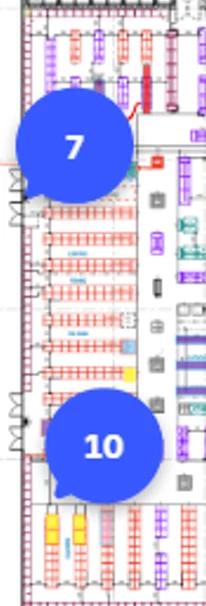
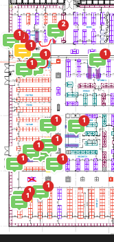
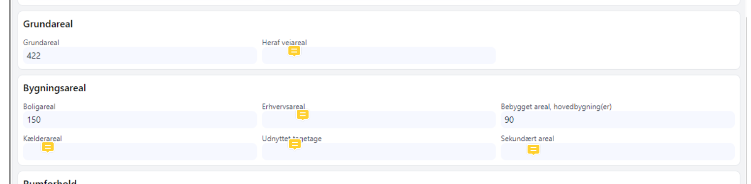
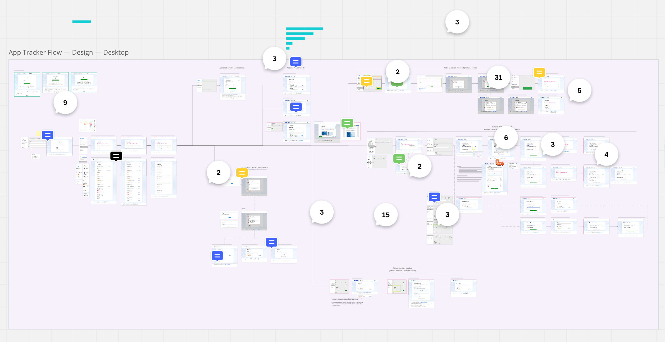
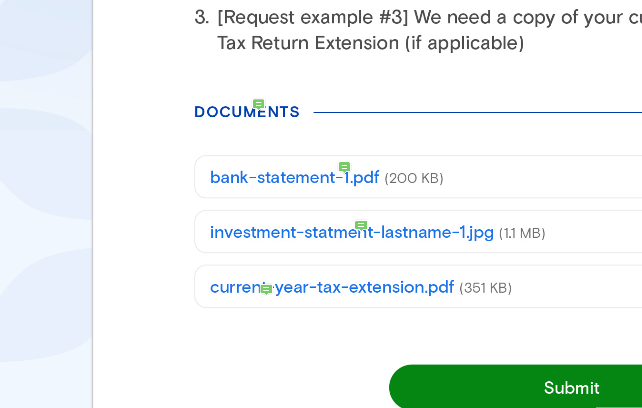
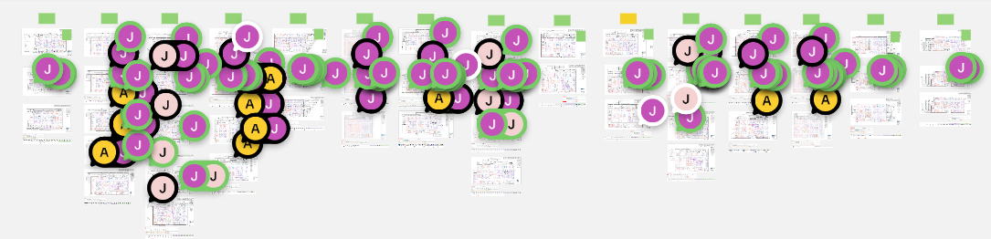
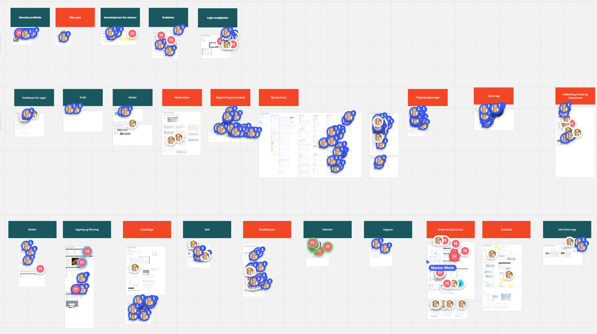
The handling of comments in Miro has recently been changed, so that the individuel comments are replaced by counters when zooming out. Please introduce a setting allowing the user to revert to the previous behavior. We need comments to be shown individually when zooming out. We also need to easyly view the colors of the comments, so we need to view the original comment labels, not the bigger round avatar "things".

We use color coded comments to denote things like status (eg. green for completed). For example, the green comments in one of our boards means "ready for testing". We have large boards with many such comments. We used to be able to easily pick out comments by color at a glance when zoomed out. But now we have to zoom in and inspect each and every area of a large board to find them. This turns a one-second task into several minutes-task, completely ruining our use case.

Pinned reply

June 14, 2024

Hi @Morten - we’re happy to share that this Wish List idea has been delivered! Please let us know if you have any questions, and thanks to al who have upvoted and chimed in on this idea. 

Was it helpful?

19 replies

Thanks Morten! I hope they will hear us, as it severely impacts our work flow too.

Attached a before and after shot of what the difference is. The new style is pretty much useless for us.


julia_rudge
Mironeer
  • Mironeer
  • 13 replies
  • May 23, 2024

I'm sorry that Comment Clusters (groupings) have disrupted your workflows, I understand how painful this can be. 
 

We're already looking into improving experience for this color coding comments workflow, without affecting the board clutter problem. We'll post an update here by end of next week (31/may). 

Thank you for the reports! This type of detailed user feedback helps us better understand and prioritize your pains. 


Forum|alt.badge.img
  • Author
  • Contributor
  • 17 replies
  • May 24, 2024
julia_rudge wrote:

We're already looking into improving experience for this color coding comments workflow, without affecting the board clutter problem. We'll post an update here by end of next week (31/may). 

That is great news. What we basically need is that you make it possible to easily identify the green comments (or other colors) on a board like this. Currently, it takes me several minutes of zooming and scrolling to do that.


If you insist on forced comments grouping, I would also like you to reconsider the zoom level (distance) at which grouping occurs. Look at this example (zoom 100%):


The group of the two comments makes it really cumbersome to see what is going on. In this case, I need to go to 125% to do that - in other cases I need to go even further. Even if you solve the color problem, this will still lead to much unwanted zooming:


Adding my voice to this request. This change has completely interrupted our workflow, as we use all 5 colors to denote which team member needs to address which comments, and the different status of each comment.

Trying to see an entire page flow (not even our entire board) at a glance is now entirely useless. Not to mention I can’t see which comments have replies until I zoom in.

As you can see by the second image, Zooming in THIS far to see 4 individual comments, is entirely tedious and unhelpful. Thank you for working on this, hoping a solution is ready soon! 


julia_rudge
Mironeer
  • Mironeer
  • 13 replies
  • May 31, 2024

Thanks for the additional feedback Morten and Lisa! We have an update on our end. 

We'll be introducing a toggle to turn off/on "Grouped comments". It will live inside the Comments side panel 3-dot menu. The setting will persist for that user, on that board. The setting will be available by next week, Tuesday, June 4th. 

We'd love to hear if this solved your problem, please reach out to me with your feedback: julia.r@miro.com 


@julia_rudge and Miro, thanks for listening to our feedback and adding the toggle option. Pleased to see more of what’s going on again on our boards! It seems someone at Miro is extremely set on adding avatars to the comments though, as these remain 😁
Listen, it’s an improvement, but personally, I don’t care WHO comments, I just want to be able to see the colour and a number. Oh, and there’s no more yellow? These avatars could definitely be smaller still.
Taking the small win for now though!
Thanks again


Forum|alt.badge.img
  • Author
  • Contributor
  • 17 replies
  • June 4, 2024

I think getting rid of grouped comments is a very big improvement, but apart from that I agree with Jeremy. The avatars and their color distract from the selected color, and the avatar style icons are also too large. And we miss yellow.

Plus, we have another issue: unread comments are now blue, regardless of the selected color. This makes it impossible to pick out the most important comments first and leave the rest for later.


julia_rudge
Mironeer
  • Mironeer
  • 13 replies
  • June 4, 2024

Hey @Morten and @Jeremy De Rouw thank you for your feedback! I'm glad that the setting to turn off/one "Group comments" helped with your most critical need. 

I hear you both on the additional needs related to your use case. I've listed them below to make sure I've captured all feedback correctly: 

  • Its frustrating that avatars are colorful which distracts from the color of the comment
  • Its annoying that photos take so much space, when its not important who made the comment for your use case 
  • All unread comments are now default blue, which means selected color is not preserved for other users who have not yet read the comment 
  • Yellow used to represent certain categories in your use case, and switching it out for grey affected your workflow 

The UI updates made to Comments was indeed indexed on the conversation use case, which is the primary use case comments are used for by Miro users. We understand however, that many users, like both of you, use comments for annotations and to categorize actions / tasks / next steps. We'll take this as signal that we need to support this use case. Its unclear how we'll support this (it'll possibly be an additional capability), however once we have news we'll be sure to update you'all! 


  • Beginner
  • 3 replies
  • June 4, 2024

Hi Miro, 

Really appreciate the action on making comment grouping a toggleable setting. 

I’d also like to second the opinions shared above regarding the avatars and new colors. My team and I really enjoyed the design of the comments where the symbology used was simplistic and easy to tell that it was a comment. 

We’ve been finding the new style is distracting since we also use comment color coding to sort priority / what is or isn’t actionable. The new style with avatar and a very thin colored ring makes it much harder to tell what is what and I’ve found myself straining my eyes to properly tell, especailly since many of the default colors for avatars match the colors available on comments. See below for an example. 

Having the color being very easily identifiable like the old style comments is also important for us to gauge the amount of effort is needed for changes as we’ll do a sweep through of the design to get a sense of how many comments of certain color there are. This is much more difficult as the rings surrounding the avatars are very hard to see.My suggestion would be to add setting that simply removes the avatar and replaces it with a squigly or lines that indicate it’s comment, similar to how resolved comments appear with the new style.

Lastly, if you could also make a toggleable setting for conversations stacking (i.e., comments showing multiple avatars when there are responses) that would be amazing. In our use case, we have our designers add responses to comments as they action them but with the new style showing avatars for original comments + responses, it makes the layout very cluttered which is creating problems for our reviewers. 

I understand the desire to make UI’s more sleek looking and minimalistic, but don’t think it should be done with the trade-off of utility / functionality. But I can also appreciate that certain use cases or emergent behaviour may not have been considered when these changes were implemented. 


Thanks again @julia_rudge Please don’t hesitate to contact me if needed.


Forum|alt.badge.img
  • Author
  • Contributor
  • 17 replies
  • June 5, 2024

Hi @julia_rudge

It is great to hear that you will continue to address these concerns.

I think a separate annotation capability would be very useful. In particular if it does not come at the expense of not improving the conversation scenario.

We have conversation-type comments in our bug tracking board. Those may be replied to, color denotes status, and they are eventually marked completed. Knowing the initial author is sometimes relevant, but only when the comment has been opened for viewing. The four needs that you list are all relevant for this use case.

We have annotation-type comments in our specification boards. Those are never replied to, color denotes type of annotation, and the author is no more relevant than the author of any other board element. The same four needs are relevant/crucial for this use case.

In our specification boards, we actually use red comments as conversation-type comments (questions, work to be done, etc.), and the remaning colors denote annotations. This is somewhat problematic, so this scenario would benefit vastly from having conversions and annotations as separate capabilities with distinct icons.

Also, the annotation use case would be greatly improved by including these aspects:

  • A larger text area when opened.
  • The ability to add formatted text (bullets being most important).
  • The ability to add inline links like in a text box.

OpenDelivered

Maria Pedone
Mironeer
Forum|alt.badge.img

Hi @Morten - we’re happy to share that this Wish List idea has been delivered! Please let us know if you have any questions, and thanks to al who have upvoted and chimed in on this idea. 


Hey Howdy Hi,

and one additional request to add to that WISH LIST.  
Would love to the the YELLOW color for comments option colors return.
Thanks.


Forum|alt.badge.img
  • Author
  • Contributor
  • 17 replies
  • June 17, 2024

Hi @Maria Pedone - yes, the ability to not group comments was re-introduced a couple of weeks ago.

However, this wish list item has become the carrier of number of related issues which also originate from the major rework of the comments UI that took place in May. Please see the post from Julia Rudge on June 4 and my post on June 5.

We need to be able to track the progress of those issues. I think Miro PM will be best at deciding to which extent they should be remain bundled, and to which extent they should be separate wish list items.

So, will you please create one or several wish list items representing these issues and post links to them here?


  • Beginner
  • 2 replies
  • June 18, 2024

Was told to come here by Support to add my voice on the recent changes to comments feature. 

1. User profile images as markers for comments is a cute idea and I can see the usefulness of them. However, for our workflow they are mostly not useful and compromise usability. I’d really welcome a return of the option to choose whether I see faces all over my boards. (We often retain resolved comments as a kind of annotation or decision history so using “hide resolved comments” does not solve the problem. )

Please can we have an option to turn this feature off/on? 


2. I (and other members of the team) don’t find the comment clustering feature useful, in fact the opposite as one has to zoom in and out to understand in detail on which items comments and new comments have been placed. 

Please can we have an option to turn this feature off/on as well? 


  • Beginner
  • 2 replies
  • June 18, 2024

I see ability to ungroup has been reintroduced. Thank you. (Maybe Support could have indicated that was in the works.)

My request still stands for having an option to remove user profile image/icon/avatar and revert to how comments used to look (including the way colours used to work and the new comment indicator used to work). 

Thank you.


Forum|alt.badge.img
  • Author
  • Contributor
  • 17 replies
  • August 20, 2024

Miro did not reply to my request for creating one og more new wish list items covering the issues that have not yet been addressed. My best advice for everybody affected is to add a vote to this item: Revert back to the old Comment UI | Miro.


ElvaMiro
Mironeer
Forum|alt.badge.img+2
  • Mironeer
  • 922 replies
  • August 20, 2024

Thanks for this comment, @Morten. We appreciate the feedback, and I commented on your Wish List post as well. Cheers! Votes are still open on that Wish List item.