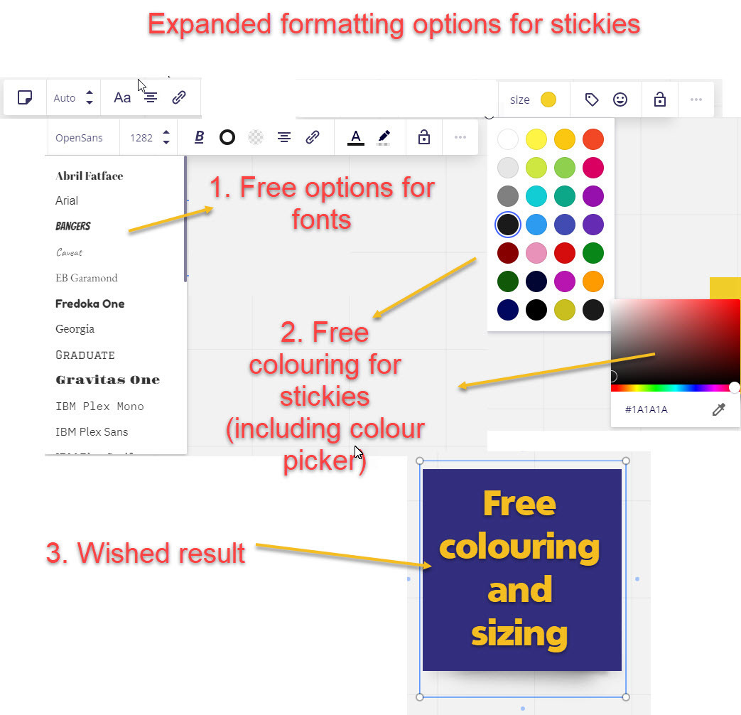
But it would be much better, if i could choose a colour for the sticky and even have more options for text formatting (the same like i have in the text-tool: bold style, fonts).
I added a picture of what i like to see in miro.
Michael
Page 2 / 2
I've read all comments in this post and looked at the different visual examples. Must say that I strongly and wholeheartedly disagree with you all.
Stickies are powerful because they are simplified, not despite they are. Being able to change font and text color and whatnot would just turn them into a circus.(OK, being able to turn text bold is an exception, I'll give you that.)
By the way, stickies can't be resized irl. Unless with scissors. So the stickies in Miro are already enhanced. Just sayin’.
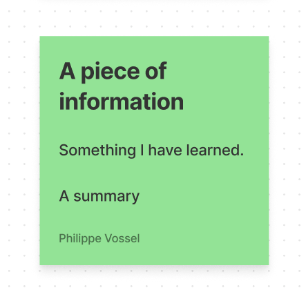
Figjam does this so much better. Super clean and therefore even more useful than Miro.
I find this frustrating and hope that Miro will work on it’s “graphics design” language and features to help organise thinking in a professional looking way.
While I don’t want as much formatting inside stickies as the original poster, I do think Miro should copy FigJam and at least allow bullet lists and different font sizes inside stickies. (And also inside shapes.)
(Bold/Italic/Underline has been added since this thread was opened.)
Tantrum mode: I just need blood red color...the dark pink is plain frustrating. Let me choose my colorssss
Please please please give us some more sticky colours to work with.