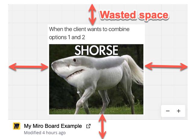
Provide an option to fit to screen or fit to macro and remove the board title and modification note for the selected frame/board embedded in Confluence so there is not such a large border of the gridline background.

It eats up a lot of real estate that could be used for other purposes on a Confluence page.

EXAMPLE: The image below is a screenshot from a Miro board embedded on a confluence page. I don’t need to see the gridlines or the board name.


Hi @Rustyn Clark,


Thank you for submitting this idea about Fit to screen for Confluence Embed! We appreciate your feedback, and our team will review it. This suggestion is now open for votes and comments.

For those just joining the conversation, if you believe this feature would be helpful for your workflow or business, please take a moment to vote and share your use case. This will help our team better understand the demand and prioritize accordingly.

Thanks again for helping improve Miro!