

Some shapes (for example the BPMN shapes) have a label text included (awesome 🙂).
The problem: Arrows lay on top of the label text and make it harder to read the label text of the shape itself (see picture).
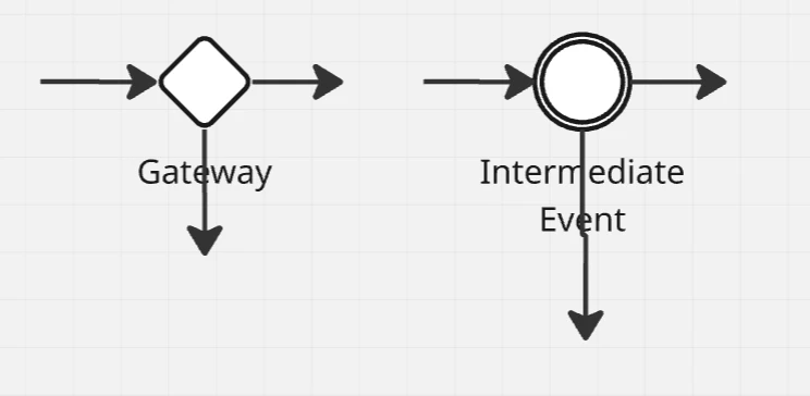
Feature wish: Make the label placement selectable (top, bottom, left, right) instead of always placing it on the bottom. This way, the user can select the placement, where the text won´t interfere with out- and incoming arrows. Alternatively: have the “place shape in foreground” option also influence the label text.
