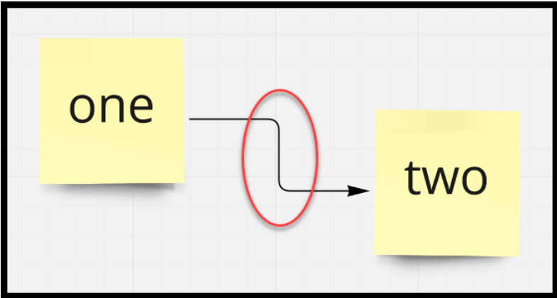
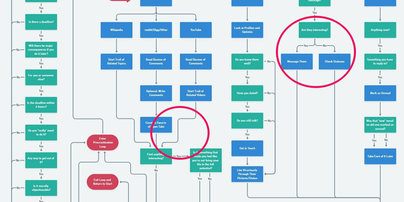
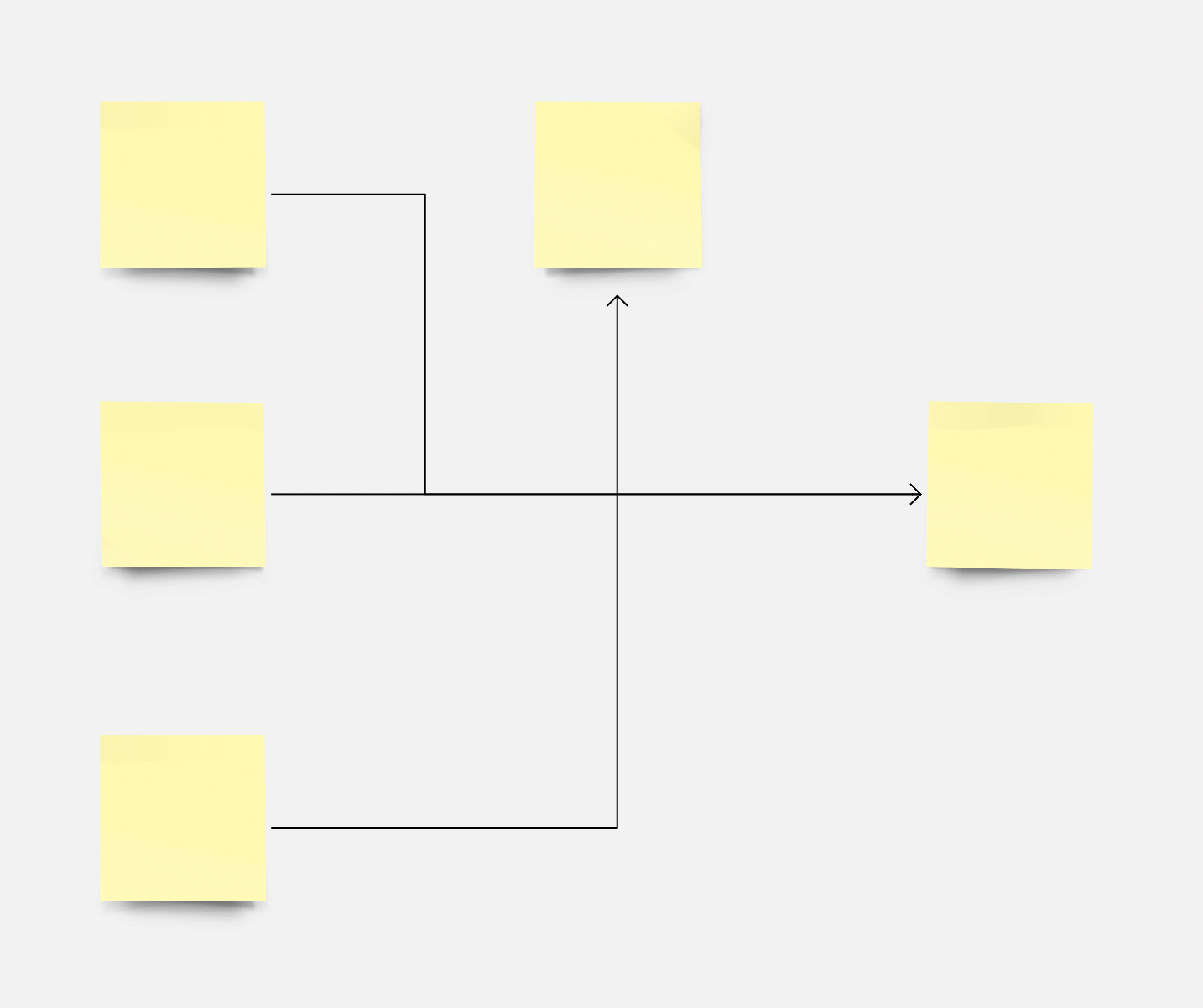
Can we have connector lines with rounded elbows? It really helps to follow the lines when they cross over or converge. The curvy line option is too curvy, resulting in some messy diagrams when there are a lot of arrows going around. The straight angle lines keep the diagram much cleaner, but if they had round elbows, it would be easier to read, and the diagram would still be clean.

Here's an example diagram where this problem occurs:
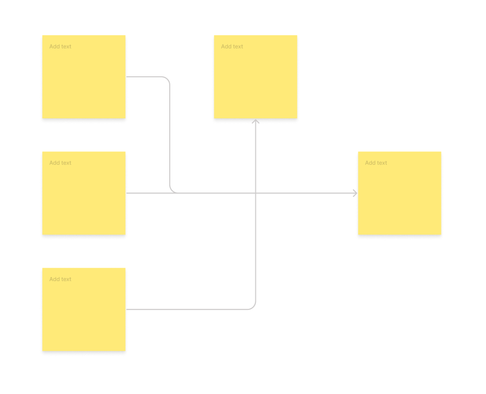
Figjam nailed it:
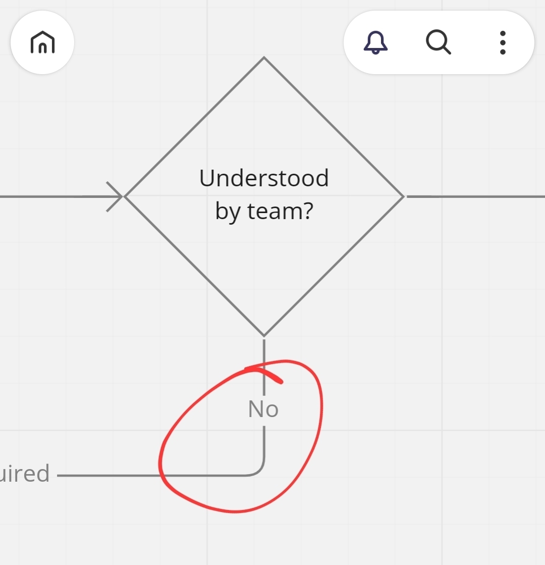
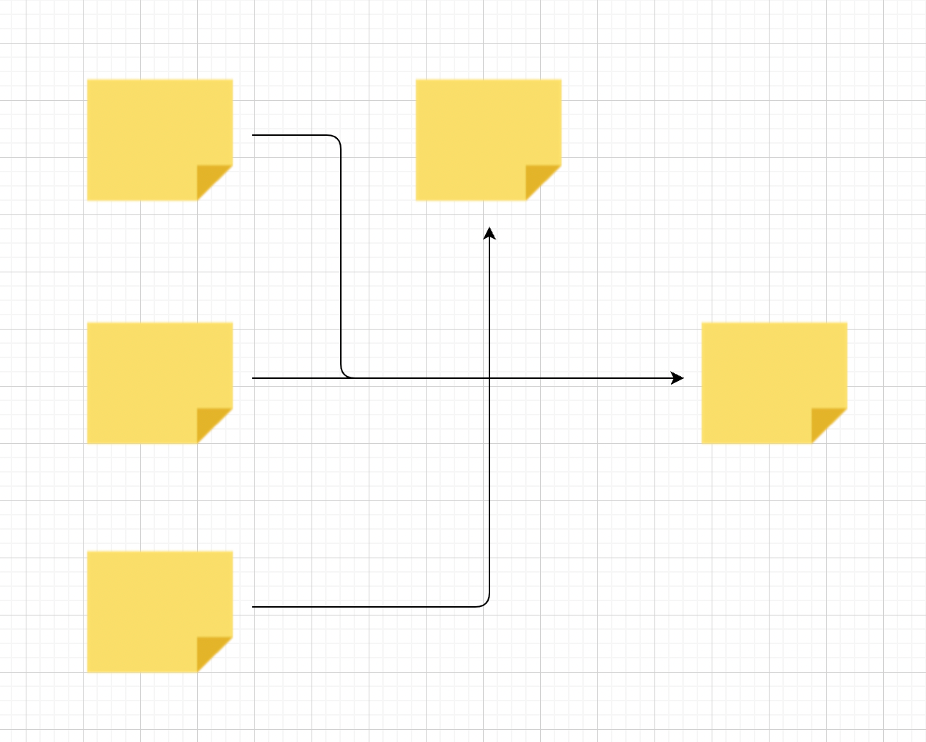
Even good old Diagrams.net allows rounded elbows:
 

@joao.faraco-memed :

Good idea - worth to vote for.

Hopefully it will made it into miro :fingers_crossed:

Michael


Upvoted - was about to make the same request. 

This is incredibly important and usually standard.

The arrow functionality is almost useless without this as the hard edges don’t provide a differentiation as to the direction of flow particularly when lines overlap, and the curved version takes up a silly amount of space on the page.


Thanks @joao.faraco-memed for adding this, whimsical has this as standard too and looks much better. Particularly like diverging arrows from a single element and the waterfallesque look.


Hello everyone, it seems this feature made it into miro now. I understand why it can be useful in some scenarios but not in all ... Unfortunately, it seems I cannot turn off the option and I would really like to have the angular elbows instead. We’ve created a rather large Kladogram wanting the angular elbows only to suddenly see them round ☹️

Does anyone know how to restore the old behaviour?


I noticed this too just yesterday, in the mobile app version at least:

Does not appear to be a way to turn it off in mobile version. Will check on a desktop later. 


Confirmed - The rounded elbows are also showing up on my desktop (Chrome and Miro desktop app) in both my Consultant and Free Plans:


I will mark this Wish List post as DELIVERED once I have confirmation from someone at Miro that this has been officially rolled out to all users.


Updated idea statusIdeaDelivered

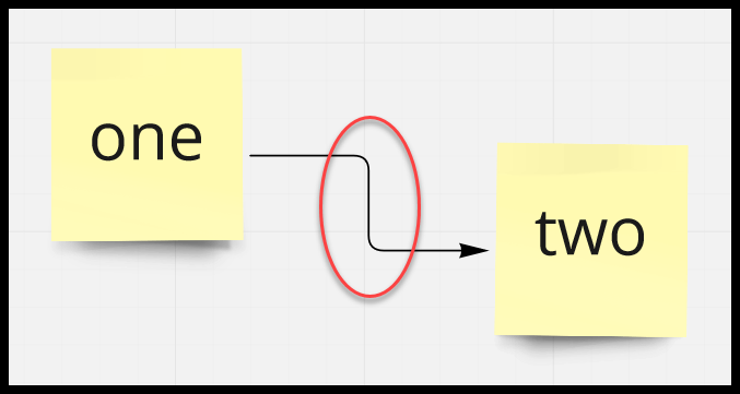
Miro has confirmed that this Wish List idea has been DELIVERD - elbows are now rounded:


Will there be a way to turn this off? It makes the genealogical tree I’ve been working on look pretty… not great. But I see how it would look good with other folks projects!


@Molly Astell - I haven’t been able to find a way to disable the rounded elbows.


Same with me - I really need to be able to turn this off!

There are 2 big reasons for that:

From UX point of view it complicates diagrams, adds additional detail, overloads the brain and the eye - basically while I understand that people can consider it prettier, from my experience it clutters the diagrams. And if I am to choose between pretty and useful I always choose useful.

Secondly, imagine that you draw arrows for a folder structure. When the lines overlap, they look like one line with several lines stretching out to folder names. But when you start rounding the corners you get a total mess…

And this is the case for today - I had a lot of folder diagrams that I needed to copy to docs today, and will have to redo them in Figma 😞.


Jumping into this thread to likewise request the ability to enable / disable rounded corners or, even better, provide the ability dial the rounded amount up and down. Even bette-better is if this could be controlled board-wide or, triple-better, if a Styling Management system could be introduced to provide more flexibility around these kinds of formatting nuances.


@Molly Astell - I haven’t been able to find a way to disable the rounded elbows.

same here! I needed the angular elbow on some of my projects 😆


Any update on the status of this? I have a new project that I am trying to make look like an older project, but because of this update the two charts look distinctly different. Please bring back the angular elbows, at least as an option to toggle between the two!