We’ve been especially focused on improving Miro UX in the past two to three months, and Auto Layout has been one of those changes we implemented to help our users work in Miro faster and more intuitively than ever before.
Let us know what you think. Have you tried Auto Layout and other features we released recently? Is there anything else that doesn’t work as expected or is currently missing in your opinion?
Page 1 / 1
Auto Layout is the next best thing to evenly sliced bread! My symmetrically driven brain received a small dopamine rush every time I use it, so thank you!
What I have noticed about Auto Layout is that, while the Auto Layout icon appears when I have selected a number of rectangle shapes, all I can do as a user is click the icon to adjust the vertical spacing between the rectangles. After using Auto Layout with stickies, my brain wants to click-and-drag the rectangles to. Let me know if you want a demo of the behaviour I am seeing. And while I’m here, do you know if there are any plans to hire any Canadians? I’d love to work with y’all.
Auto-layout is a great addition to the feature set, @Lena Shenkarenko ! What would be another awesome enhancement to it would be to have an option of deleting empty stickies/shapes.
Kiron
I tend to simply use a frame and pick the organize option, then delete the frame.
And now that grid is available, it works almost as well.
But I'm sure this will be nice as well.
Thanks.
Thank you so much for adding this feature, it came just at the right moment! It saves me so much time in organizing our beyond messy boards.
Now the only thing would be an automatic resizing of shapes, so that I can quickly turn 100s of oddly shaped shapes into a neat grid with a click.
Thanks again!
Mega hella quintillion congratulations to the Miro team for introducing Auto Layout!!!! I currently perform this action manually with spacers across objects to get my layouts snug. Thank you so very deeply.
At a higher level, the speed and thoughtfulness of feature rollout is top flight. Miro is the greatest.
@Lena Shenkarenko, it is a great feature!
But I wonder, in what way is it different from “Smart alignment” feature that you announced a month ago, on 1st June? They seem to be pretty identical for me (apart from new name, of course). Are there any improvements in the mechanics?
This is an amazing update! Thank you so much for saving me so much time.
@Lena Shenkarenko, it is a great feature!
But I wonder, in what way is it different from “Smart alignment” feature that you announced a month ago, on 1st June? They seem to be pretty identical for me (apart from new name, of course). Are there any improvements in the mechanics?
Hi Pawel – we did tweak the interaction with the feature as well to make it more intuitive to the users. We rolled it out on June 1 as a soft launch, got some feedback, made a couple of minor tweaks and officially launched it yesterday Thanks for following our product updates – and let me know if you have ideas how to make them better.
Hi Pawel – we did tweak the interaction with the feature as well to make it more intuitive to the users. We rolled it out on June 1 as a soft launch, got some feedback, made a couple of minor tweaks and officially launched it yesterday :)
Wow, that’s even better. You’re doing it just by the book :)
Thanks for following our product updates – and let me know if you have ideas how to make them better.
I do have, I do, Lena :)
Although I am pretty new user for both miro and even younger part of this community (joined a month ago), currently I have 2 major achievements:
… and I - with my clients and partners - will keep up helping you to make Miro better and in time :)
Howdy howdy - a bit of feedback after using the tool. Before jumping in I still want to preface that array management in Miro has always been a dream and Auto Layout is a big step forward :)
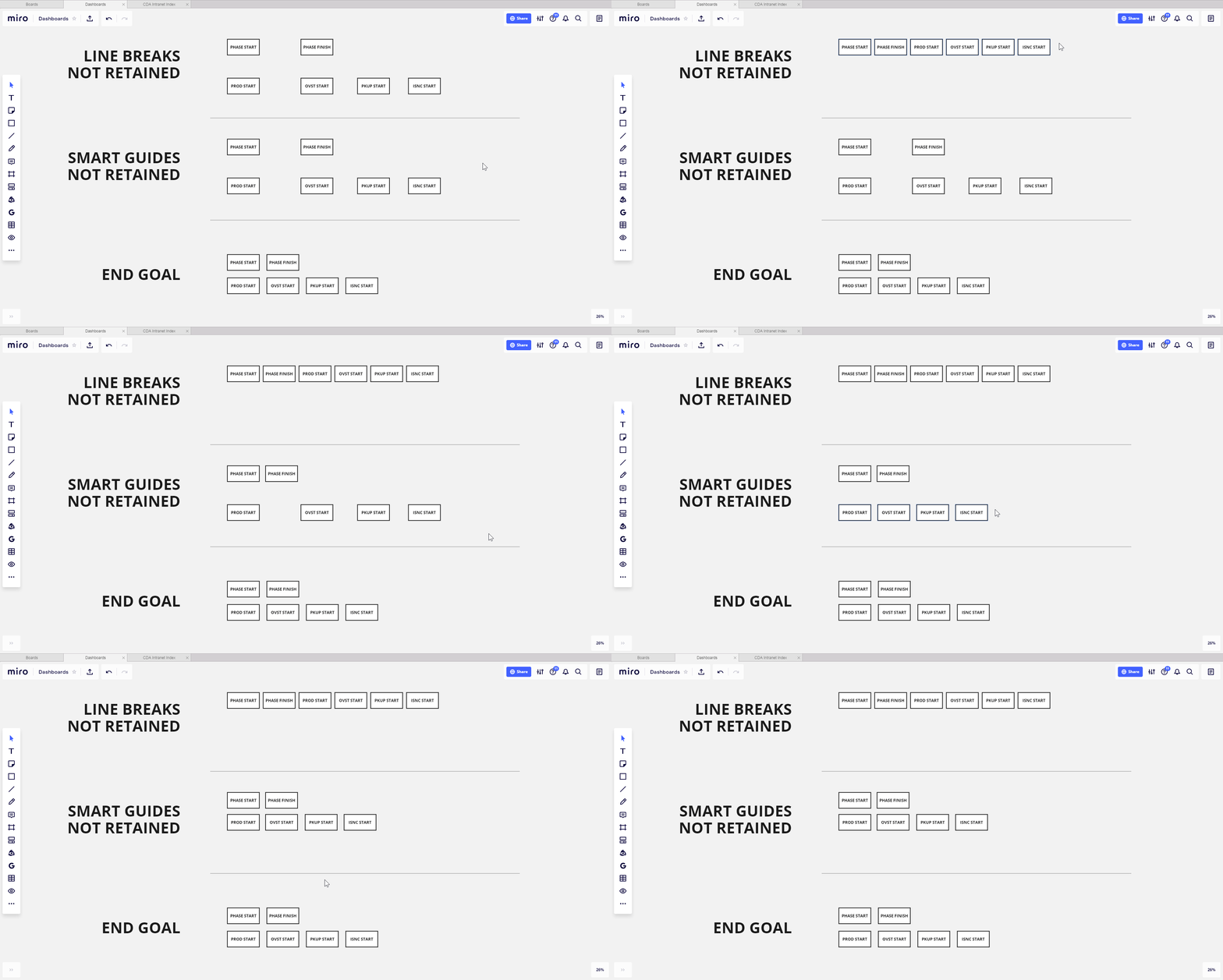
The feedback is focused on managing arrays with multiple “line breaks”, so to speak. Auto Layout forces scattered objects into row placement based on width constraints. While the sensible next step is to use Auto Layout across each desired row, the smart guides become lost in adjustment.
The neat next step would be to create a multi-dimensional approach, where auto align could function both on the X and Y axis, allowing someone to drag in either direction for ratio-driven changes.
I’ve included a gif to highlight what I’m describing. For larger matrices of information or objects I’ll probably stick with spacers to keep alignment tight (it’s become a compulsion) but for single-row blocks I’ll definitely lean on Auto Layout. Thanks again to the team
EDIT: Another thought just occurred - manual assignment of spacer / gutter width or height across arrays. This would simplify the management of alignment and probably be light years easier to implement than some kind of multi-directional line-break-recognizing whatever
This is very welcome!
Love this. I find myself trying to use it to adjust spacing vertically, especially on Frames (I come from sketch, figma, XD etc.). This doesn’t work currently.
I wonder if dragging the auto layout handle vertically could adjust the vertical spacing?
Great feature for getting structure to a cloud of sticky notes!
I’m a big fan! I use it to reorganise ‘extracted’ documents from the block arrangement to one vertical column. Now I can re-organise a 100-page PDF deck into one scrollable column in 2 seconds - amazing!
Great feature but it still needs a few tweeks to be awesome. I find I have to re adjust the vertical distances between elements if they have connectors between them. When you space the elements, the lines are really shortened and it’s hard to see whether a line is solid, dashed or dotted. It would be great if the process took into consideration the line length in both vertical and horizontal planes. Probably a big ask but it would be appreciated.
Loving this new feature, thank you for the update!
I would like auto-spacing as I’m dragging shapes around - similar to other workflow diagram tools. Currently there is alignment, but not snap to spacing to match spacing of other objects in the same line or connected from the same object/shape.
Also, perhaps a distribute option when grouped for auto-layout? Right now, I select three shapes and it collapses them all together. I would prefer to distribute horizontally/vertically. Did I miss this?
I am looking for an Auto Alignment feature in Miro. As soon as I drag an element next to an existing one, it should suggest me the outer line as a starting point.
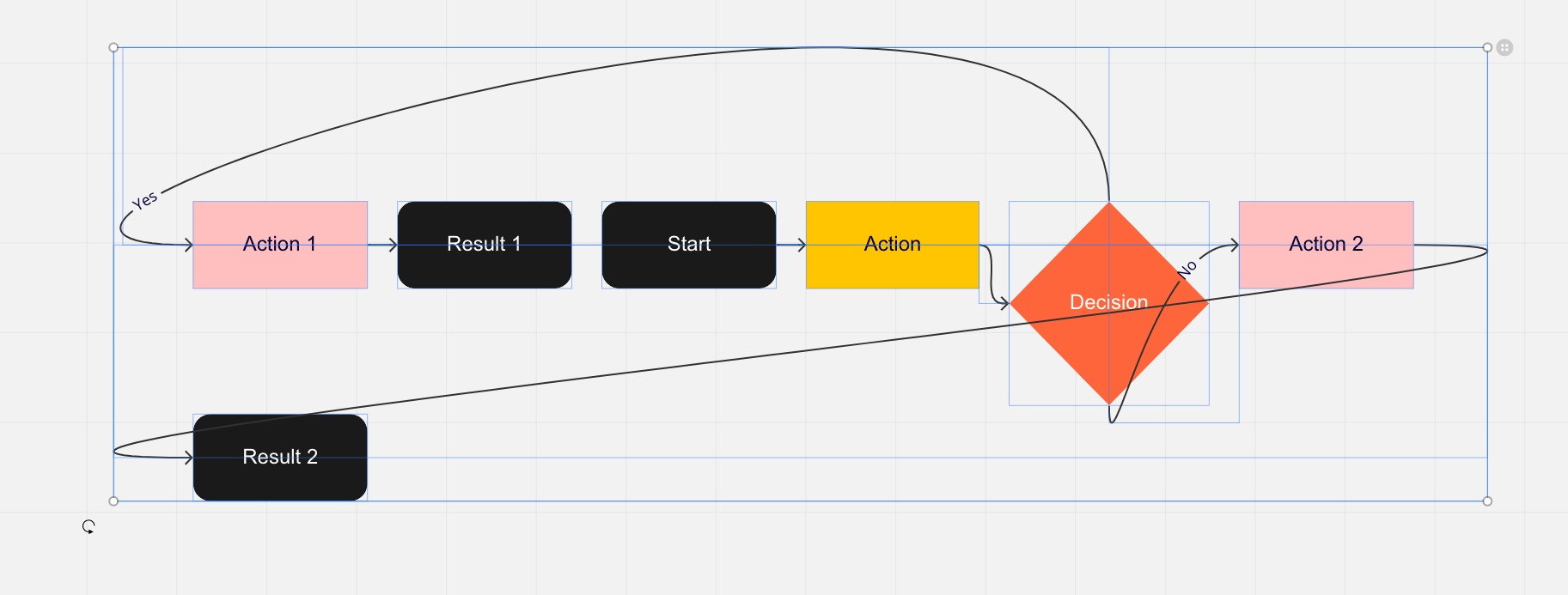
So just applied auto layout to a flow chart template. This is the result… Not really a useful feature if not respecting connectors and hierarchy?
Can it work on vertical alignment as well?
Right now it seems to only care about horizontal
Hi @Mircea Braescu - while auto layout works while dragging horizontally, you can still align objects a number of ways (horizontally, vertically, and on left/right sides in relation to each other). You can align any objects (such as sticky notes, pictures, frames, etc.). Please visit this Help Center article to learn more. Thank you!