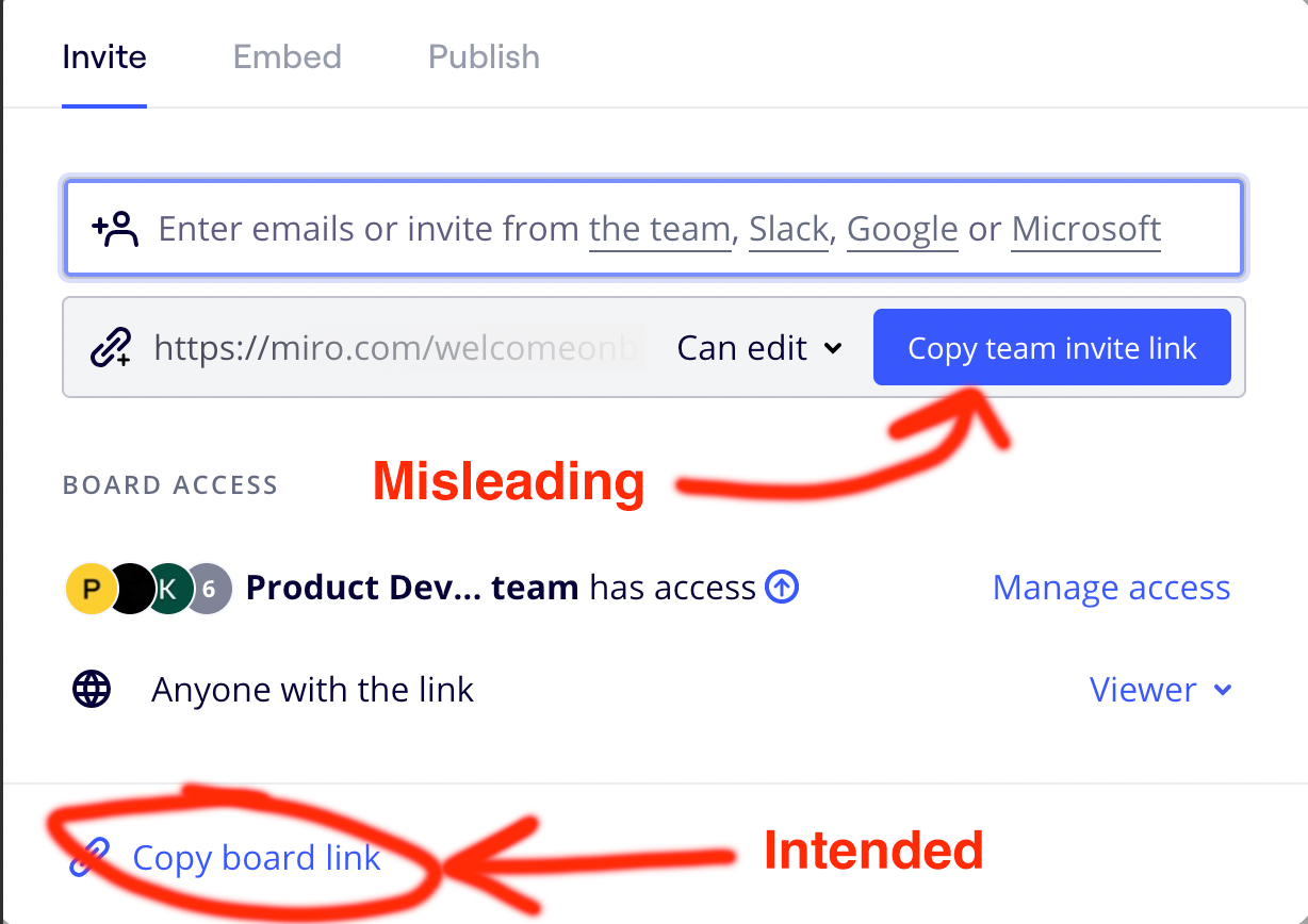
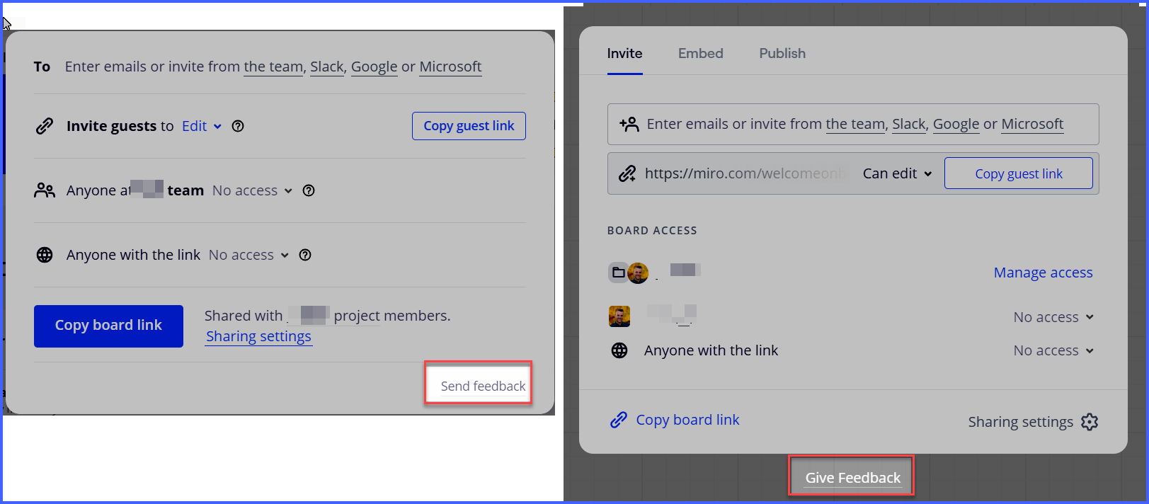
Miro’s page share function is intentionally misleading for users. If I’m trying to share my board with somebody outside my work group I would assume the link that is generated would allow external users to view my page. Miro has grouped “Invite team” and “Share page” into the exact same window and they highlight “Copy team invite link” making it most visible call to action. Sending this link forces users to sign in. If I want to share the page with somebody outside my group the “Copy board link” is this tiny unbounded text link at the bottom of the box. This is completely unclear and extremely confusing for people. Separate “Invite team” and “Share” features or change this UI. The number of times we had to trouble shoot this problem (including the permissions options) before realizing the intended link was just at the bottom of the window was incredibly frustrating, especially on a deadline. This is a severe design issue which can be fixed incredibly easily if you cared about user experience.
Terrible UI with share function.
Enter your E-mail address. We'll send you an e-mail with instructions to reset your password.


