New update of text-input and text-box?

You Miro has already established unique style of ux and workflow, if you don’t know why user pick Miro although there is thousand of mind-map product on market? because your advantage is quick, fast and simple. Now congratulation you mess it up by changing established feature (the text-box that automatic shrink and enlarge base on text size really boost workflow speed, and user like it!) to make user have to adjust their text-box everytime, and now I have to look for other mind-map product. Haiz…

Hi @Arshiva Marsaint! Thanks for your feedback, as you hopefully understand making you hate our product wasn’t what we ever intended. 

It will be very helpful if you can record and share a video (here in the thread or via DM) of the mind map behavior you’re describing because it sounds like a bug more than anything. 


Hi @Arshiva Marsaint! Thanks for your feedback, as you hopefully understand making you hate our product wasn’t what we ever intended. 

It will be very helpful if you can record and share a video (here in the thread or via DM) of the mind map behavior you’re describing because it sounds like a bug more than anything. 

is not bug but i hope it is.

recently Miro has an update and suddenly when I log in, text-box option changed.


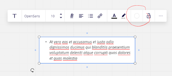
I been using Miro for long time, the text-box is uses to have border option, now is gone.

Then, I found out the border-line option is available on “shape”. But, if typing in shape, I have to manually enlarge the shape in-order to view all text (if the paragraph is long)


Back to text-box,

This is new update of text-box, I was like “What the fxxx?” Why design like this? It is very horrible. 

I don’t know what happened to Miro internal UX team decision, this type of design style is similar to MindMup, MindMeister, XMind… etc other mind-map software. But peoples are choosing Miro must have reason, for me, is Miro clean and comfortable UI and UX.  


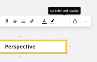
Screenshot below is previous text-box, the padding is perfect, clean and comfortable, why change it?


I hope Miro’s team bring back the text-box border-line option, and fix the padding.

And always: keep the existed features when adding new features, or you might scare away existed users.


@Arshiva Marsaint - I suspect you are experiencing a bug as I am able to set the text box background color from both the Miro web/browser app and desktop app in multiple free plans as well as my consultant plan:


The text box padding is also normal.

I suspect this to be a bug as another user just posted asking where to find the background color option in this post:

https://community.miro.com/got-a-question-ask-the-community-45/how-to-fill-background-text-boxes-2395


I experienced same thing as well, although I am using multiple browsers and multiple devices, all have the same problem.


The border line in picture was previously set, now I cannot change it


@Kenji Fukurou - Yes, this does appear to be a bug. please reach out to the Miro Customer Support team directly by creating a ticket via this special form.

It would also be helpful if you could come back here and let us all know what Support team tells you. 


Hi @Arshiva Marsaint – this is helpful! I misunderstood your first message, and thought the behavior change was in our mind map tool. 

I can confirm that we’re testing the new text box behavior. Thanks again for providing your feedback, I communicated it to our product team. 


Reply