How do I return to the collaborators’ cursor display to the upper-right corner? Instead, the “meet” button.

@Ksenia Sulim - Well, you have me stumped as I have never seen this “Meet” button. I am not sure if this button is from an app that you have installed or a new feature that is rolling out (intentionally or by accident).

@Marina / @Kiron Bondale  / @mlanders / @Jonathan White / @Isman Tanuri - Have any of you seen this button before?!

@Ksenia Sulim - If you (or any other members of your Miro plan team) didn’t recently install an app from the Miro Marketplace, and

  1. signing out and back in to your Miro account; or
  2. signing in from a private/incognito browser window

doesn’t get rid of this button and bring back your show/hide collaborators’ cursors button, then I would suggest that you reach out to the Miro Customer Support team directly by creating a ticket via this special form to see what they can tell you.

It would also be helpful for the rest of the community if you were to come back here and share what the Support team told you.


@Robert Johnson :

It’s the first time I see this button - maybe it depends on the plan @Ksenia Sulim has.

Could you tell us @Ksenia Sulim what plan you have?

For us with the consultant plan it seems to be unknown.

Michael


@Robert Johnson  @mlanders :

Thanks a lot for your answers! This Miro team is created by my student. As I know, his current plan is free, no apps were recently installed (or I don't know). We probably need to re-registrate member to avoide this bug. Details : picture shows what is under Meet button. "Timer", "Voting", "Video Chat" and "Chat" commands moved from the lower left panel. The length of this panel has been shortened. 


@Ksenia Sulim -

I wonder if this is some beta testing being done by Miro for a new interface for the meeting tools in the platform? @Marina would likely know…

Kiron


@Ksenia Sulim :

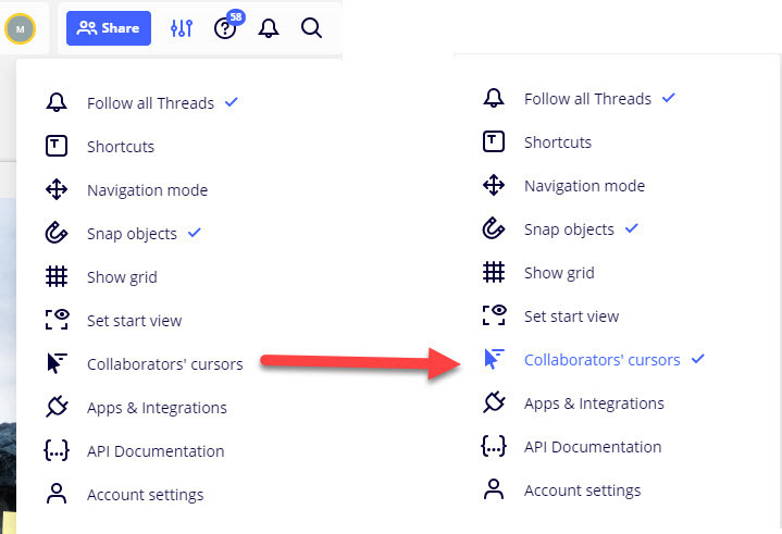
What if you tick the “Collaborators’ cursors” on does it change anything or shows it the cursor
 

Michael


@Kiron Bondale

I’ve asked myself the same:

It does make sense to me and it does look like that they’ve changed the top menu and put everything together when it comes to meet: Chat / Videochat / Timer / Voting

This things are not in the left buttonbar like we can see it … but logically I would add the screenshare button to the top, too.

Michael


My problem is solved! We will adapt to the new version. THANK YOU @Kiron Bondale @mlanders 


Good catch @mlanders on getting to the Collaborators’ cursors option in the board settings menu! I was too focused on the new, shiny button!

I would vote for the cursor option to be added back to where it was rather than it being out of sight.


I would vote for the cursor option to be added back to where it was rather than it being out of sight.

@Robert Johnson I agree - I like to have it back if we’ll get the other buttonbar, too.


Hi @Ksenia Sulim, @Robert Johnson , @Kiron Bondale and @mlanders – I sent you a quick follow-up note in the private messages.