
"Comments" changed in design

  • 28 September 2023
  • 21 replies
  • 362 views

I am using Miro for a research study. 

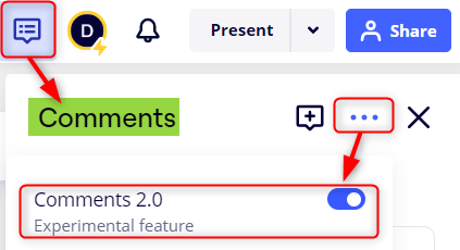
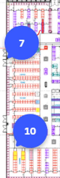
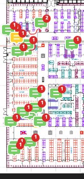
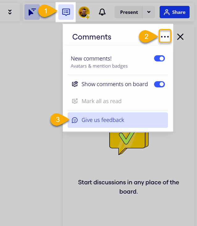
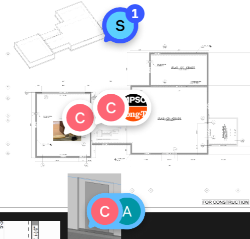
Today my template has changed the design of all the comments. The comments now look bigger and circular, now also with a “C” text. The colours have also changed. Unfortunately these now cover the text of some items and disturbs my study design. 

Does anyone know how to revert back to the original comment design?


21 replies

Userlevel 3

Thank you for the feedback on this new experimental feature. We are currently evaluating feedback of this redesign. 

At the moment, you are able to toggle off Comments 2.0 within the comment thread three dot (...) menu. 

Let us know if you need additional help! 

Thank you very much for your reply. This has fixed the issue for me.

It would have been great if I had been able to find out this possibility immediately, to be able to switch it back, as I have already had to use the template. This is was stressful. Perhaps experimental features should not be switched on as default, and there should be more communication about it - perhaps an alert on the miro board itself? I did search for the new comment design on the website and I did not find it mentioned, but I see it is there now (maybe I missed it).

Many thanks

How can I update to Comments 2.0 version? My friend has updated version to comments 2.0 but my account is still the old version:(

How can I update to Comments 2.0 version? My friend has updated version to comments 2.0 but my account is still the old version:(

I just noticed this comment which was posted 27d ago so maybe it’s already resolved, but the answer (for my user interface/experience at least) is:


Had the automatic update to Comments 2.0 last week and it severely impacted the way we use the coloured comments function in our company.
We collaborate on store plans with many other functions in the business and use the coloured comments to indicate an action, ie: yellow = to be done, green = actioned, blue = question for another function, etc. When we look at many plans on a board in a zoomed out view, you get a clear overview of where your priorities are.

With the new update, in a zoomed out view all you can see are the ‘grouped’ comments, ie: a dot with the number 10 in it. Then you have to zoom right in to see where those comments are and what colour they show. Absolutely rubbish!

Through this thread, at least I now have found out you can toggle Comments 2.0 off. I understand that not everyone uses the old comments feature exactly like we do and that the new feature could be beneficial for other uses.
Perhaps this should remain a CHOSEN feature?


Userlevel 7
Badge +12

@Jeremy De Rouw 

Through this thread, at least I now have found out you can toggle Comments 2.0 off. I understand that not everyone uses the old comments feature exactly like we do and that the new feature could be beneficial for other uses.
Perhaps this should remain a CHOSEN feature?

I have mixed feelings about Comments 2.0 so far, e.g., while I like the avatars that show up on the comments, and sometimes like the grouping of comments, I also miss seeing them at a macro level, and by colour as you have pointed out. I am hopefully that, given Miro’s slow rollout of this feature, Miro really taking the time to listen and learn from the feedback.

While the product teams do monitor this forum, if you haven’t already, I would suggest that you leave your feedback via the Comments panel too:


And, for everyone reading this post, the toggle to disable Comments 2.0 has been renamed slightly:


Userlevel 1

Had the automatic update to Comments 2.0 last week and it severely impacted the way we use the coloured comments function in our company.
We collaborate on store plans with many other functions in the business and use the coloured comments to indicate an action, ie: yellow = to be done, green = actioned, blue = question for another function, etc. When we look at many plans on a board in a zoomed out view, you get a clear overview of where your priorities are.

With the new update, in a zoomed out view all you can see are the ‘grouped’ comments, ie: a dot with the number 10 in it. Then you have to zoom right in to see where those comments are and what colour they show. Absolutely rubbish!


We use color coded comments in a similar way. The new grouping destroys our workflow. And Thursday, the control to keep the old functionality was removed. I have submitted a support case to Miro asking them to revert the change.

Yes, I was pretty annoyed this week when I saw that too. I’ll submit one too.

Userlevel 1

Unfortunately, I did not manage to convince Miro about the importance of introducing a toggle to get rid of the counters and just show the original comment icons. We have written back and forth, but I did not manage to get past 1st line support.

Their reply: “I escalated your input to our Product Teams and received confirmation that this change was implemented after extensive testing and they have deprecated the ability to revert back to the old comments feature. The goal of this update was to address overwhelming feedback from our users to visually clean up the board so comments didn't block too much of the content.”

I believe Miro made one mistake, and then they made another trying to fix the first one.

First, they changed the comments ikons to larger round “things” with images in them. As the OP mentions, they are too large and block board content. Second, instead of going back to what worked well, they introduced the counters. So here we are.

I can easily see that some users out there may be happy to get the counters. But I think that it is a really poor move by Miro to make such a breaking change without introducing a toggle to decide between the two behaviors. We even know that they have the code for this toggle in place.

@julia_rudge I really urge you to reconsider this.

I too contacted Miro support conveying dislike of the “counters” and expressed the desire for a toggle.  My team and I were using color coded comments in a similar way to what was expressed in prior threads here.  We find the recently added “counters” to be too large, that they block board content, and are an unwanted hindrance to the way we prefer to use MIRO. 


Would be much more useful if the settings could be toggled to enable a view that displays both. 
All the COMMENTS

and the COUNTER tally...like this:


instead of a view like this:


Userlevel 1

Since Miro has this as a bug (which I still think it is), it must be handled as a feature request. Miro has written to me that the right place for those is the “Wish List”. This has a voting function, and statusses set by Miro.

So, I have created this entry in the Wish List: Keep showing individual comments when zooming out (as before) | Miro.

Please vote! And it could be great if you could re-add your screen shots there. I don’t have any showing the previous UI.

Userlevel 1

Edit: “Since Miro rejects this as a bug...”

It’s so annoying this recent update. We have all the accounts in my team, with different comments design. I was thinking of making a new code color for the company, but I cannot make it because all the accounts are different. If Miró wants to apply new updates, it’s ok, but make it for all the accounts, or at least for the accounts of the same company. Please release the switch button to be able to have all the accounts with the same view. 

Userlevel 3

I'm sorry that Comment Clusters (groupings) have disrupted your workflows, I understand how painful this can be. 
 

We're already looking into improving experience for this color coding comments workflow, without affecting the board clutter problem. We'll post an update here by end of next week (31/may). 

Thank you for the reports! This type of detailed user feedback helps us better understand and prioritize your pains. 

@julia_rudge Hi,


Any updates on this matter? This also caused an impact on our workflow as we used colored comments to identify status for tasks. 

Making such a huge change to an important feature without giving the option to keep the other design wasn’t a great move!

Please let us know whats the follow up on this.


Thanks !


Userlevel 3

Hey @Diogo Silva , yes we provided an update here last Friday.

The setting to be able to disable/enable "Grouped comments" is already rolled out and available in the Comments side panel. We'd love to hear if this solved your problem, please reach out to me with your feedback: julia.r@miro.com 

Greetings @julia_rudge The sidebar disable/enable "Grouped comments" is helpful.  Thanks.


A second request.  Wondering now about the color change on Comments.  Since we first enrolled in MIRO (a couple years ago) we’ve been mostly using Red, Yellow, Green comments like a traffic light. With the comments colors conveying similar intent like this:

RED= stop. can’t be resolved at this time. 

YELLOW= still needs work.

GREEN= problem addressed. good to proceed.

So that when all the comments had been addressed all the comments would be green.


Now that the YELLOW comment color has been replaced with a GRAY it’s fairly dysfunctional for my team because the GRAY/WHITE is a lot less visible and tends to be lost in the background. 

Compounding this is that the new comments graphics (now emphasizing the commentor initials) the comment color is more obscured and less useful. 
1.) Can we get YELLOW comments back?
2.) Can there be a way to toggle off the avatar (commentor’s initials)? Or make the avatar smaller as has been suggested in other community threads. 
Please help.  Many Thanks


I’d like to add my voice to the request to allow to turn off comment 2.0 update (as was available when this was a pilot). We have 5 people leaving comments back and forth on hundreds of stickies and it is very distracting to see the initial avatar of each person who has left a comment rather than just the comment bubble. It makes it much harder to click on the right comment without zooming in significantly, to see which comments are unread, and overall makes the board incredibly overwhelming to the point where we may not be able to continue using it.

I understand this feature may be helpful to some, but if we could still have the option to toggle off comments 2.0 that would be greatly appreciated. (I also turned off the group comments function but that does not address the larger issues listed above).


Thank you!

Userlevel 3

Thanks for continuously sharing feedback with us.

Unfortunately we cannot continue to support the old version of comments, however we have taken your feedback into account and we're looking to solve it with possibly a new feature. Stay tuned! :)  

Thank you to the Miro Team for allowing the ungrouping of comments again.

I would like to second the request for being able to have more control over the main color of the comment icon since we were also using these colors to indicate types of comments and their status. The initials of the commenter and the color coding based on that is not useful for us.

Thank you, Miro, for listening!

Reply