Dear Miro-Team and Miro-Community,
since about a week ago, links pasted into Miro create a card with a different style than before. My question is: Is there any way (official or unofficial trick) to keep using the old style of cards for new links? I would not mind creating them manually or copying the existing ones and changing the URL, but so far I have not found any such trick. I have even created a Miro-addon using the Web SDK, to recreate the old style using individual elements in a frame, but faced many problems such as getting the embed data without using cross site requests or tools like embedly.
So my question to the Miro-Team is: Is there any way to revert back to the old design? Are there plans to further improve the new design to make it more usable? Is there any way to create the old style of link/embed using the REST API or Web SDK?
And my question the the Miro-Community is: Does this bother anyone else? Has anyone found workarounds for this problem?
Why I care about the link design so much:
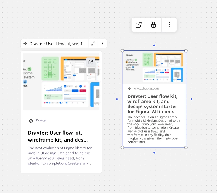
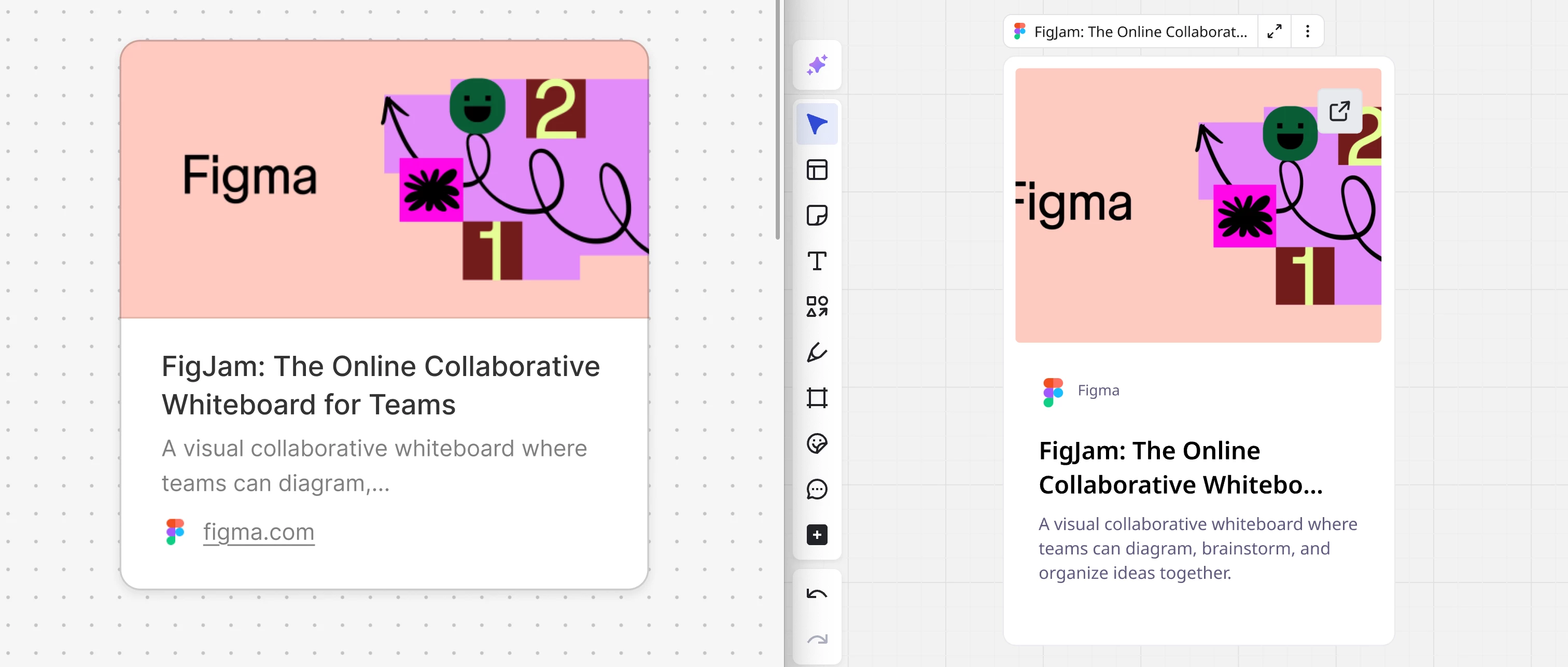
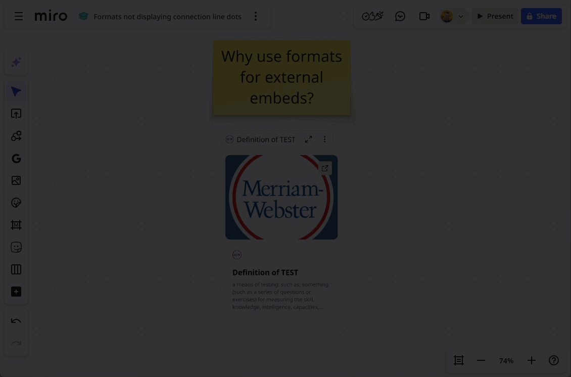
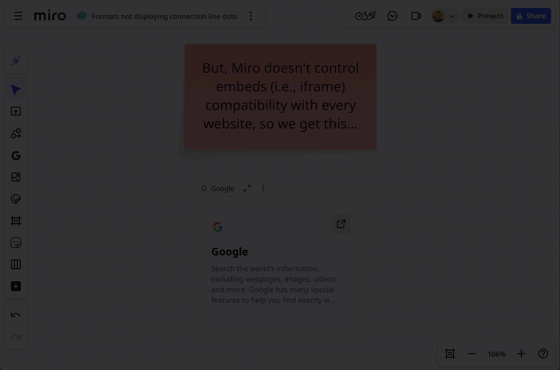
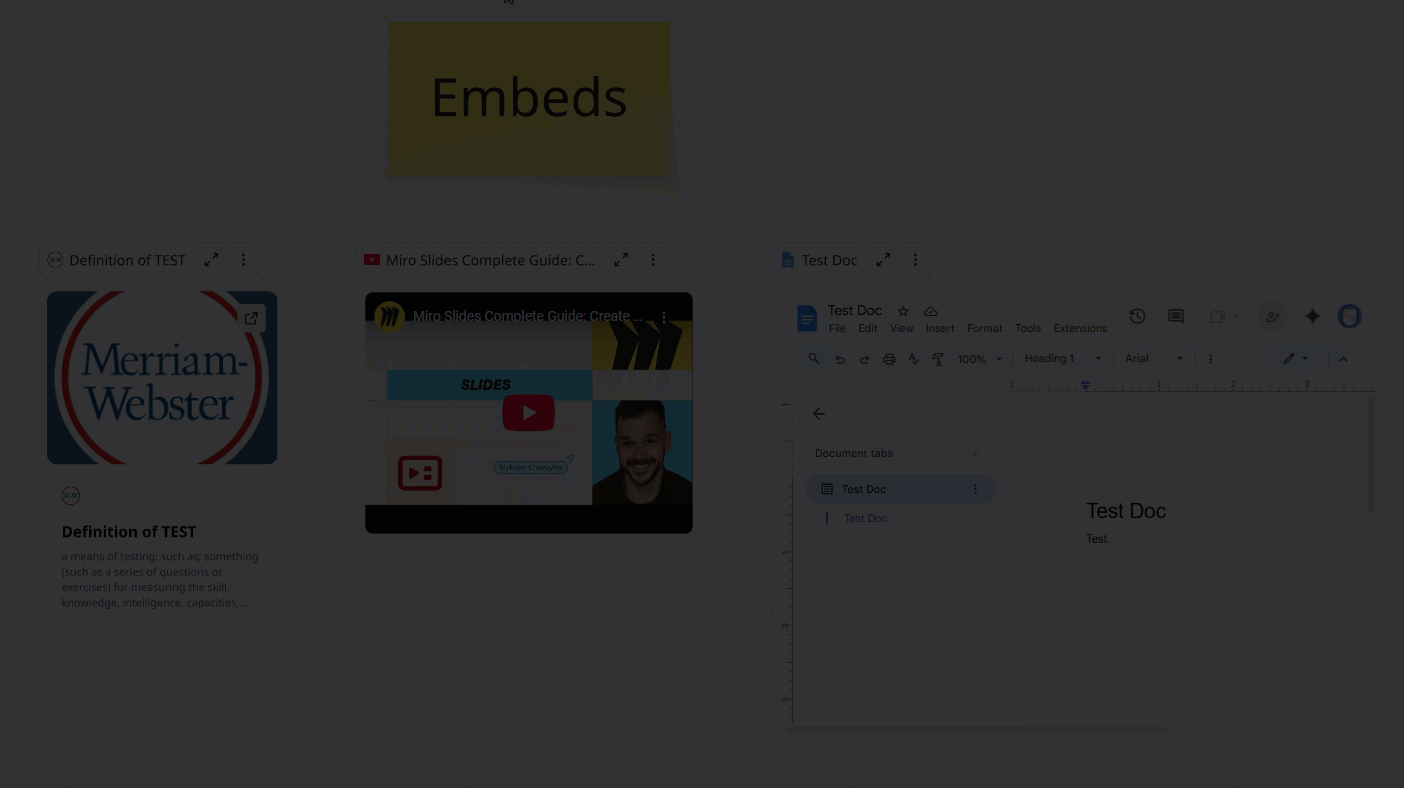
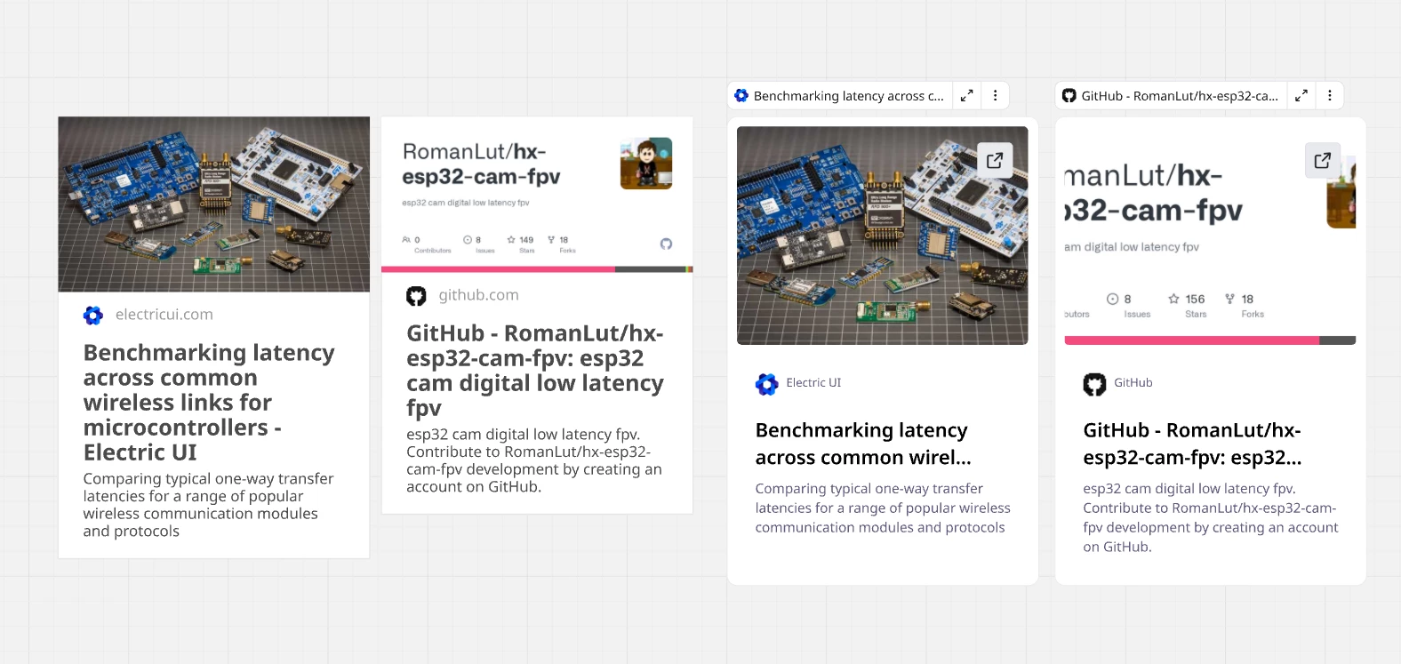
When I started using Miro a few weeks ago, one of the things that I really enjoyed was how you can add links to your board to act like a visual overview of all resources related to a project. A big part of what made that possible were the pretty, but information dense link/embed cards with a nice large image preview and enough space to fit the full title. Since a week, these cards seem to have been replaced with cards of a different style, that makes it nearly impossible to use Miro in this practical way.
My opinions on the new card design, compared to the old one.
Pros of the new cards:
- Button for opening links directly
Cons of the new cards:
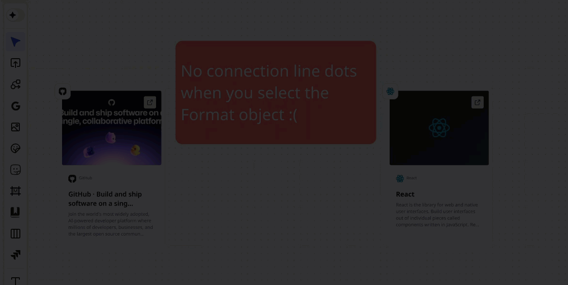
- Title truncated much earlier. Even very short titles get truncated.
- Less information even while using a smaller font due to vary large whitespace.
- Floating bar above, that interferes with other items and unexpectedly appears only at certain zoom levels.
- Very different design from old cards, requiring recreation of all cards if aiming for a consistent board design.
- The proportions are odd and the design looks unfinished. (example: why is the favicon almost 2x larger than the domain name text?)
Best regards,
Felix