hey there…

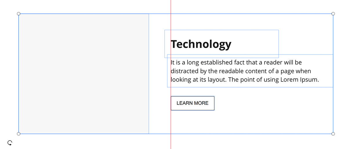
when wireframing in miro, different sized text boxes and assets (like images, buttons etc.) never align correctly using the align tool. i always have to align them manually, which drains a considerable amount of time. below is a screenshot of the problem. you can see the red line is the actual alignment reference and all assets align in different horizontal positions…
and if i select the assets and use the align tool, here's how it looks.…
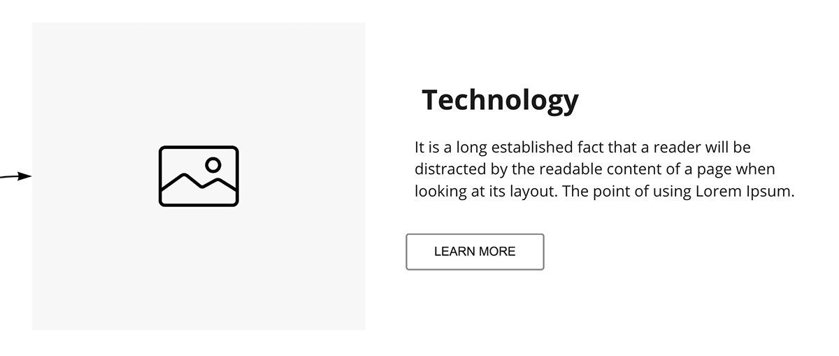
you can see that vertical alignment completely fails. does anyone know how to tackle this issue?

@icedevice - This behavior, while not your desired outcome, is functioning as intended, i.e., the objects (including their internal padding) are aligning by their outer border.

Since this is not something that us, the end user, can control, I suggest that you add this as an Idea in the Wish List category by following the guidelines here: Wish List: Everything You Need to Know. If you do create a Wish List Idea post, I would also recommend that you post a

Or, you may just want to add your comments/votes to a number of existing Wish List Ideas:

https://community.miro.com/search?q=padding&content_type%5B0%5D=ideation


I have a weird trick for this one.

  1. Convert all your text box to shapes (e.g., square).
  2. Convert them back to text box.

And voilà! no more padding on the boxes.

They still need to fix this.


Reply