Change colour of charts and stacked charts


I saw there was a question on this, but couldn’t see it in the wishlist, so here goes.

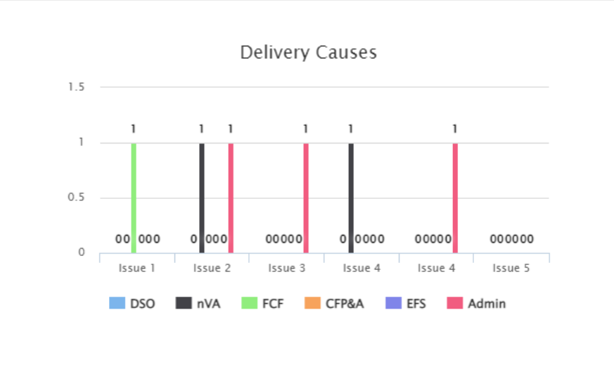
It would be good to have a bit more control over the charts that are available.  Two primary things for me would be:

  • Being able to change the colour of chart series - colour plays a big part in communication
  • Having a stacked column chart - along with colour, stacking columns keeps things tidy and helps communication of information

Suppose changing colors in pie charts can be considered part of this wish, this would really help


Thumbs up for stacked bar chart to keep things tidy! My organization uses bars every day to report issues and prioritize focus, it would be great if we can see a stacked version to visually see the peaks. Also, are the ‘0’ needed?


This would be a HUGE win. I use charts in combination with other tools (voting is a big one) and being able to match colors for clarity of data is a pretty key feature.