Open

Miro Academy Basics not userfriendly

  • February 16, 2024
  • 1 reply
  • 13 views

Hi,

in the first course of the Miro academy, where the menu is explained on the page, the popups which explain the menu/buttons always overlap the menu/button itself, so it is not visible at all which button it explains:

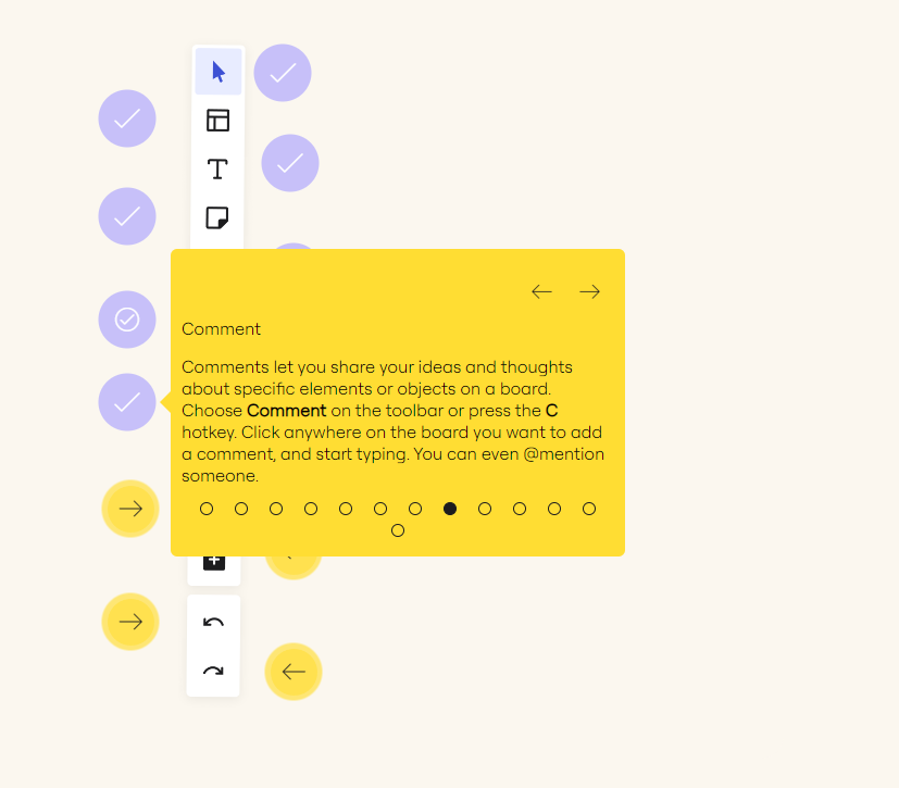
For the yellow arrows on the left side, the pop-up goes to the right, as in the screenshot, and for the arrows on the right, the pop-up goes to the left. So it always overlaps the white menu bar with the buttons on it. This should be the other way (arrow on the left → popup to the left / arrow on the right → popup to the right), so that the menu with the buttons is always visible.


Regards,

Nadine

Pinned reply

February 22, 2024

Hi Nadine,


Thank you so much for this feedback! We’ve added your note to our backlog as we agree there’s room for improvement with this interaction. Let us know if you noticed anything else amiss or have any other feedback. We’re grateful for your suggestions!

Was it helpful?

1 reply

Jen Clark
Mironeer
  • Mironeer
  • 17 replies
  • February 22, 2024

Hi Nadine,


Thank you so much for this feedback! We’ve added your note to our backlog as we agree there’s room for improvement with this interaction. Let us know if you noticed anything else amiss or have any other feedback. We’re grateful for your suggestions!


Reply