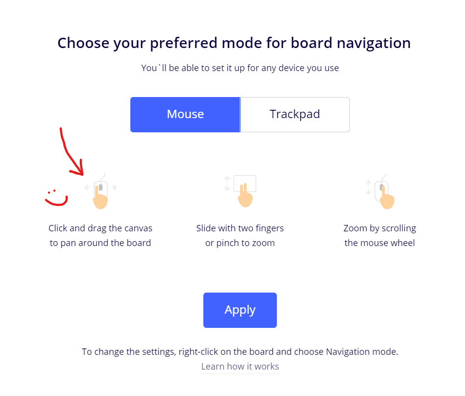
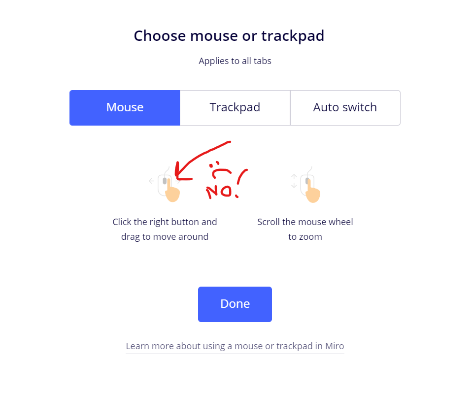
Is there any way at all to return to using the left mouse button to move around the screen (click and drag)? It seems going to the Navigation Settings only allows you to choose between using the mouse or trackpad, but no option is available for choosing which mouse buttons control movement. Not sure why Miro decided to make this sudden, unnecessary change! If it’s not broken, don’t fix it!
- Home
- Community overview
- Questions & Ideas
- Ask the Community
- Any way to go back to left-click mouse navigation on screen?
Any way to go back to left-click mouse navigation on screen?
- October 22, 2021
- 49 replies
- 3629 views
49 replies
- Volunteer Community Moderator
- October 22, 2021
Have a look at the following help center article:
https://help.miro.com/hc/en-us/articles/360018109574-Work-smarter-not-harder#pan
Tip: Hotkeys for this are the V or H key, or holding the spacebar when in select mode to toggle to pan mode.
- New Here
- October 28, 2021
Is there any way at all to return to using the left mouse button to move around the screen (click and drag)? It seems going to the Navigation Settings only allows you to choose between using the mouse or trackpad, but no option is available for choosing which mouse buttons control movement. Not sure why Miro decided to make this sudden, unnecessary change! If it’s not broken, don’t fix it!
I definitelty agree with the statement, if it’s not broken, don’t fix it. I understand if there’s people out there who find it annoying, but at least give us the option to reverse the setting. I don’t enjoy it at all and it’s making my experience for using Miro much worse. Options always saves lives that’s what I believe, nothing wrong about that.
- New Here
- November 3, 2021
Is there any way at all to return to using the left mouse button to move around the screen (click and drag)? It seems going to the Navigation Settings only allows you to choose between using the mouse or trackpad, but no option is available for choosing which mouse buttons control movement. Not sure why Miro decided to make this sudden, unnecessary change! If it’s not broken, don’t fix it!
I definitelty agree with the statement, if it’s not broken, don’t fix it. I understand if there’s people out there who find it annoying, but at least give us the option to reverse the setting. I don’t enjoy it at all and it’s making my experience for using Miro much worse. Options always saves lives that’s what I believe, nothing wrong about that.
I find it extremely annoying! I’m ready even to stop using this platform! When I try to navigate with the right mouse button, it brings me back to dashboards every single time I unbutton the right mouse button - it’s disgusting! Why do I need these new features which absolutely don’t work properly? Why to change that???
- New Here
- November 28, 2021
Robert,
Thank you, this is very helpful. I did not know about the V and H hotkeys. I also wonder why you can activate the select mode on the toolbar but there is no option for hand/pan there.
Yuriy
- New Here
- December 23, 2021
I can activate select mode using the toolbar but I cannot deactivate it, please could this at least be turned back into a toggle between select and pan modes like it used to be? currently there’s no way to get to pan mode without using the keyboard
- New Here
- December 24, 2021
I also have the same problem - old boards are moved with left clicked mouse and the new ones - with the right click. Oh my, that is so annoying to change the pattern, cause I need different boards…
Old good with left click

Horrible new one with the right click

- Contributor
- December 24, 2021
Yes, from people I have spoken to it seems like the Miro community is in agreement that this is a step backwards. So far out of the miro users who have contacted me about the change, only 1 / 8 of them like it. I am going to try to keep an open mind, however I have been using Miro for about 10 hours since the update and am still struggling. There is another post where miro have given a little bit of explanation regarding the change: https://community.miro.com/ask-the-community-45/new-mouse-functionality-is-there-an-option-to-revert-back-to-the-old-control-scheme-6773
I will ask more mironeers when people return back to work how they find the new control scheme and update these threads with the feedback.
- Contributor
- December 25, 2021
Now that I have changed the way I use Miro due to the new update, I think I have an idea on how Miro can keep the simplistic approach of not having any customization (as I think this is what MiroHQ is going for) while making the platform remain usable for those who have it hard-wired into their brains to left-click to move.
Personally, I have migrated to holding down the space button to move around the board so that I can stay with the left-click method of movement. I have not heard from many other Miro users due to Christmas, however I have heard from some that they are doing the same. My issue with this method isn’t that I need to keep my arm at the keyboard, but that I need to continuously tap the spacebar on and off in order to interact with objects.
My solution: as the spacebar method is a rather niche way of interacting with the board, why not make it so that when this is held down, you can also interact with objects with left-click as well as panning around the board? This way while holding down space, long time Miro users can use the boards without feeling alienated from the platform.
Overall, I would like an option to return to the old way, however this could be a middle ground. I think this should be looked into though before people return to work from the Christmas break!
- Beginner
- December 26, 2021
This is a bad UI/UX change -- so bad that I’m on the phone with Miro product management this week about it. What makes it bad is it goes against everything we intuitively know about navigation. Think about this -- you hand someone Miro, and the first thing they do (and are interested in) is navigating the campus, not selecting objects (in fact, there are no objects to select by default). They’ll do this with their left button, and when they do that, they get the selection rectangle. So now the first thing an administrator has to do teach someone how to navigate the board. This is so mind-boggingly remedial (and pointless) that it defies logic.
We’re an Miro Enterprise shop, and are in serious discussions internally to leave Miro if this type of change isn’t reverted or given an option to set.
- Contributor
- December 27, 2021
This is a bad UI/UX change -- so bad that I’m on the phone with Miro product management this week about it. What makes it bad is it goes against everything we intuitively know about navigation. Think about this -- you hand someone Miro, and the first thing they do (and are interested in) is navigating the campus, not selecting objects (in fact, there are no objects to select by default). They’ll do this with their left button, and when they do that, they get the selection rectangle. So now the first thing an administrator has to do teach someone how to navigate the board. This is so mind-boggingly remedial (and pointless) that it defies logic.
We’re an Miro Enterprise shop, and are in serious discussions internally to leave Miro if this type of change isn’t reverted or given an option to set.
Yes, I have taught one person Miro and it does seem trickier now. I will be teaching larger groups Miro in the new year so I will update these threads when I have more data on onboarding users with the new update.
Unfortunately it doesn't look like Miro is open to changing this new feature based on our feedback as in this post > https://community.miro.com/ask-the-community-45/new-mouse-functionality-is-there-an-option-to-revert-back-to-the-old-control-scheme-6773
Miro said “It’s very likely that it’s here to stay” after hearing concerns.
- Experienced Community Member
- January 3, 2022
Hi all, first off – thanks for bearing with us and providing detailed descriptions of things that work and don’t work for you! The product team is currently consolidating all of the feedback to decide what the next steps can be. I will share an update with you here in the next few days once I know more.
In the meantime I also encourage you to give this update some time. You may get used to it after a few days, and, if not, please, don’t hesitate to flag it here – I’ll make sure to surface all of the feedback the community members are providing to the product team working on these updates.
- New Here
- January 4, 2022
Hi all, first off – thanks for bearing with us and providing detailed descriptions of things that work and don’t work for you! The product team is currently consolidating all of the feedback to decide what the next steps can be. I will share an update with you here in the next few days once I know more.
In the meantime I also encourage you to give this update some time. You may get used to it after a few days, and, if not, please, don’t hesitate to flag it here – I’ll make sure to surface all of the feedback the community members are providing to the product team working on these updates.
Hi
As a (very) frequent user of Miro I am so annoyed by this change it made me switch back to old and inferior solutions I long ago neglected like Google Slides.
I am left-handed, so the old navigation with left button+zooming with scroll wheel was natural and easy. The new change makes me work slower, less efficient, breaks my line of thought and make the entire Miro experience bad!
I hope you realize what I am saying - this is not a matter of us user getting used to a new change in the UX - it is a crisis of broken experience that has impact over your most loyal users!
Hope this will come through without obvious reactions like “try to get used to it” - do we have any other choice???
- New Here
- January 4, 2022
I enjoy using Miro and it continues to impress me however I do not like this change. I don’t believe this is something that people will eventually get used to and prefer in the long term. From my perspective the old controls worked fine, no need to change!
- Experienced Community Member
- January 4, 2022
The only reason why I’m encouraging you try adopting the new pattern is because we’ve already hear from many Miro users who initially were frustrated with the update that they were actually able to get used to it and could see the benefits of the new product behavior. Of course, even if after a few times it still feels awkward and you have a hard time using the product, do let us know, and we’ll make sure to factor your feedback in when working on the future updates.
- New Here
- January 4, 2022
Echoing the comments here - not a great change. Its also unintuitive, and not to mention uncomfortable, to reach across your mouse keys with your first finger as the guidance suggests. Yes there is the work around with the pan tool and the associated shortcuts but that doesn't take away from the added challenge this change has brought.
I understand the rationale with switching to prevent folks from moving items around the boards (although I control this with the locking down functionality) so how about giving us the option to choose between the 2 functions?
- January 4, 2022
we always optimize for simplicity, ease of use, and delightful user experience
I am not delighted. I am dismayed. You’ve complicated your software.
we’ve already hear from many Miro users who initially were frustrated with the update that they were actually able to get used to it and could see the benefits of the new product behavior
Prove it. I don’t believe you. This sounds like a complete fabrication to dismiss or minimize complaints you are receiving about a poor decision.
- New Here
- January 5, 2022
I also vote for the option to set left click to drag. From a UI perspective it doesnt work the same as every other piece of windows software
- New Here
- January 5, 2022
This is EXTREMELY frustrating! I’m assuming a large portion of Miro users are using a Magic Mouse, yet the settings and prompts only reference a two-button mouse with scroll. Please revert the change.
- Experienced Community Member
- January 5, 2022
![]() Like I said above, I’m making sure to re-surface your feedback to the product team, and will follow up with everyone in this thread early next week.
Like I said above, I’m making sure to re-surface your feedback to the product team, and will follow up with everyone in this thread early next week.
Below is an example of positive feedback for your reference from a community member. That being said I fully understand that other users have different experience with this update, that is why we’re currently working on consolidating all of the data points to decide what the next steps for us can be.

- Contributor
- January 5, 2022
![]() Like I said above, I’m making sure to re-surface your feedback to the product team, and will follow up with everyone in this thread early next week.
Like I said above, I’m making sure to re-surface your feedback to the product team, and will follow up with everyone in this thread early next week.
Below is an example of positive feedback for your reference from a community member. That being said I fully understand that other users have different experience with this update, that is why we’re currently working on consolidating all of the data points to decide what the next steps for us can be.

Thank you for providing a testimonial for the new update
Maybe creating a poll for the community would help in confirming whether the new update has been poorly received or not?
- New Here
- January 5, 2022
+1 for reverting back to old way of left click move.
I have been using the new update for weeks now and I cannot get used to it, it is not intuitive. My meetings are not as seamless and this is hurting my adoption plans throughout my org for 2022.
It is best if you just give users the preference, not a board preference, but a user preference. But if this is not possible, please revert this feature and allow users to navigate board with left click.
- Miro Hero
- January 5, 2022
Is there any way at all to return to using the left mouse button to move around the screen (click and drag)? It seems going to the Navigation Settings only allows you to choose between using the mouse or trackpad, but no option is available for choosing which mouse buttons control movement. Not sure why Miro decided to make this sudden, unnecessary change! If it’s not broken, don’t fix it!
100% agree, this is so unintuitive and frustrating! Please switch back to the previous mouse button assignment. This not only serves to create inefficiencies in our daily work, but to confuse our clients whom are just getting used to the platform.
- Beginner
- January 6, 2022
Think about this -- you hand someone Miro, and the first thing they do (and are interested in) is navigating the campus, not selecting objects (in fact, there are no objects to select by default).
.
.
We’re an Miro Enterprise shop, and are in serious discussions internally to leave Miro if this type of change isn’t reverted or given an option to set.
This is a fantastic point
We never had an issue at my organization with people selecting objects and moving/deleting them with the old settings. If that ever happened, a quick cmd+z undid it no problem (an immediate, responsive learning experience that quickly became intuition.)
Now, I have to keep clicking “V” to pan with the left click which is very counterintuitive (the right click to pan keeps glitching for me and feels VERY awkward).
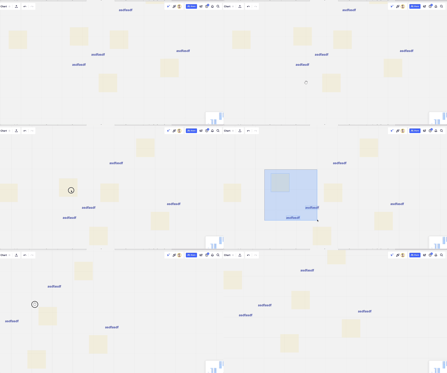
Old UX 

New UX 
(See reply, wouldn’t upload to this comment)
- Beginner
- January 6, 2022
Enter your E-mail address. We'll send you an e-mail with instructions to reset your password.
Scanning file for viruses.
Sorry, we're still checking this file's contents to make sure it's safe to download. Please try again in a few minutes.
OKThis file cannot be downloaded
Sorry, our virus scanner detected that this file isn't safe to download.
OK


