New mouse functionality - is there an option to revert back to the old control scheme?
I’m at a loss as to why miro decided how people should use their mouse or trackpad.
I am now required to use the opposite button on the mouse to navigate the board...why can’t the user decide??
It’s not a real question for the community, rather a comment about user experience.
Page 1 / 2
Miro has recently switched the left and right click button. I think that there should be an option to revert back to the old control scheme. Even if it is hidden in the menu’s, it will give people who have been long time Miro users the option to use their dominant finger to pan. I made a Workshop in Miro this morning, and my right click finger feels fatigued, but hopefully I get used to it.
I agree- really struggling with this new mouse option and i would like to revert back to the old way.
If you’re like me and your main concern is finding you have less precision of control and more fatigue with the right-click button, I do have a few less than ideal workarounds until Miro can address the issue.
A few people have said it, but ‘Space’ as well as ‘V’ and ‘H’ are all hot keys to go into pan mode where you can use left click to move. If you are willing to hold space when you need to pan, this could work.
Now that the left button creates group select boxes, you can drag these to the edges of the screen in order to pan that way. It doesn't feel like the dragging functionality of old and the issue here is that you will need to click off of items that you inevitably select due to the box. Which brings me to my personal workaround…
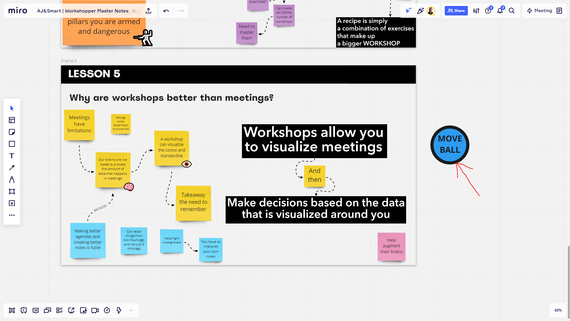
The move ball. I have been dragging around this ball seen in the image below, as when you touch the edge of the screen with the ball, the board will pan. Again, this is not as ideal as dragging like before and if you are working with a big board, the ball will not scale with how zoomed in you are.
Like I mentioned previously, I am hoping that we get the option to revert back if we choose to.
I absolutely agree. I’ve been using Miro with no issues until today. Now something changed with how I use my mouse to move around the board and it makes no sense and is incredibly frustrating for me. I have an ergonomic mouse with 3 buttons but I really only use 2 (top & middle). Before I used my primary button (top) to move around the board. All of a sudden today, after some type of change / update, I now have to use my middle button, which is very awkward and not natural. I should be able to decide what button to use, especially if it is not the standard mouse click.
Don’t have an ergo mouse, but found that I tend to just hold down the spacebar to navigate around. I then use the scroll wheel to zoom in and out. Today it mentioned that I can use my right-button on the mouse to move around.
Wonder @Amy Mccarthy if this is specific to a 3-button mouse. Nonetheless, know it can be frustrating.
I’m happy to switch over - even though it’s going to be tough after two years of use. BUTwhat I find most annoying is that the switch to right side mouse navigation has only applied to some of my boards. Some are still left side navigation and some are the new right side navigation. This is sooooo painful as every time I go into a board I have to change. And then I forget half way through.
If you’re going to change it - change it for every board.
I agree! It’s extremely inconvenient, especially for children who I have to work with.
Today we got a silent update that changed the mouse keybinds without alerting the users and giving them the option to revert back.
The teaching community and all our students spent hundreds of hours getting used to working on Miro and developing muscle memory (dragging with the right mouse button) and now it’s changed over night for no apparent reasons. A huge disappointment for me personally and for all (I mean all) of my students.
Please, give us the option to use the old settings we all got used to.
Hi everyone!
Thank you for sharing your feedback! This update was thoroughly tested before being released to all Miro users, and we are confident it makes our product more delightful and intuitive.
All of the UX improvements we are implementing are optimized for reducing accidental content creation and editing, and decreasing the complexity as much as we can. If there is a way for us to eliminate extra steps that are too complicated for the majority of users (such as remembering to use specific hotkeys), we try to do this, whenever possible.
That being said, we’re always open to feedback: please, let us know how we can improve:
Can we do a better job communicating such updates in the future and onboarding you into the new patterns & behaviors we introduce to our product?
Is there something critical you are now unable to accomplish because of the recent update?
Please, provide as many details as possible, and I will make sure to share your feedback with the product team.
We also encourage you to give this update some time – try using it for a few days, and let us know if it’s still not working for you. It’s very likely that it’s here to stay, and we’ll definitely let you know if we implement any changes based on the feedback you and other users provided us.
@Amy Mccarthy it will be very helpful if you can DM me the exact model of your mouse or share it here, and the team will look into it for you to understand if everything works for you as expected.
@Kate McRae, please, lmk, if refreshing all of the open tabs with boards helps. We released the update more than 24 hrs ago, and all users should have received it on all of their boards by now. If the issue persists, we’ll definitely look into it for you!
@Lena Shenkarenko -
Given the feedback on this change as well as that for the removal of the creation of objects via double-click in a separate discussion thread, I am wondering whether the product team would consider creating a user preferences capability where users could provide their preferences for such actions rather than being in a position where functionality is lost or significantly altered?
Kiron
I understand that this may have been tested and for new users it might be more intuitive. However I would be curious about how long the tests were performed for as I believe this change creates a ‘fatigue’ effect when using Miro for long periods of time. Personally I use Miro all day long as I use it for everything in my job and workshops. I will list the negative effects of the change I have found below.
Fatigue. My middle finger is not my dominant finger and so using it to pan means that it gets tired and hurts after using Miro for more than 2 hours.
Not being able to zoom while panning. The vast majority of people pan using their middle finger and so now my board movement is impaired because I have to keep switching my finger from my scroll where to the right click button.
Accidental right clicking. I would call myself quite ‘Twitchy’ on the board. I keep accidently right clicking when trying to do fine movements (Granted this could be practice / bug fixes)
Loss of accuracy. As all UI designers know, users are far more accurate with their index finger, which is why most things on a PC is dedicated to this finger. I am not the most coordinated person, however I am not as accurate as I would like to be with this new update (This is not a practice issue as there are study’s that show users are more accurate clicking things with their index finger)
As stated before, I don’t think this update should be reverted if new mironeers are finding it more intuitive. However I believe there should be more user testing with people creating large scale boards over longer periods of time, because I believe that is where you see the flaws in the new control scheme. Even if it was a Miro App so that new users would never find it or even a chrome extension, it would give users who’s livelihoods are creating boards the option to use maybe the less intuitive, but far less fatiguing control scheme.
It would be good to get a concrete answer from Miro on whether this will be looked into, as I act as a Mio consultant to my clients and most of them are contacting me in regards to whether this is a bug. If there will be no option to revert back, I will happily tell them that they should give the new control scheme some time as whether the control scheme is intuitive or not, the platform is still by far the best digital whiteboard tool out there. Looping back to the communication aspect, it would be brilliant if there was an official statement from Miro regarding the change that I could forward to clients so that it is clear that it is a feature and not a bug
I can second much of what Connor said. My dominant finger is not my middle finger and much of my time in Miro is spent moving around the board. By the end of the day yesterday my hand and fingers were hurting and I could tell they were strained due to the change in how I was using Miro. I can spend hours in Miro at a time and this is definitely going to be a problem for me. I personally have Tendonitis so any additional strain on my hands can cause a lot of pain that unfortunately does not just go away. I can still feel it this morning.
The way we need to use Miro now feels very unnatural and cumbersome. I was just using Google Maps last night and moving around the map works just the same as navigating Miro used to work and it felt very natural and intuitive. Also, I honestly do not feel that this change will cause me to inadvertently move things on the board less than I did previously.
If you feel the change should stay, can you provide an option for customers to modify the mouse settings so that if it is easier for them to do things the old way they can switch back to the old settings? Sure I can get used to it over time but after how my hand felt by the end of the day yesterday I am concerned that this is going to trigger my hand pain and cause flare-ups with my tendonitis again.
I use the mouse mode with my trackpad and clicking with two fingers and moving is much harder to control. This update is like relearning Miro navigation (which I have been using since it was called RealTimeBoard). I don’t see why you couldn't let people customize their own controls.
Thank you @Kiron Bondale , @Connor Wakefield , @Amy Mccarthy , and @Aaron Kurth for your feedback – I already shared with our product team.
@Connor Wakefield , please, encourage your clients to give this new behavior a try because we also learned that it typically takes just a few times of using the new pattern to get used to it and start benefiting from it.
It would also be helpful to understand if you and your customers saw the in-product onboarding that we added to ensure you don’t miss this update and don’t end up thinking it’s a bug (and if you did how we can improve it to make it more helpful for you)
Thank you for this Lena. I will update you in a week or to with whether me and my clients get used to the new control scheme. I will forward them this article too, thanks again.
In terms of the in-product onboarding, I’ll be honest I usually x out of them as soon as I see it and look at the change log. This didn't cause me any confusion as it took me only a few seconds to figure out what happened. I will ask around with my clients to see if they read the pop-ups. If you were to improve it, I would possibly suggest having a full screen pop-up for updates that change the fundamental way you use and interact with the platform rather than the ones from the bottom right corner which highlight new features. I dont recall seeing a pop up though, although I may have left my Miro app on and it may not of refreshed the board.
thank you to all who have raised this issue. it’s not a minor one and i’m glad i’m not alone in my frustration. i use miro daily for work and this change has affected my workflow significantly. @Lena Shenkarenko what can we do to help you with the the request to allow preference controls?
@colin carroll We are currently aggregating all of the feedback, and I will make sure to surface your point of view together with all other questions and concerns raised in the community to the product team. Thank you for bearing with us, I’ll come back with an update when I have one!
I can also add that as a MacBook user I had developed a very efficient way too navigate around by zooming out and back in again using two fingers on trackpad. Actually just like in Google Maps. Now it’s gone. Pinch zoom feels way much heavier to work around the board.
@Pekka Immonen thanks for flagging this – I’m going to double check with the product team if this is expected, and get back to you!
This update was thoroughly tested before being released to all Miro users, and we are confident it makes our product more delightful and intuitive.
@Lena Shenkarenko we’re telling you right here in this thread that we are not delighted and that it isn’t intuitive. Listen to your users. We’re literally telling you this isn’t the case.
You should provide a way to switch back to the old mechanism.
The new one is causing physical strain because it goes against normal navigation schemes for software. Additionally, because Miro has chosen to be different (and argumentative with user feedback) I have users at my company who are being forced to switch back and forth between control schemes with Miro and other software.
I am not delighted.
I am dismayed.
I agree with @Pekka Immonen - I used to do the same thing to navigate on a Mac trackpad with two fingers, very likely because I spend a lot more time on Google Maps than on Miro. While I have indeed got used to this change, it doesn’t mean I like it. It’s less onerous with a real mouse for sure, but on a trackpad, it’s significantly less delightful than before, in my opinion. The fact that Miro didn’t do what you now do is one of the reasons I chose it - it used to be super fast to navigate. No longer.
As for accidental input, that’s what undo is for, no?
Anyway, not to blow it out of all proportion. It’s still great software. Just one of life’s micro disappointments that something you like got a little bit worse.
@Jacob Hernandez thanks for your input, I responded to you feedback in this thread, adding here for visibility.
@James Bellamy thanks for sharing your perspective I’m definitely sharing it with the product team along with the rest of the feedback from the community members!
Please change this back! Completely unintuitive! Our clients will be discouraged to continue using the platform!
Agreed! It might be a deal breaker for me. I used Miro so effortlessly before and now it’s very clunky, laggy, and unintuitive. I’m shocked that there’s not a setting that allows users to revert back to the old way.