I have spent a lot of time lately translating my in-person training workshop content into a collaborative live online training environment. I've read and seen plenty of best practices from other sharers (thank you!) and created the boards as you can see below.

I also managed to deliver a session of this 2-hour live online training workshop with business partners in another country this week. Here are my learnings from that opportunity:

  • Less is seriously more! Miro is such fun to use and I actually built lots of engagements and activities for this session. I probably ended up using 50% of what I built. In an online environment, it takes probably 50% more time to complete activities and discussions than offline. The good thing is I can easily see what's next on my board and skip content/discussion as necessary.
  • Give plenty of ramp up time! The participants love the experience of using Miro, the interactivity and the engagement throughout the workshop. To get to this stage, however, means plenty of opportunities for participants to be familiar with Miro. I used ice breakers, sticky note writing/voting, etc. 
  • A quick demo upfront on key Miro features is always useful! Despite the best of intentions, and as we know it, not everyone will have the time to play or get familiar with Miro before the workshop. I also built an 'Intro to Miro' which had little patronage (as expected).
  • Keep it simple visually! While I had so much fun building the different activity areas, it proved to be a distraction during the workshop. Participants were very excited to explore the Miro board while I was presenting and this is a big distraction! For future runs, I will look to "cover" these parts with plain shapes and unlock them when we're ready to work on that part of the board.
  • Bring people back to a central point! I built something called a "Workshop Table" with key workshop information, notes, learning agreements, etc. From here, anyone can navigate to any part of the board. I also created many red buttons that say "Back to Workshop Table". This would help participants to quickly get back to the "middle of the room" if they are lost on a board.

There are many other learnings but will keep them till the next time.

You can check out the public board here: 


This is our 'Intro to Miro' board to help participants be familiar with key Miro features: 


Do let me know what else can be improved in the comments. I am thankful that Miro has opened up plenty of possibilities in my work as a coach, facilitator and trainer, even if it means bringing most of it online.

Oh ps. Guest Editor move is game changing! woo hoo!

Hi Isman, thank you so much for sharing this with our community, super helpful. Can you ping me at lena@miro.com – would love to chat about possible options to feature your content to make sure even more Miro users can use it when preparing their workshops in Miro :raised_hands:


These are great lessons, @Isman Tanuri!

A few other lessons I learned while preparing and delivering my first live virtual class were:

  1. Use frames/boxes to hide content for subsequent exercises so folks don’t get distracted. I try to match the color of the underlying canvas as much as possible and lock those boxes.
  2. Use a single class board unless the exercises are so complex that a separate board is warranted
  3. Use links to jump from one part of the board to another quickly
  4. Start with a sandbox exercise to teach rudimentary Miro skills
  5. Give each person a different color to use for their stickies - makes it pretty easy to see how engaged different folks are

Kiron


Hi Isman, thank you so much for sharing this with our community, super helpful. Can you ping me at lena@miro.com – would love to chat about possible options to feature your content to make sure even more Miro users can use it when preparing their workshops in Miro :raised_hands:

Hi Lena, happy to do so and happy to share with the wider community too.


These are great lessons, @Isman Tanuri!

A few other lessons I learned while preparing and delivering my first live virtual class were:

  1. Use frames/boxes to hide content for subsequent exercises so folks don’t get distracted. I try to match the color of the underlying canvas as much as possible and lock those boxes.
  2. Use a single class board unless the exercises are so complex that a separate board is warranted
  3. Use links to jump from one part of the board to another quickly
  4. Start with a sandbox exercise to teach rudimentary Miro skills
  5. Give each person a different color to use for their stickies - makes it pretty easy to see how engaged different folks are

Kiron

Thanks for sharing your own learnings, Kiron, these are great!


Thanks for sharing your story, @Isman Tanuri :hugging:

I will move this post to our Community Stories category, the so-called inspiration hub :relaxed:


@Isman Tanuri this is a-ma-zing! 

A lot of new ideas and great tips & tricks!

Thank you so much for sharing :)


@Isman Tanuri this is a-ma-zing! 

A lot of new ideas and great tips & tricks!

Thank you so much for sharing :)

Thank you, Martina, and equally, your work in Miro has been inspiring too!


@Isman Tanuri - thanx for sharing :)

I’ll do the same later - I hope I’m able to give you some ideas to ‘repay’ for your generosity - I’ve experience of remote on other platforms so I expect some ideas might be useful but so far i am still exploring miro’s features and facilities

When i get a little further along I’ll post too

Stay safe

Ciao


Thank you very much for sharing the Public: Module 1 - Practical Leadership, as a teacher it blew my mind 🤯, so many ideas came to my mind to use in my classes that I can fully provide at MIRO 👨🏫.


  1. Use frames/boxes to hide content for subsequent exercises so folks don’t get distracted. I try to match the color of the underlying canvas as much as possible and lock those boxes.

Kiron


Hi @Kiron Bondale What do you mean by Use frames / boxes to hide content? I tried to hide content but did not identify the way to do it, thanks!


@Jaime Moncada -

I just create a rectangle shape with 100% opacity in a grey or black color and use it to “mask” the stuff I don’t want folks to see. I lock it into place and then when I’m ready to reveal the content I will unlock it and reduce the size or delete it.

Kiron


@kiro

Cool, thanks, nice tip!


Awesome @Isman Tanuri ! Thank you for your insights which help me a lot.

I love the idea of the workshop table and will definitely use it in my upcoming workshop.
I have a question regarding the sticky colors and weren’t able to find information regarding my issue: Is it possible to adress a sticky colour to a specific person? Or is it more like: People on the board choose their preferred colour and make sure they stick to that, e.g. by copying and pasting their initial sticky?
Thanks a lot!


Hello @Wiebke Stegh, glad to hear you like the workshop table idea. By the way, the template is in the Miroverse. I’ve shared the link below for you to download.

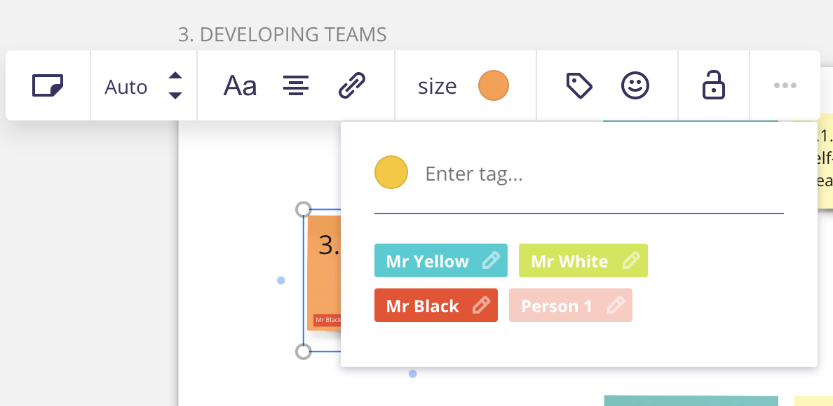
Unless it’s really important that the participant is identified, I prefer to let people explore their sticky colours. However, if needed, I’ll ask them to write their names in the sticky notes with their answers. Alternatively, there’s a way to tag a group of sticky notes with names. You can prepare this before hand.


Here is the Miroverse link to the classroom template:

https://miro.com/miroverse/category/miro-experts/classroom-layout-for-training-and-workshops/


Hey! Where can I find a link to duplicate this board: 


I found it a great demo example for non-Miro users. 


Hey! Where can I find a link to duplicate this board: 


I found it a great demo example for non-Miro users. 

Hey @meloffbird thanks for the interest, this board isn’t to be duplicated. You may however wish to check out @Kim Roth Howe’s Miroverse template which is similar: https://miro.com/miroverse/welcome-to-miro/


Reply