
Open

Miro Community | Attention Tags + Threaded discussion + Compact UI.

  • November 9, 2022
  • 3 replies
  • 45 views

Shayne Smart
Forum|alt.badge.img

This community is a nice clean design, however IME, it’s a lot of effort to get to content due to scrolling and hard to see visual hierachy in replies. I so want to use it, but it’s so painful, it’s reached the point of being worth writing why. 

The forums could be much better with three reviews of the design:

  • Additional (or less) Attention tags e.g. eliminate or resolve “don’t miss” when resolved.
  • Visual hierarchy of replies  i.e. replies to replies.
  • Compact UI for less scrolling i.e. dump white-space and improve layout.

Details in the replies.
3 replies

Shayne Smart
Forum|alt.badge.img
  • Author
  • Active Contributor
  • November 9, 2022

ADDITIONAL OR LESS ATTENTION TAGS

As a user, I should see current attention tags such as don’t miss, so I am not reading outdated information. 
 
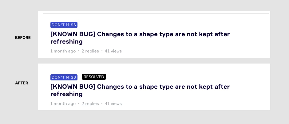
There is currently a don’t miss tag. But then the request is resolved. So now it’s not reallly don’t miss anymore. One solution could be add a “resolved” added, or just replace the “don’t miss” with resolved.

Visual Example


Good practice: Ideally The original poster of the bug notification should be the one to choose if it’s resolved - within reason, some people are just never satisfied ;)


Shayne Smart
Forum|alt.badge.img
  • Author
  • Active Contributor
  • November 9, 2022

THREADED DISCUSSION
 

As a neurodivergent user, I must be able to see the visual hierachy of replies in order to navigate the content hierachy, identify answers and skip repetitive or irrelevant content. 

Today, replies are listed as a big-long list. So tracking replies-to-replies is difficult.

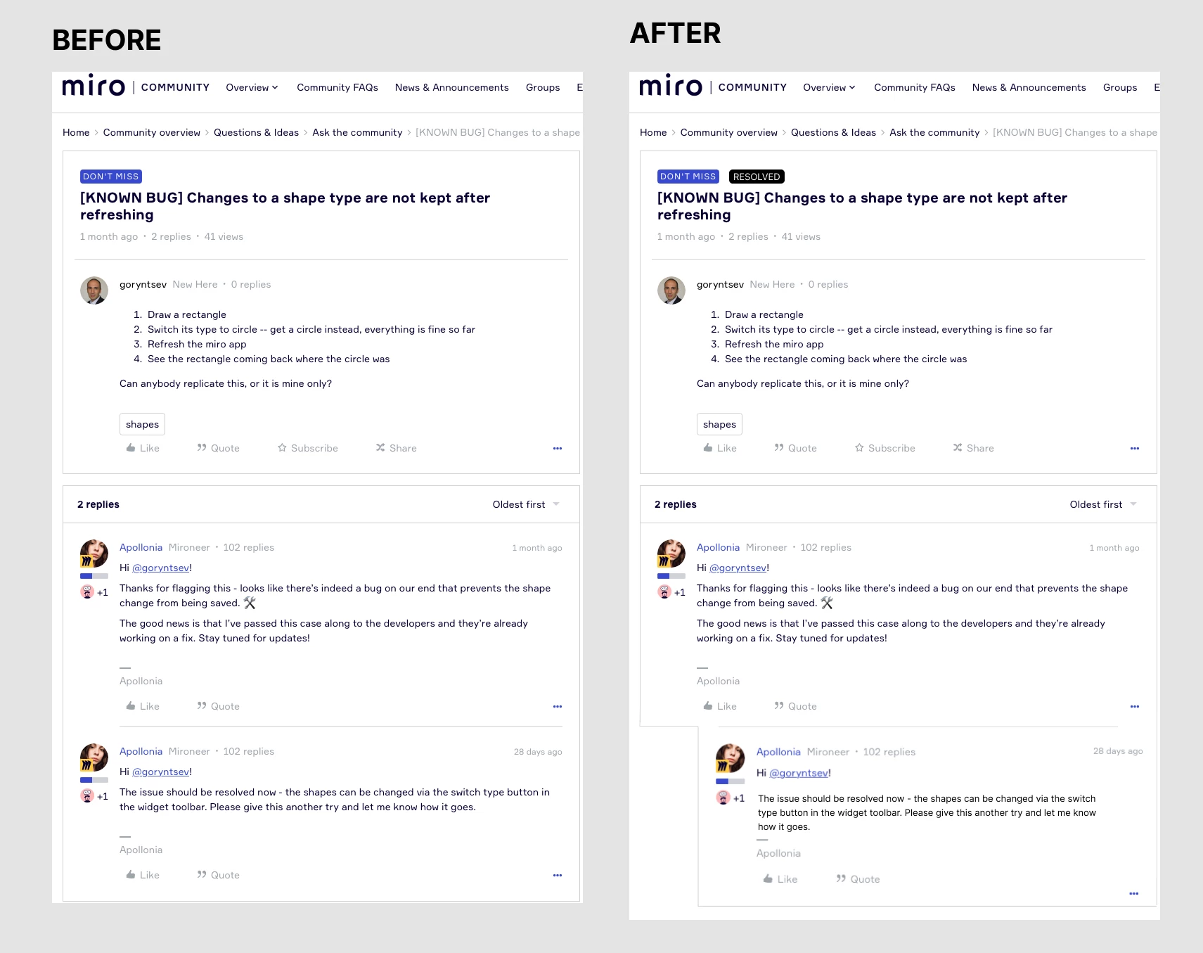
Ideally there would be an additional indenting for replies of replies.

Visual example

Clearly the indentation in this example has a problem, that the indenting isn’t very obvious! The container lines don’t work so well  for indicating indentation

Good practice: We can collapse one, or collapse all replies to replies.


Shayne Smart
Forum|alt.badge.img
  • Author
  • Active Contributor
  • November 9, 2022

COMPACT UI by about 50%
 

Please introduce a “compact” UI setting. Or tell me where to find it! The current UI requires a lot of scrolling, or roughly about 2x as much scrolling as needed.

Think about community forum layout as signal, with noise.
For all the visual noise, community members have to do more cognitive work (effort) to find the content.
 

The signal to noise ratio sensitivity is different for different people, but everyone has a limit. For many Neurodivergent people like myself, that sensitivity is high. This means a little noise goes a long way to rejecting the forums.


Signal is: The valuable content parts we came to read
Noise is: UI elements aligned vertically that can be compacted. Noise is blank-space that can be compacted.
Noise is not:  White space. White is necessary to visually distinguish elements, but a bit too much white space is a pretty website, not a functional community for contribution.


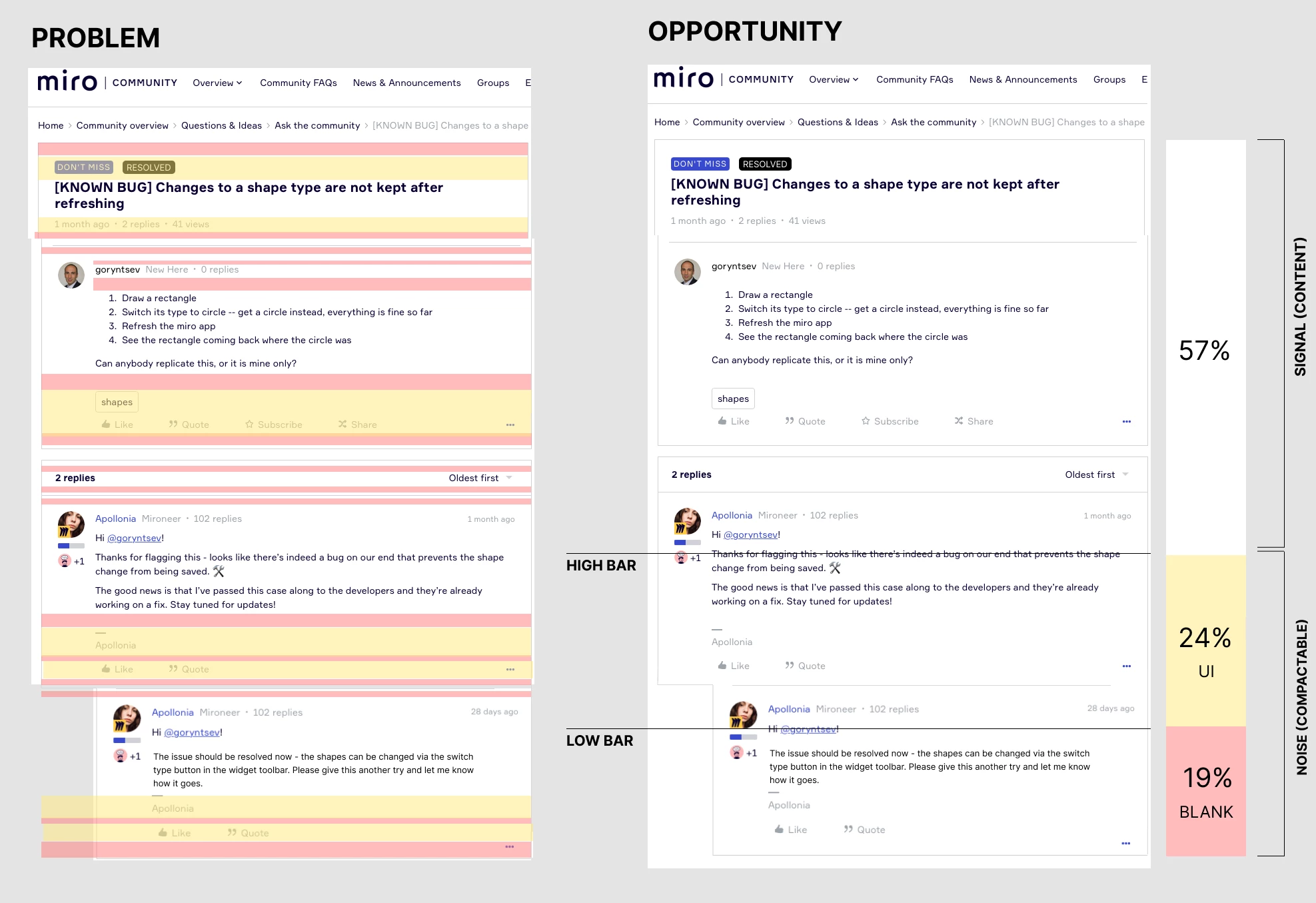
Visual example of the opportunity of compacting.
The PROBLEM shows the noise marked. The OPPORTUNITY shows combining all the lines together is about 45% of the UI could be compacted if a compact mode is offered.

Legend
White = Content, the good stuff.
Orange = UI organised in rows.
Red = Blank.