My specific use case:
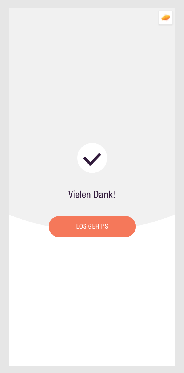
I’m actually creating user flows in Miro and import/sync mobile screen designs from Sketch App to the Miro board. Then I link from each of these synced screen designs to Zeplin (for the developers / measurements etc.) – Experienced this as a quite nice workflow!
Only annoying point: Depending on the view zoom, the link buttons in the upper right corner are quite large and so cover content.
There is actually no way to hide the link buttons (like “hide comments”) to have a cleaner and undisturbed view.
PLEASE add a Hide “Link to” Button function!!!
It is a general problem for several cases (actually all cases of the “Link to”) not just the my mentioned use case above.
Thanks in advance!
Best,
Christoph


