Similar to how Freezing a row or column works in Google Sheets / Excel, I think it would be useful to allow users to “pin” or “freeze” elements in Miro and have content scroll behind / underneath it.


The use case for this is when you have a complicated grid or calendar view, similar to my Resourcing board: https://miro.com/app/board/o9J_koZn4wE=/

It would be amazing to be able to “pin” the dates at the top and have the grid of projects / resources fall under it, so as you scroll down on the Miro board you can be referring back to the week as you get deep into the grid of projects.


+1. This would be amazing. The main limitation I have with Miro is the inability to display all/relevant information when building out content. I often find myself back in Excel so I can freeze vertical and horizontal columns and rows to be able to scroll. 


Following!

Would love this feature.


This would make my use of the board a lot greater! Right now i have to have a small IRL-whiteboard next to our big touch-screen with Miro running to always have the info visible regardless of where you are currently navigated on the miro-board.


I actually think this would be helpful for other use cases than tables/grids i.e. being able to select a section of elements that subsequently remains visible in the view no matter where you scroll to. I see use cases for Process diagrams and Mindmaps, especially when presenting.

Maybe a double-camera concept could be a way to implement it: you selection gets a rectangle second and static viewport around it while the primary one remains movable using scroll, zoom etc. The mentioned case of an excel-like grid can easily be covered by it, as the rectangle would be generated from the boundaries of the row/column to freeze.


Lock horizontal scroll for titles on the right, or vertical for titles on the top would be perfect. Inside of a panel or something like this. I’m using the roadmap template and I miss it so much!


How is this idea doing? This is the ONLY flaw of Miro for my (and my colleagues') needs. Imagine a gigantic User Journey Map table without the option to freeze top row :rolling_eyes: You ar literally lost after scrolling a bit. Other than that it would be so perfect for the purpose! Please do include the freeze option :pray:


I need freeze columns in my life…. please Miro can this be top of the list? 

:pray:


Miro’s Kanban Framework template kind of does that with its first row. Miro could approach grids similarly at least :pray:


We’re doing a concept mapping at the moment and this feature would be GOLD! 


Same need here - would highly value a new tool or feature to Identify a space and then within it.. build out a timeline (x axis)  and scroll vertically (y axis) as you add content below. 

I am building a visual to show overlapping work streams similar to a gantt chart. Issue is as you add projects vertically you soon loose sight of your timeline. If you zoom out the detail can’t be seen and so you need to duplicate the timeline. Issue with this is if you create a frame you might see the timeline twice and its redundant… 


Would love this for the app User story mapping 


A much needed feature.  Actually, would love it by Friday at 2pm for my next presentation :)


I imagine the feature like this

  1. All objects have a display attribute that can be set to either:
    1. Static (the default)
    2. Float Horizontal (holds it’s vertical position relative to the window bounds
    3. Float Vertical (holds it’s horizontal position relative to the window bounds)
    4. Floating (holds it’s position relative to the window bounds
  2. The last position an object is moved to is it’s saved or statically set position on a canvas.
  3. There are two modes, static and floating. 
    1. In static mode, all objects are positioned at the saved or last statically set position on the canvas. 
    2. When entering floating mode, all objects follow their display attribute. 
    3. Returning to static mode returns all objects to their saved or last statically set position on the canvas.
  4. In floating mode, you can only change the positions or size of objects that have a display attribute set to Static

In this way, and assuming that a “group” is implemented as just another object, to create headers that float vertically or horizontally, on could simply group either vertical or horizontal headers, set them to the display attribute to the proper value, and upon entering float mode, one could pan over the canvas with headers in position.


Yes please!!! (:


I just discovered Miro this week. I am blown away by how amazing it is.  This is the only feature I’m missing so far.

My use case: I’m doing a road map.  I’d like to be able to scroll to the right but keep the row headers visible.


I would love to see this too. I have a wide table (an event model) with swimlane headers in the first column that I need to keep visible as I scroll to the right. 


Desperately need this feature. Is it on the roadmap? When would it be released?


My team and me would really appreciate this feature. We use Miro as a game board with some clients. The only problem is that we can’t lock people in a particular area of the Miro board. So, it would be interesting for us to be able to freeze a frame instead of a column or a row. 

Thank you!


Talking about this now. Definitely need. If a table gets bigger than what fits in a single view on my screen, then I have to go back to column headers and row index for reference. It’s annoying. 


It is remarkable that this feature has not been implemented yet. Such an obvious improvement.


+1 on this feature!


Freeze will be a very powerful feature - and as said before - an obvious one :-)


This would be incredibly useful and encourage larger teams to embrace the software.

KanBan seems to do this automatically as the top row ‘freezes’ as you scroll down ... it seems entirely reasonable that MIRO can build this into other features and give users the control over floating/frozen panels.

Right now there is a usability barrier when it comes to creating big taxonomies and ideation structures, zooming in...out…in...out...in… to avoid getting ‘lost’ really disrupts navigation and workflow!!

I’m enjoying the software, but I’d love to LOVE IT. 


I have managed to do something like this. It isn´t the simplest thing, but it works.

You can use the kan ban teamplate, eliminate all rows but one, rename it to te column name you want and set it behind your table. 

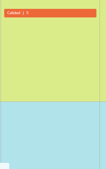
This is how it looks when you scroll:

note: kan ban displays the number of items you have per column, i have created the items i need in each column to show the column number.

table when you scroll


I support the idea as described, this would be super great!

Maybe a “smaller” version would be to have this working just for the table component.


Yes please, without it I can;t move so much of the items I work on to Miro and stuck in excel.

please please please.

As a User, when a table is added the first row or column can be selected and be frozen. When the user scrolls vertically or horizontally this selected row/column row remains is visible