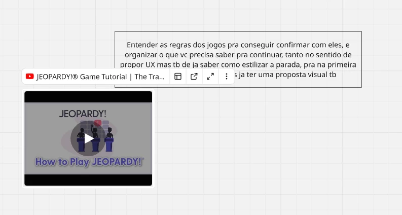
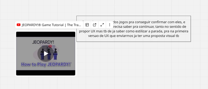
I love you Miro, but you did something like some months ago which I cant understand.
Before, we used to put links there and they would stay there as an image, youtube videos as playable, and it was amazing.
Then you added that bar on top, that keeps changing size, getting on top of other stuff, causing missclicks and looking horrible. All buttons there and everything that bar allows us to do.. I dont think are necessary, could all go to a right click menu :(
At least give us a way to disappear with that thing in the settings, not individually like clicking on each to hide, just for making it go forever in the interfaces of those who like me, cry everyday because of that bar.
Thanks!