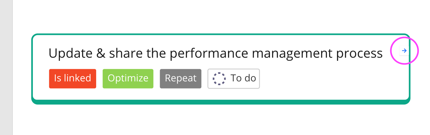
It would be great if we could change the look, size and position of the “link” button when you link two objects together in Miro (look at the small arrow in my pink circle; isn’t very visible or user friendly, so hard for team members to find or understand; I had to add a tag to the card to make it evident that they need to pay attention to it). Thanks!