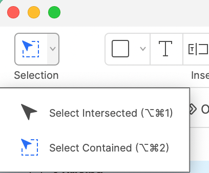
@Christine Power - I agree. If it helps, I learned in the following thread that you can hold down the mouse button until the cursor changes to a crosshair and then objects will only be selected when they are fully enclosed in the selection box/lasso:
https://community.miro.com/ask-the-community-45/is-anyone-else-struggling-with-the-changes-to-the-select-functionality-6788?postid=28803#post28803
After the change, the default behaviour should have been as it was before, with the new behaviour requiring a long hold.
P.S. Do vote for your own idea
Can't agree more. The new selection behavior is a productivity killer.
The default should be to only select the contained objects, as that's your natural intention. Why would you make that selection - instead of a wider one - otherwise?
If anything, please make it a quick toggle - like the mouse or trackpad option - so we can get back to working efficiently.
@Ben Majer here the intention for this change is written:
Selection of sticky notes, shapes, text, emojis, frames, and lines is now much easier because we allow to select them when the lasso is touching only ~1% of the object
The updated selection behavior may not be working for you as expected if you use shapes as background for other board objects (for example, text).
https://community.miro.com/ask-the-community-45/is-anyone-else-struggling-with-the-changes-to-the-select-functionality-6788?postid=28803#post28803
@Lena Shenkarenko From my perspective also the 99% case is that I want to select only the contained elements and not the intersecting elements. Because often there is a shape in the background. For example on this template. So the current behaviors is suboptimal for me as well.
@Robert Johnson I wasn’t aware of this – thanks for linking to the post, great advice!
I find the long-press interactions (a) not obvious enough if you if don’t already know about it and (b) more fidgetly / friction-filled than I like, and (c ) too many common/frequent interactions are using long-pressa.
Re: object selection, let’s have an easy and obvious toggle in the settings or mechaism like Ben M. suggested above.
In the vein of consistent behavior and avoiding the extra effort and time of the long-press: why is “lock” an object in the contextual menu but the unlock is a long-press on a popover that you have to trigger with a click action first?!! Why can’t un-lock just be a click of the icon in the contextual menu, same as you locked it?! It would be faster and easier than click > mouse over to whatever place the “long press to unlock" appears on screen > long press > mouse back to the object you were intending to interact with.