
Hi there, I’ve been using MIRO for about 4 weeks now, and I was wondering if anyone has tips on design best practices when it comes to balancing text size, to frame size, to zoom ratio? (if that makes sense)
- Home
- Community overview
- Inspiration
- Inspiration and connection
- Board Design Best Practices
Board Design Best Practices
- June 2, 2020
- 22 replies
- 15591 views
22 replies
 +4
+4- Miro Hero
- June 2, 2020
Hey
This could be a frame with many slides in them or a frame with an engagement space.
My rationale is that the board can be zoomed in up to 400%.
 +7
+7- Volunteer Community Moderator
- June 2, 2020
I like to use type face as the “anchor” to drive the size of everything else. As we export our boards for participants after our classes, I find a type face of 24 works well for most “body text” and that then naturally drives the size of other objects.
Kiron
 +1
+1- Active Contributor
- June 2, 2020
Hi
 I second the advice to start with a font size of 24. I used to start with 12, but there is a minimum font size. So when I want to make smaller “superscript” notes, it’s much better to start with 24 as the typical size.
 Something else I have learned after a few years in the platform is that I encourage change. It’s okay to start with something (a template, a timeline, chart, colors...) and not expect it to look like that forever. It’s easy to make changes as you learn what works best to visualize and plan.
 The side-bar menu can be customized with apps/option you want. If you have added more apps (from the … ellipses) you can click/drag onto the side-bar for quick access.
- Active Contributor
- June 5, 2020
Hi Jenny! i have only been using Miro for about the same amount of time as you, but I have settled on my own answer to this question that might be helpful.
I mostly run synchronous online workshop meetings, and my participants mostly use sticky notes to interact with my board, rather than any of the deeper or more structural tools that we use to design boards. The sticky notes have 3 automatic pre-sets for size… they can be S, M, or L. So, I size everything around working with the M sized sticky notes for group work, and S sized notes for individual work, and occasional L sized notes for attention-grabber points.
+6- Miro Hero
- June 5, 2020
This is a great discussion. Glad you asked it
Great suggestions by others!
Its funny, just an hour ago a new user (he’s like ~2 weeks in to using Miro) asked me the same.
. . .
The one place where I feel like Miro currently stumbles for me WRT zoom … is on flow charts or anything involving arrows at low zoom % levels (zoomed way out).
- You can resize text to get it larger and visible when zoomed out.
- But arrows max out at what looks like 32pts (relative to text).
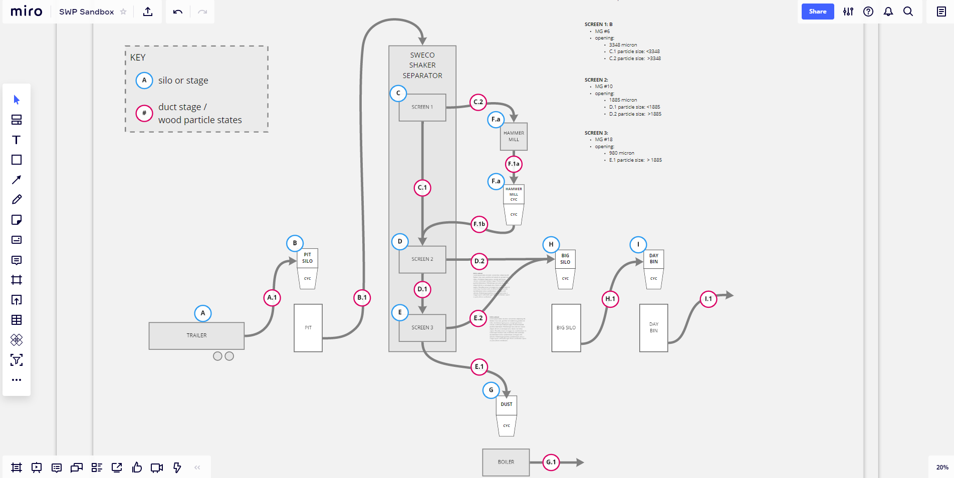
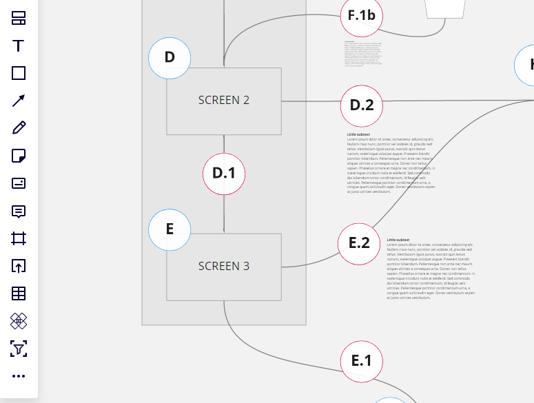
BIG PATHWAY FLOW CHART EXAMPLE:
Say you want a... “big pathway” type flow chart using lines/arrow… and you want to be able to read text at each station (node) along that pathway. And you want to see the arrow heads because thats critical to understanding which way the flow is going.
Good Method:
Ex: first image below. The zoom level is 75% and the arrows are at Max thickness
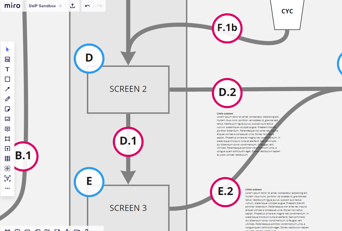

Whole board/frame looks like this at 20% zoom: some of the major stations on the pathway have text that is legible, but the smallest font in the middle is illegible without zoom in. What’s important to note is that the lines are legible… they have A) weight - they convey the structure legibly at this viewpoint, and B) legible arrow heads.
Bad Method:
Compare the above to the flow chart below, which was made to fill the screen at 4% ( this would ostensibly be a scale I might choose in order to preserve many more levels of zoom-in detail.)
Notice that the pathway stations or node titles ARE still ~legible. *** but *** the arrows no longer have visual weight and their arrow heads can no longer be seen, so the directional ‘flow’ logic is lost.
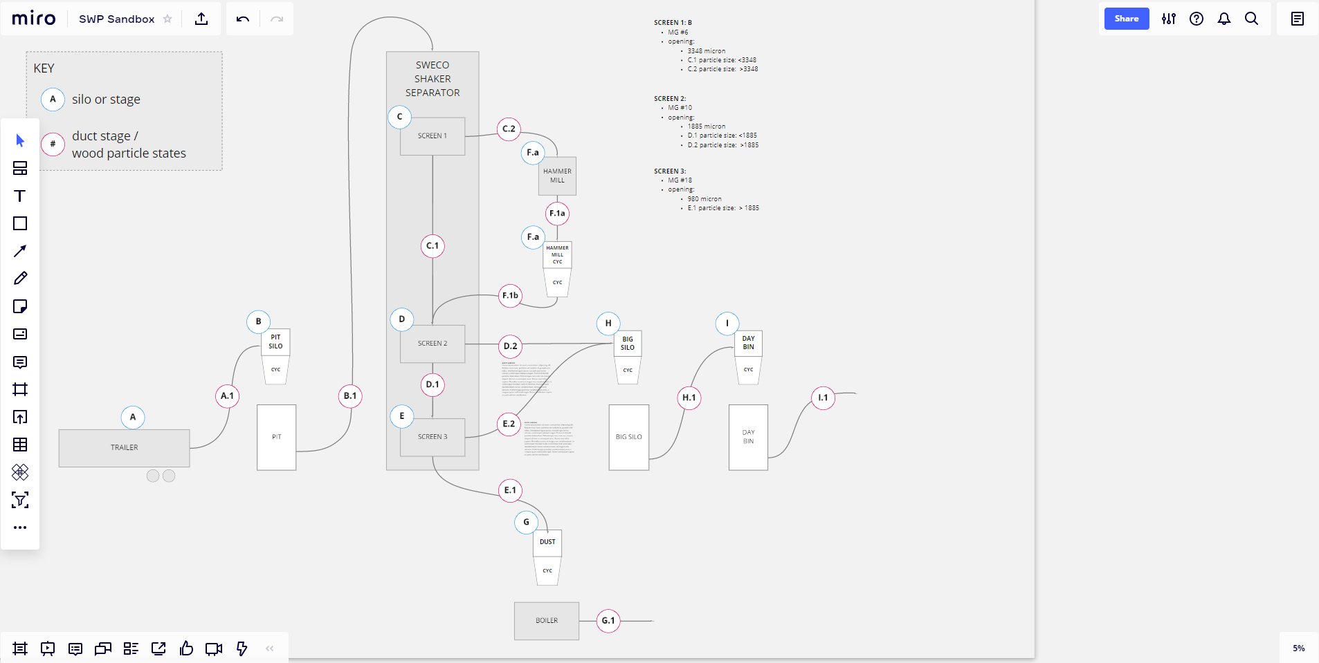
So -- where does this leave us?
Suggestion:
If making a flow chart, I recommend keeping the whole chart visible within a screen at a minimum zoom of 20% ( 20-100% is a good range).
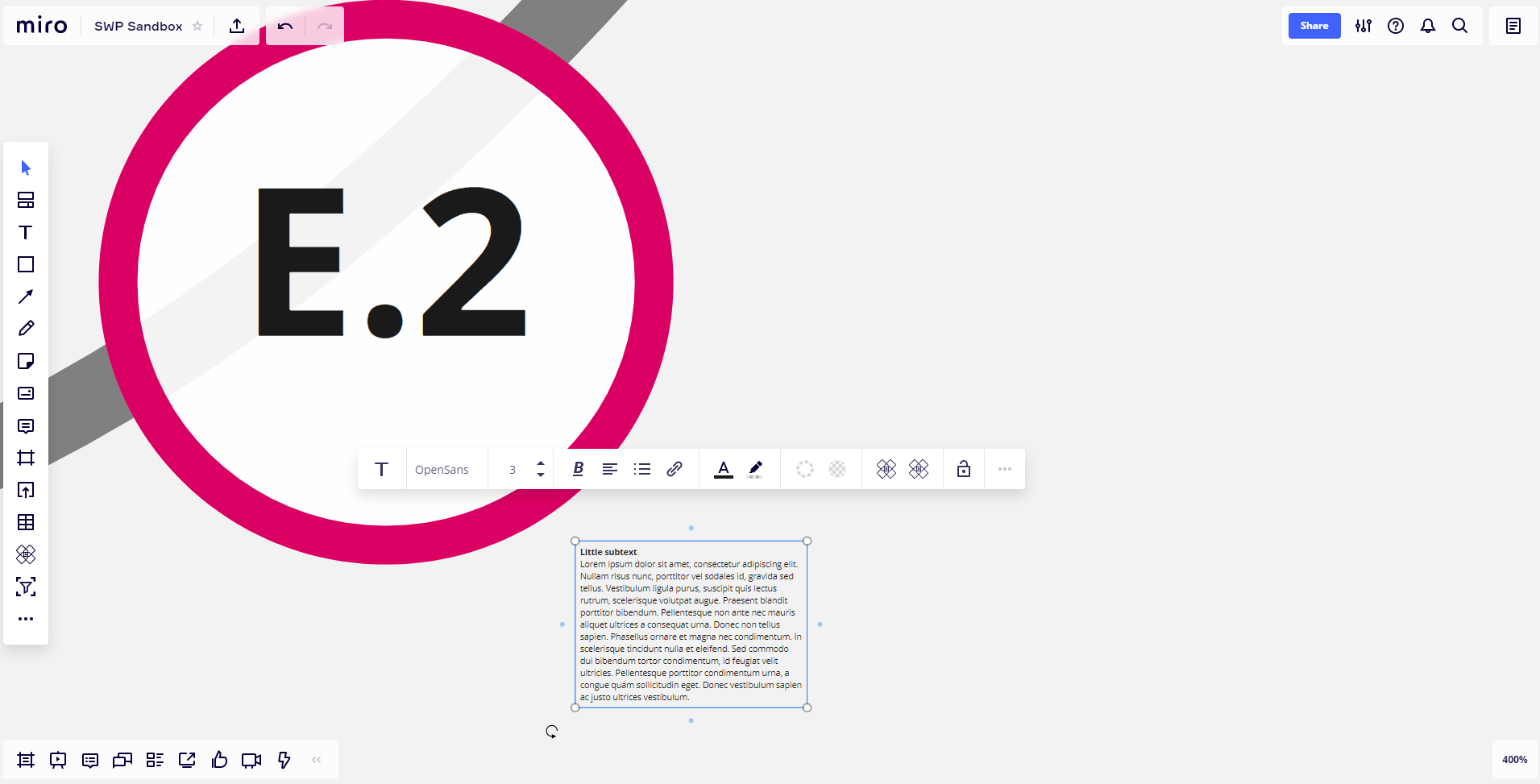
This still leaves plenty of zoom-in (up to 400%) and low-level detail ‘small’ text can be re-scaled down to illegibly small. Here is the first example again:
- zoomed all the way into 400%
- the pathway line is max thickness and
- the text is 3 pt.
Think visually. Work brilliantly. || visualthinking.tools || Creators of 'PowerPack', 'Clusterizer' and 'Totally Random' Miro Apps: || max@refractivestrategy.com || Support Community Miro Plug-In Creation: https://www.buymeacoffee.com/refractive
+4- Miro Hero
- June 8, 2020
Hi Jenny! i have only been using Miro for about the same amount of time as you, but I have settled on my own answer to this question that might be helpful.
I mostly run synchronous online workshop meetings, and my participants mostly use sticky notes to interact with my board, rather than any of the deeper or more structural tools that we use to design boards. The sticky notes have 3 automatic pre-sets for size… they can be S, M, or L. So, I size everything around working with the M sized sticky notes for group work, and S sized notes for individual work, and occasional L sized notes for attention-grabber points.
I have never thought of this,
- Beginner
- June 11, 2020
Hi!
I think it depends on what are your needs. For example, in some workshops I have 3 teams and I create only 1 frame for the 3 teams of course each time has a square with their activity but all 3 squares are in the same frame. This because they can just open the frames view and go directly to the correct exercise.
On other cases I just have to create a frame for each activity because I only have a team on each board.
When I create frames, I always try to use the same size. Find the size that best fits you’re needs and be consistent to it. Even you can create a template with the size and maybe your logo or whatever info you will try to add.
Hope this contribution helps :)
+1- Active Contributor
- June 12, 2020
That is a good idea to create your own template
 +9
+9- Experienced Community Member
- June 13, 2020
Made the same experience as
I prefer to work with stickies in combination with arrows and shapes.
So to see the arrow endings and the edges of the shapes you have to zoom into your canvas.
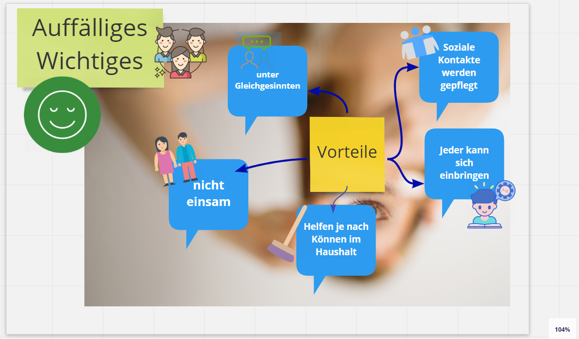
So at the beginning i add pictures zooming into my canvas to 100% and adding arrows and anything else.
So for me the best to zoom nearly to 100 % (or a bit more or less)
Adding everything I need to have so I am able to work with arrows, stickies and shapes combined:
Michael
+1- Experienced Community Member
- August 15, 2020
Thanks
But at the same time, I tend to imagine new details later and may want to add onto the training map by adding other sections so that the training map would be supplemented with other training related areas, such as training logistics, participant or facilitator criteria, etc. so then I might find myself wanting to zoom out from what was my level (1) to a level 0.
So is there some kind of Scaling Guide that would help with scaling? For example, how many levels can fit in if you take an A4 sized frame paper and zoom out until it’s a thumbnail size on an A4 frame, zoom out again until that is again a thumbnail size, and zoom out again until that is thumbnail size, etc. That would help in planning which level of magnification to use for the base level.
Maybe a Scaling Guide is a feature request.
+1- Experienced Community Member
- August 16, 2020
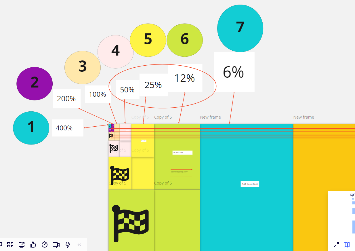
My curiosity got the best of me and I had a bit of extra time; I decided to figure out the minimum and maximum scale of an A4 size frame, by doubling the width each time beginning at a 400% zoom. It doubled 12 times on my desk screen. I found that to my liking I’ll likely start the “home” view between 12% and 25% zoom. This will to allow me to zoom in two levels and out a level or two. But when zooming in beyond 200% and out beyond 3%, and the usefullness of features like arrows and text declines.
+6- Miro Hero
- August 16, 2020
I think you’re onto something here. Maybe a few more layers of information and use case consideration and this could become a sort of “best practice guide for sizing, scale and layout”
Gonna spend more time looking at your board :)
Think visually. Work brilliantly. || visualthinking.tools || Creators of 'PowerPack', 'Clusterizer' and 'Totally Random' Miro Apps: || max@refractivestrategy.com || Support Community Miro Plug-In Creation: https://www.buymeacoffee.com/refractive
+1- Experienced Community Member
- August 17, 2020
I think you’re onto something here. Maybe a few more layers of information and use case consideration and this could become a sort of “best practice guide for sizing, scale and layout”
Gonna spend more time looking at your board :)
- New Here
- August 27, 2020
- Miro Hero
- September 20, 2020
This is SO helpful!
Further, I often print people’s boards to pdf for them to have their own hardcopy of our experience together. I struggle with having the text readable AND the images clear and not have to do editing in the pdf for overall size.
I would love to create my frames to the same size as a typical pdf output: 8 ½ x 11 or 11 x 17, but I seem to be unable to have a consistent printable output.
Is there a frame you use for consistent pdf output?
Thanks!
Marne Maykowskyj, MSOD, Integrative Enneagram Accredited Practitioner, Certified Fearless Organization Practitioner
+1- Experienced Community Member
- October 5, 2020
I tend to start my “home screen” with a 16:9 shaped frame to fill my laptop screen at between 20 and 25% so that I can scale up and down, because my frames have frames with content inside them. I wouldn’t usually go two frames deeper, but do find that I start adding other frames to my home screen making the full map quite bigger.
I find that consistency is quite important for workshops, pick a frame size for most content and stick with it.
- Contributor
- December 3, 2020
Hi everyone, having read all of this, I still have a question.
Why would you not create your ‘home screen’ (e.g. a list of ‘menu options’ that link to other parts on the board) to be readable @ 100%?
Same question for other ‘exercises’ on your board. When would you not want them to be readable at 100%?
Is the main thing to make the different part of your board the same size, so that you don’t have to zoom in and out as you navigate the board?
Thanks
Bennie
Cape Town
+7- Volunteer Community Moderator
- December 3, 2020
I’d agree - as much as possible you want to avoid the need for folks to be frequently zooming in or out. It’s one thing if they have to zoom in at the beginning but after that it should be zoom-free as much as possible.
Kiron
Kiron D. Bondale, PMP, PMI-ACP, PSM II, ICP-ACC, DASSM, DAC, DAVSC, PMI-RMP
- Beginner
- February 4, 2021
The length and imprecision of this thread reveals a serious problem. I’d like to get the communication to possibly be more precise by asking the Miro staff one question: “Despite users’ freedom to do whatever they want, is it, or is it not the intention---and wise use---of such a system, that when you set the viewing zoom level to 100% that you would see objects scaled themselves to their authored resolution (which I call ‘100% scale’ unless someone can educate me)?” In other words, if you paste in a mockup of a screen portion that is 400px X 300px, and you zoom to 100% in Miro, the mockup appears at its authored size occupying 400x300px???
I think I’ve figured out the problem, at least so far as people complain about ‘pasting things in and being too small’ and similar confusions. I had this confusion when asked to contribute screen captures to someone else’s boards. Here’s what I think is happening, presuming that Miro does NOT in fact do any automatic or errant zoom changes, nor does it use some ‘smart’ logic to interpret paste-resolution:
Images such as screen captures are always pasted in at 100% scale. But my prior author probably didn’t notice that because they had a zillion things in their board, their zoom level was down to 1%. So after pasting, they couldn’t resist the temptation to manually resize (rescale) their newly pasted image so they could see it… WITHOUT doing the right thing, namely zooming in. So then they start having greatly enlarged content items, which, when setting to 100% zoom, look grotesquely large.
+6- Miro Hero
- February 4, 2021
You’ve honed in on it. Here’s a very related, in depth response I gave in a similar thread here:
-- pasted in here --
You’ve probably made a marvelously expansive board and are zoomed out far and are/or importing something small.
Being zoomed out really far will be the challenge here… for most working/reading spaces assume the zoom level at 25-100% is going to be best … I believe that’s a reasonable zoom level to receive images from the google image integration. But don’t be daunted by creating vast boards with many layers/levels of detail… just know that as you do, some of the Miro interface assumptions (image size on import) will become more of a challenge you need to look out for.
Possible helpful way to think about it: You may want to think of it as: at 100% zoom, a Miro board ‘pixel’ is 1:1 with your screen’s pixels / an image file’s pixels. With that in mind... the logic used as Miro first places an image is to size it such that at 100% zoom the image will appear exactly as many pixels (w/h) as you’d expect and fill up the approx amount of screen space. If screen is 2000w and image is 1000w and Miro zoom is 100% the image will fill half the screen. If you imported that image it would be hard to miss at 100% zoom. But if you import it at 1% zoom it will look 100X smaller=> 1/200th of the screen.
TMI: As you size up or down an image and zoom in and out of it, it will resolve dynamically ( you may see images temporarily re-rendering to different levels of detail… the effect there is that if you brought in a, say, wallpaper image that is the exact pixel dimensions as your screen: 1) no matter what size you make it in Miro, when you zoom to the point that it fills your screen, it will look good ( not pixelated ) 2) if you zoom in beyond that point the image will begin to look pixelated. Also, if you import a small image 16pxX16px png icon for example, it will act and appear like 16 px of screen at whatever size you resize it and will look pixelated if you zoom in beyond its screen width spanning 16 px. Lastly, a high-res image, larger than your screen size, can provide an unpixelated image ~’landscape’ on your board that you can zoom into without it looking pixelated.
Side Note: As you might expect: This logic is actually handled differently for SVG’s.
Tips for Placing Images:
If you’re using the Miro-integrated Google images plugin: it places the item in the exact center of your viewport ( the center of your current location over the board ). So move yourself somewhere in the board where the arrival of that image will be visible and not confounded by other objects. If you don’t see it… use the click drag “lasso” select to select it. Zoom in to the exact center of the place you imported it.
If you go to Google Images the website and right click and “copy” an image (or have any image from your computer (a screenshot for example) on your computer’s clipboard)) and return to Miro and paste it into the board with ctrl+v(win) cmd+v(Mac) it will paste NOT in the center of the viewport/canvas location but it will place the image wherever your cursor is over the board. This is a super helpful bit of logic as it allows you to pinpoint where you want images to land ( but it also throws miro users until they know its happening -- threw me for the longest time when I was doing as you are … importing into a vast board at low zoom (>1%) ).
If your board is too big and you’re too zoomed out needlessly:
I occasionally find myself sometimes building a board too large to start and end up at really low zooms (zoomed way out) and I’ll: unlock everything, select all, and resize everything considerably, then readjust/ double check that line width and shape strokes look ok ( as they are the only two things that don’t scale down in that event).
Happy imaging :)
Think visually. Work brilliantly. || visualthinking.tools || Creators of 'PowerPack', 'Clusterizer' and 'Totally Random' Miro Apps: || max@refractivestrategy.com || Support Community Miro Plug-In Creation: https://www.buymeacoffee.com/refractive
- Beginner
- February 5, 2021
I’ll state the following as facts/directives and allow the Miro folks to correct where needed:
- Unless you are using a special plugin (such as Google’s) Miro pastes images where the mouse cursor is.
- A reasonable goal for your boards is that when the Miro zoom is set to 100%, that images---especially designed layouts and mockups---render at their authored size… at 100%. This is a nice convenience, but you certainly can use Miro however you wish.
- Miro always pastes pixel-based art (not SVGs for instance), at 100% scale. In other words, it does not do anything differently---it does not apply special logic to adjust an image’s size or pixels-per-inch---just because Miro might be zoomed all the way out to 1%, as can happen when your board has a lot of content.
- As a beginner, it is best to NOT resize images if they appear too small after you paste them. Instead, look at your Miro zoom level; is it a small number relative to 100… is it under 30%? That’s why your image is small; you are zoomed out incredibly far to encompass the whole board. Zoom to 100% and check that your image looks “as authored or captured… that it looks to be 100% scale.” Then zoom back to perhaps 70% and continue working.
+6- Miro Hero
- February 5, 2021
@jack -- I agree fully - well put, and simply - » with one addition / reminder.
As a beginner progresses I’d encourage them to explore and exploit the unique and awesome capability of creating Miro boards that can be appreciated at a wide range/fluid continuum of zoom levels. This allows their information space to be multi-layered/leveled in detail and allows fluid traversal and connectivity between each level. This multi-level of detail is not a fit for all use cases, but its definitely a very unique value proposition of using Miro over, say, Powerpoint.
This is a persistent presentation problem with other media like Powerpoint… levels of detail are static and not fluidly traversed. The audience for such presentations are then not gifted the powerful cognitive leverage of spatial memory … a concept in Powerpoint is dissected and presented in a discontinuous series of vanishing snap shots(pages). The spatial/conceptual relation and proximity of information is re-parsed at every snap-shot/page.
This is all to say -- if a user is presenting a conceptual space that has many levels of detail … I’d encourage them to feel free to zoom images up to be visible at low zoom levels. And even then… I’ve found that a good range to stay in, for overall workability, ( IMHO ) is 25-200%.
Think visually. Work brilliantly. || visualthinking.tools || Creators of 'PowerPack', 'Clusterizer' and 'Totally Random' Miro Apps: || max@refractivestrategy.com || Support Community Miro Plug-In Creation: https://www.buymeacoffee.com/refractive
Log in to the community
No account yet? Create an account
Log in with your Miro account Login with Token
Enter your E-mail address. We'll send you an e-mail with instructions to reset your password.