For a user story template, how can I edit the text size and font?  Particularly the font size of what is titled “release name” - it is so tiny it’s unreadable (this is a UX accessibility issue and a significant one) and requires constant zooming in to see what that layer is.  Moreover it’s almost impossible to present this on a zoom call or google meet call because that shrinks it even more.  It would be OK if this could be changed/edited but that doesn’t seem possible.  I’ve looked at the tutorials and they show an outdated way of editing text that would apply only to text that one is creating from scratch (the menu the tutorials say will come up, has been changed btw) https://help.miro.com/hc/en-us/articles/360017572094-Text.  The editing template tutorials also don’t show a way to fix. this, they’re focused entirely on editing existing fields and sharing.  

I’m pretty frustrated. 

Hi there, Scott!

I’m sorry to hear that this has been a frustrating experience for you and I really hope I can help here! I am not 100% sure what template you are referring to but if you are talking about the one called “User Story Map Framework” I’m afraid it is not possible to format the text in the cards (other user story template also include text fields were the text is editable, of course). If it is, could you please provide us with some screenshots? We would like to try and find out how to make “release name” bigger and easier to read!

Another tipp from our side would be to enlarge the size of the individual card. Also, keep an eye on the zoom level on your board - we usually recommend working on a zoom level of 100%. It might also be worth a shot to add the template to your board and then to set zoom level to 100%. 

I hope this helps! Happy whiteboarding! :rocket:


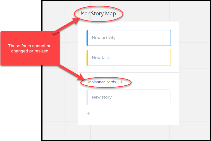
@Scott Maloff - As @Eva27 states, if you are referring to the User Story Mapping or Kanban frameworks, you cannot change the font type or size.


@Robert Johnson, yes those are the fonts that I was referencing.  I kind of knew that there was no way to change them after spending a lot of time trying to figure that out.  BUT…… that doesn’t mean that it should be this way!!  I think I made some valid points as to why it needs to be changed on Miro’s end - please put it into Jira or whatever system you have and label it a high priority feature request.  Accessibility alone is a good enough reason, but the notion that it’s incompatible with Zoom calls turns what should be a very helpful visual aid into something with significantly diminished value.  


@Scott Maloff

please put it into Jira or whatever system you have and label it a high priority feature request. 

I do not work for Miro and therefore do not have access to their backlog. Instead, if you would like to see changes made/have a feature idea/etc., I would suggest that you post in the Wish List category, so others can upvote your idea.

If would be helpful for both other community members who may wish to upvote your idea, and for any Miro product team members viewing your post, if you were to use screenshots (or video - Loom is free, quit easy to use, and very easy to share a video) of exactly what you are looking to change, the issues you are currently facing, etc.

Creating a Wish List post

Guidelines here: Wish List: Everything You Need to Know.

If you do create a Wish List Idea post, I would also recommend that you post a link to it back here, so that future readers of this post can quickly get to and vote for your Idea.

Lastly, don't forget to vote for your own Idea.

My experience with User Story Mapping

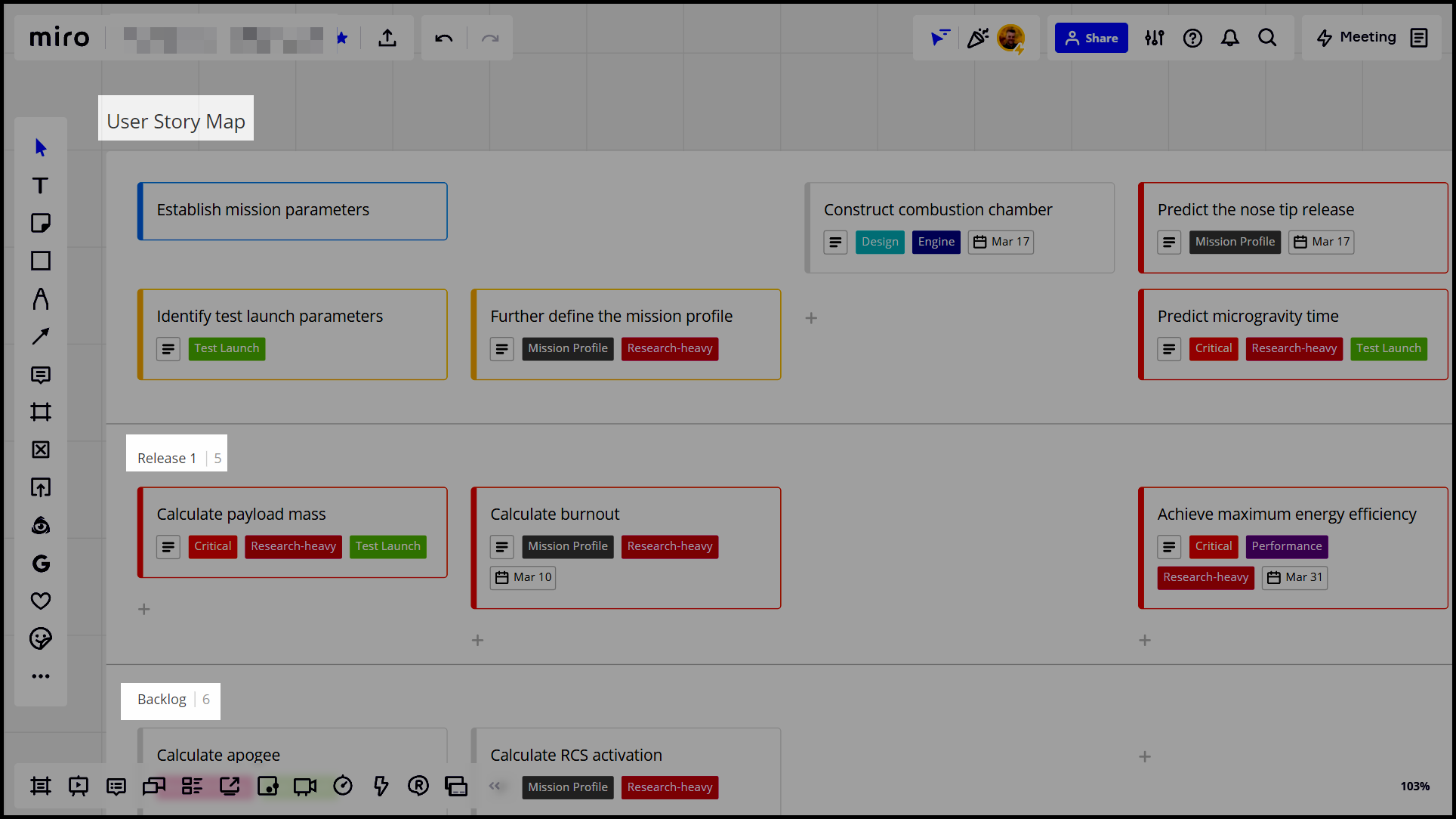
For myself, our team has been using the User Story Mapping framework over screen share (MS Teams) since the pandemic began without and complaints that it is too small. However, I do know that it is quite easy for participants in a MS Teams call to zoom in (the user can use Ctrl+wheel on their mouse), so perhaps some are doing that - I can’t speak to Zoom.

Here’s an example of what I see I have my board set to fullscreen (on my laptop) which is how I then share Teams:


Feedback on Help Center articles

I’ve looked at the tutorials and they show an outdated way of editing text that would apply only to text that one is creating from scratch (the menu the tutorials say will come up, has been changed btw) https://help.miro.com/hc/en-us/articles/360017572094-Text

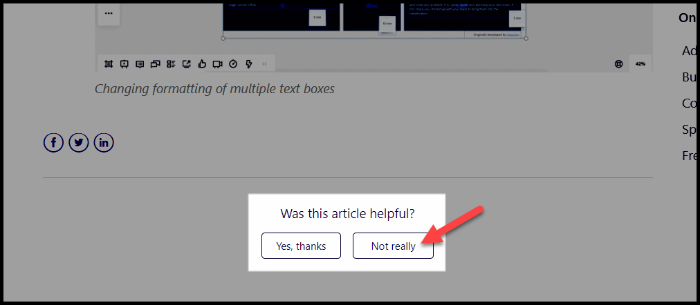
I have been assured that someone is reviewing feedback submitted via the buttons at the bottom of each article:

If you come across anything that looks out of date/incorrect/etc., it would be helpful if you were to click the Not really button and let Miro know.


Sorry @Robert Johnson - I’m new to Miro so please forgive my mistaking you for a Miro person.  I’m used to Adobe and their forums where an Adobe person (if one is lucky) will respond to a posting.  I sincerely appreciate your help and again apologize for mistaking you for someone at Miro! 

As for Miro the lack of feedback loops, updating their online materials regularly and aggressive-willingness to interact is just baffling.  


Hi Scott and Robert!

Scott - we’re really sorry for the time we kept you waiting! We are immensely busy at the moment and try to answer every question one after the other. I do understand how frustrating it must be waiting for a reply when something is impacting your work performance! 

We also use Miro in combination with Zoom calls and have not had any such issues but we absolutely want to make sure that you are able to use it as efficiently as possible - to that end, could you provide us with some screenshots or even better a GIF of when the text is too small during a Zoom call?

And Robert is absolutely right about our Wish List - it would be great if you could post your idea here as I haven’t found a similar request in the Wish List so far. 

Here you’ll be able to:

  • Submit your ideas
  • Discuss possible workarounds with other Miro users
  • Upvote the features you’d like to see in Miro (Each month, ideas with 100+ upvotes are reviewed by the Product team)
  • Subscribe to email updates when a new topic is added to stay in the loop

With regard to your Help Center feedback about the outdated screenshots of our text editing tool, I’m embarrassed to say that I feel rather silly - I reproduced every step on the article you mention and couldn’t find any difference… Would you mind pointing out to us exactly where you spotted a screenshot of an outdated version and I will be happy to pass your feedback on to our Help Center manager! We’re always grateful for feedback that helps us to get better and as Robert pointed out, we do value the feedback you leave through the Help Center feedback button at the bottom of each page!

Robert - a MASSIVE thank you for sharing your knowledge and experience!

I’m looking forward to hearing more from both of you!


I completely agree.
The small font and wide width cause very few things to be displayed and legible.
To a point where it’s useless - Miro tool is supposed to help grasp visually significant portion of information.
Well, here the font size kills Miro tamplate if not whole Miro entirely.


Reply