"Comments" changed in design

  • 28 September 2023
  • 4 replies
  • 62 views

I am using Miro for a research study. 

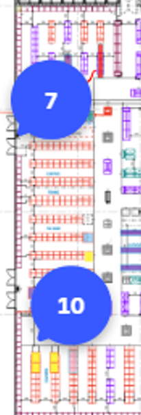
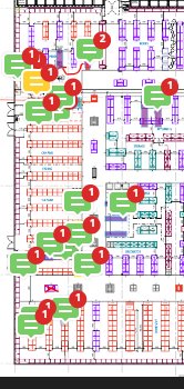
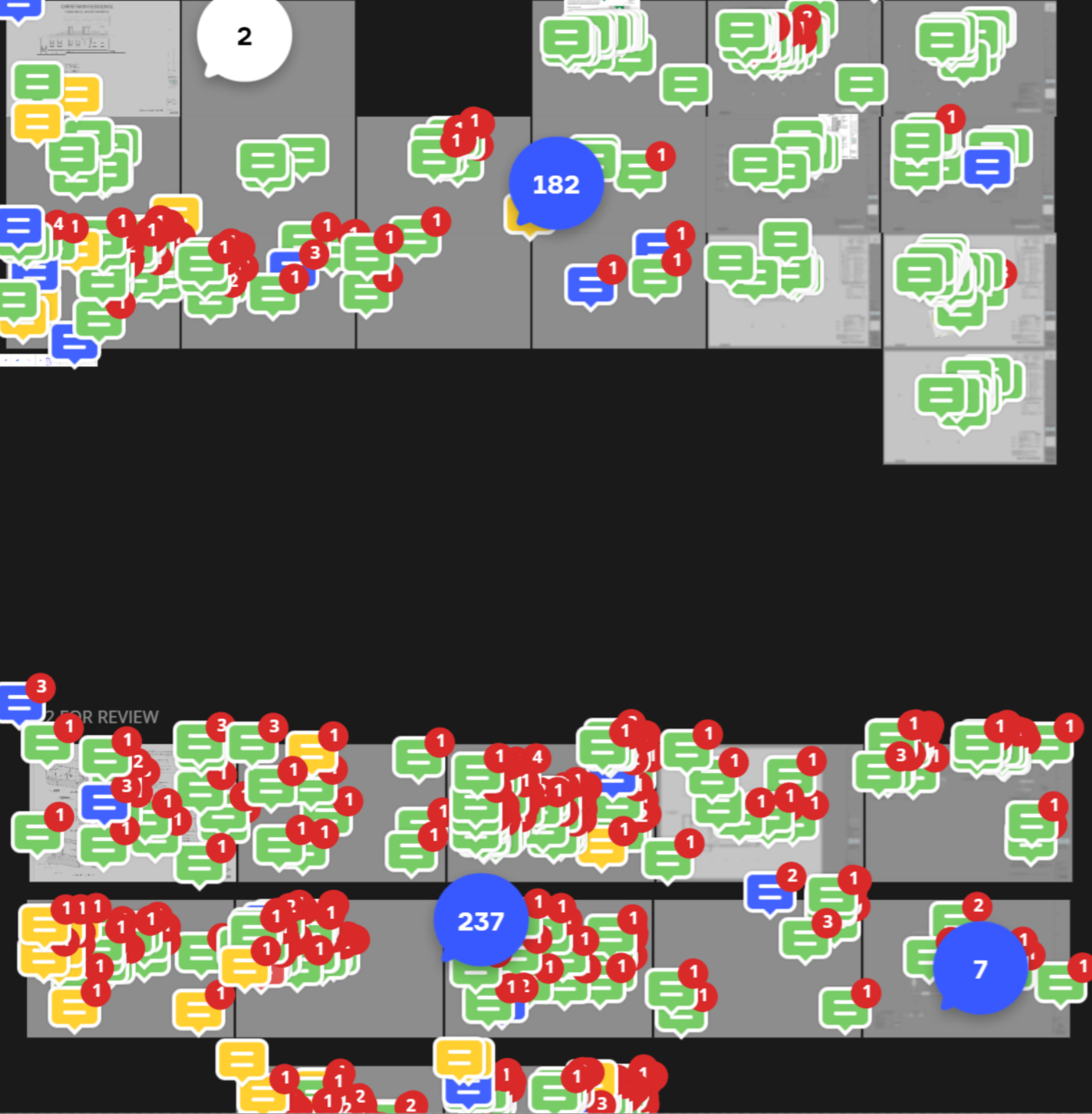
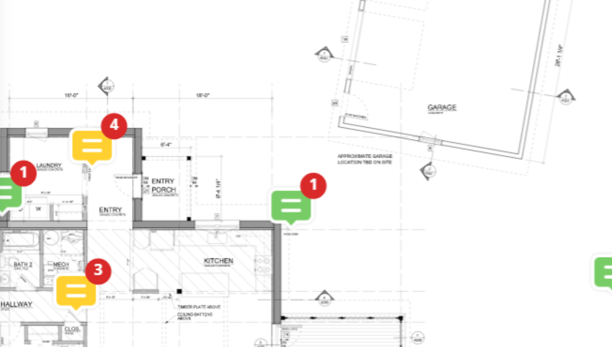
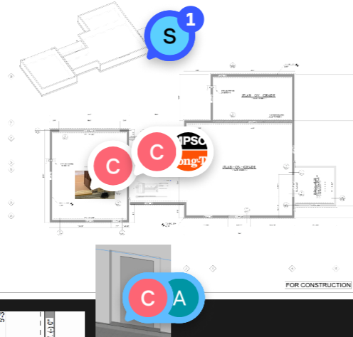
Today my template has changed the design of all the comments. The comments now look bigger and circular, now also with a “C” text. The colours have also changed. Unfortunately these now cover the text of some items and disturbs my study design. 

Does anyone know how to revert back to the original comment design?


4 replies

Userlevel 2

Thank you for the feedback on this new experimental feature. We are currently evaluating feedback of this redesign. 

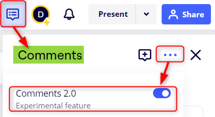
At the moment, you are able to toggle off Comments 2.0 within the comment thread three dot (...) menu. 

Let us know if you need additional help! 

Thank you very much for your reply. This has fixed the issue for me.

It would have been great if I had been able to find out this possibility immediately, to be able to switch it back, as I have already had to use the template. This is was stressful. Perhaps experimental features should not be switched on as default, and there should be more communication about it - perhaps an alert on the miro board itself? I did search for the new comment design on the website and I did not find it mentioned, but I see it is there now (maybe I missed it).

Many thanks

How can I update to Comments 2.0 version? My friend has updated version to comments 2.0 but my account is still the old version:(

How can I update to Comments 2.0 version? My friend has updated version to comments 2.0 but my account is still the old version:(

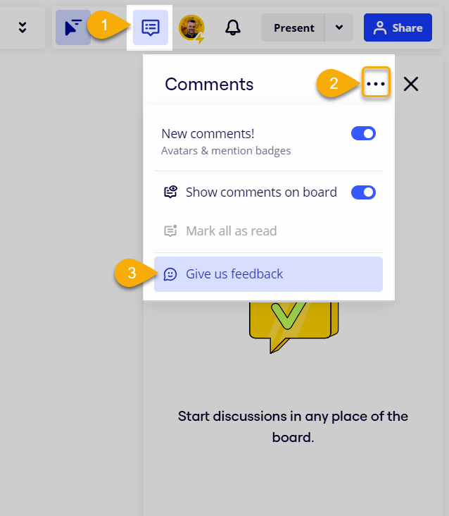
I just noticed this comment which was posted 27d ago so maybe it’s already resolved, but the answer (for my user interface/experience at least) is:


Reply