So I have a special case. I am preparing a workshop with many activities for various groups.

Each of the groups will be assigned a colour so it will be easier for the members of the group to identify which board belongs to them.

I have observed the following issue:

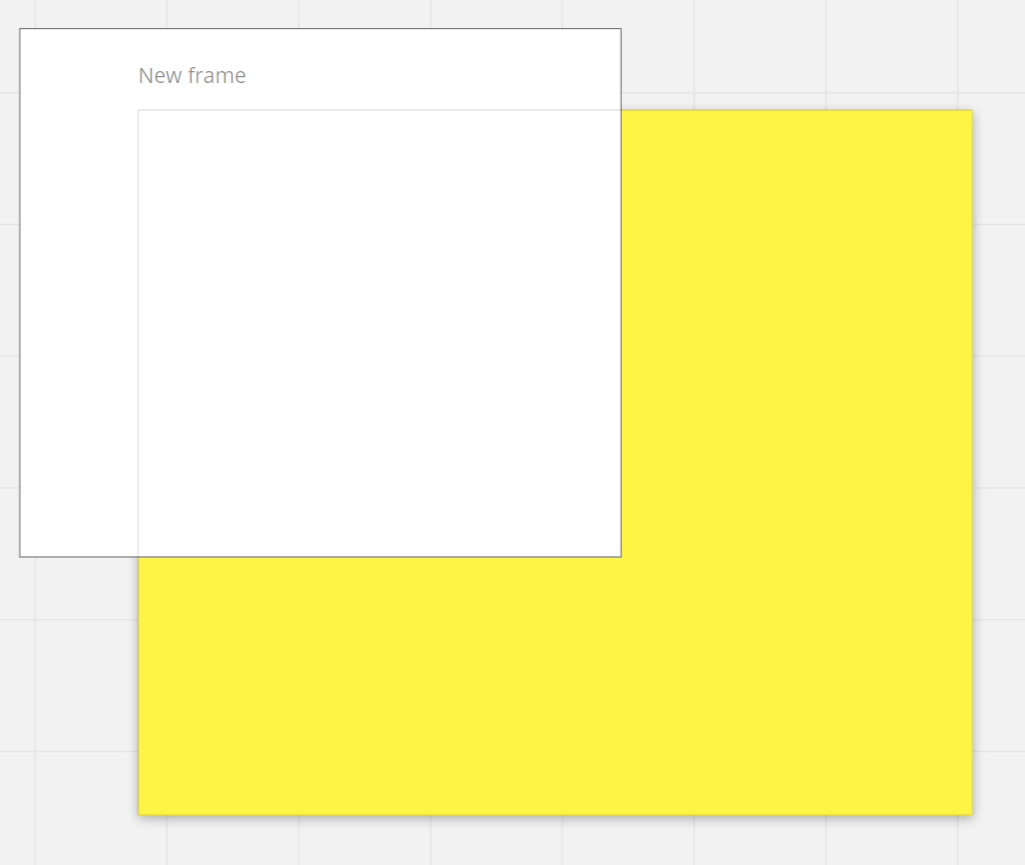
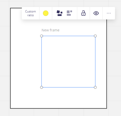
the background colour of the frame is overwritten by the background colour of the rectangle that should be under this frame. The rectangle is bigger than the frame, I wanted it to overlap many frames with one big rectangle.

In the image that I attached - the frame should have a yellow colour but the colour of the rectangle (white) overwrites it.


@adhe -

Frames are the underlying base upon which widgets such as rectangles are placed. Even if you use the “Send to back” command on the rectangle, it will never be overlaid by the color of the frame. 

Normally, frames should be larger than the widgets which are placed within them so the frame color would show up wherever no widgets were placed.

Kiron


@adhe  I agree. 

I found that frame color behaves unintuitively -- so I abandoned it as a feature and instead do as follows:  (scan below text to see the example I reference)

  • Mega Background: very very big blue Miro rectangle, sent back, locked. 
  • Background Decoration: Transparent bkg PNGs Pclouds] 
  • Stations:  frames + content ( mostly presented by the facilitator, mostly plenary/all group ): Think: ‘read-only’ 
  • Pads or Workstations: these are setup to be group workstations, breakout group whiteboard / tables.  These want to be framed, shape/border delineated, guiding-content-embedded. 
    • I build these as follows:  s frames + background miro shape (semi-transp rounded rect) + text instructions + guiding content. locked] ]  + n resources for participants (I like to prime them with stylized/theme-setting Miro objects: pre-sized sticky notes, text templates (H1,H2, P, comment)), shapes, etc oNOT LOCKED]] 
    • Think: ‘read&write’ 
    • These Pads or Workspaces: :  useful for
      • notes and meeting activity posterity screen shots 
      • parking lots/bike rack 
      • tangent idea spaces 
      • polling spots
      • portions/stages of mental model, systems, where participants can encode system-location-specific thoughts
  • Frames:  in order of chronological touchpoint in a meeting flow.
    • Whole board’ 
      • /presented via screen share in zoom/similar]
    • Agenda steps (each)  
      • ipresented via screen share in zoom/similar]
    • Agenda overview  
      • /presented via screen share in zoom/similar]
    • Participant landing zone’: (‘field trip metaphor’ ~=~ “OK- We’ll be heading into Miro now… here’s where to park and how to get in the building and where we’ll meet.”) 
      • gpreviewed to participants via screen share in zoom/similar]  “this is where you’ll land, what you’ll see, and what you’ll do first, and what to do if it doesn’t work… ready?” → 
      • the first place the participants land and begin on boarding]
    • Miro orientation / onboarding sandbox
    • Workshop:
      • Workshop Orientation (what, how, who, where)
      • Workshop Routing (head to your ”pads”)
      • Workshop workspaces / pads (each framed and labeled clearly (big miro text + frame title) 
      • Return location, convergence /synthesis space. 
      • Concluding zone

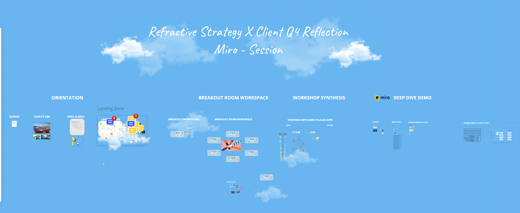
Here’s some snapshots from a recent strategy session ~30 participants: 6 breakouts of 5. 

Whole meeting board


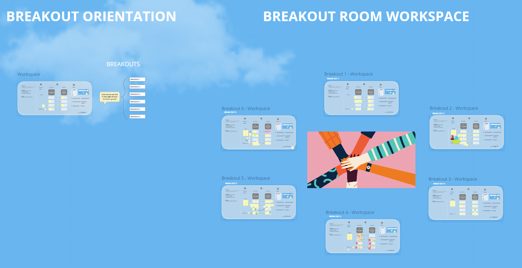
Section of the board / agenda  where we do the break outs.
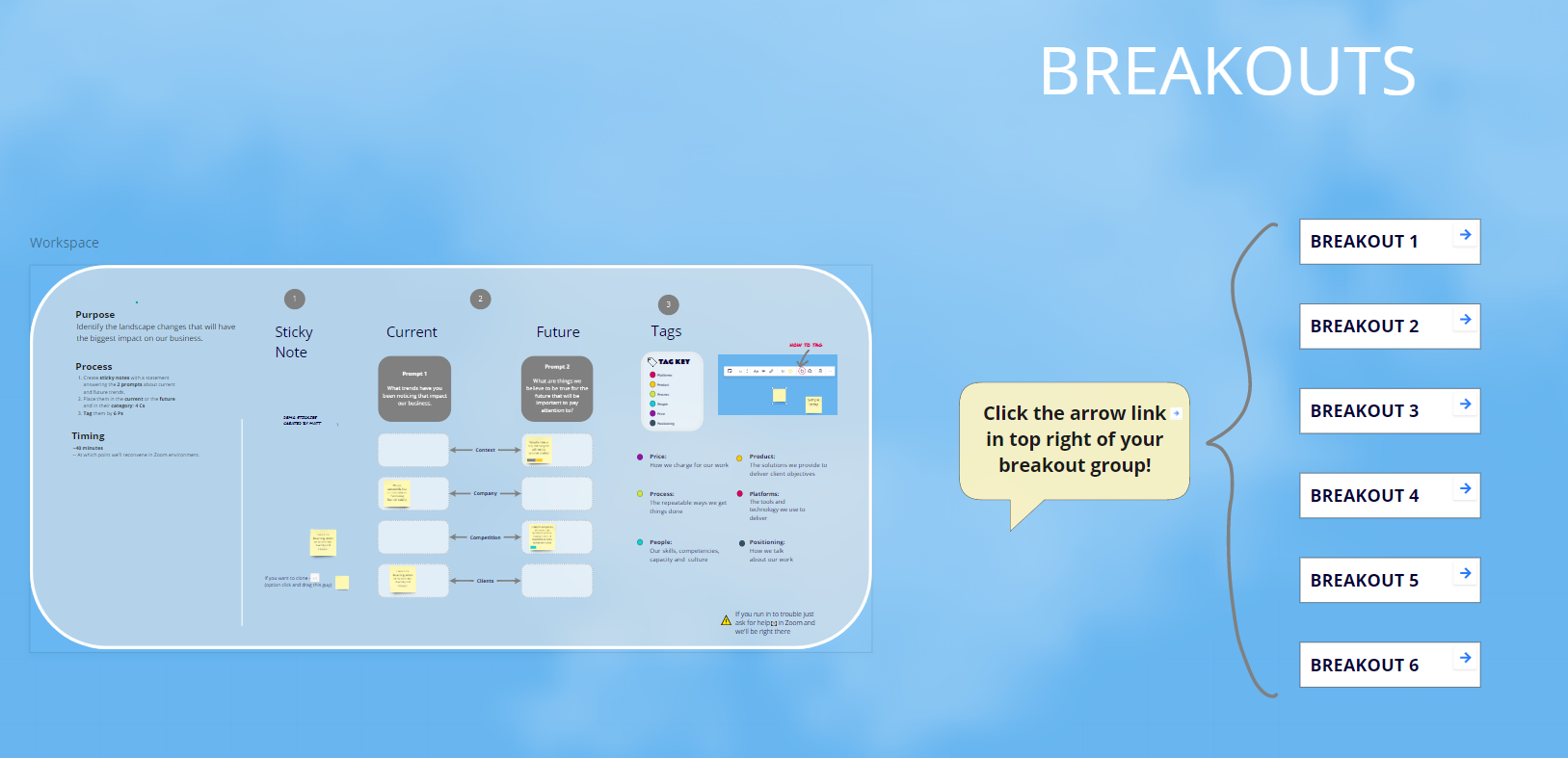
This is the break out orientation section.   The facilitator models the workshop methods, and explains the tasks ahead.  Note the ‘internal links’ buttons on the right. When they click their respective room link they jump to that location.


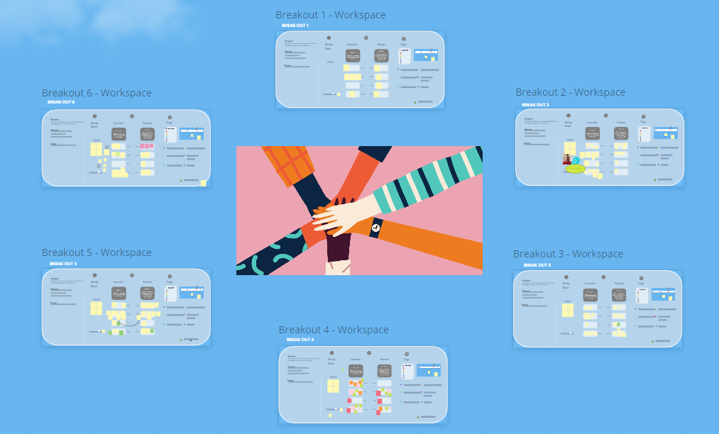
Here’s the workshop zone. I call each breakout workspace a ‘pad’ from a designing-the-board standpoint, and a ‘workspace’ or ‘pad’ when speaking to the participants. 


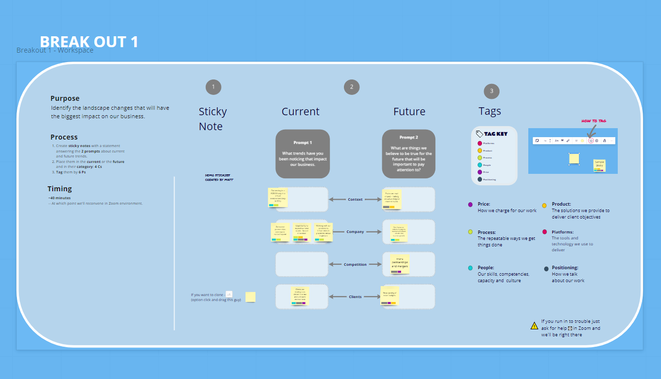
Here’s a break out workspace / pad up a little closer everything but the sticky notes is locked down, the stickies were there to prime a particular size, color, etc.  There’s a key on the right for tags. Note the Big Miro text in the top left titling the pad as well as the frame has title.


Reply