Text padding shouldn't change with text size. It makes left aligning difficult atm.
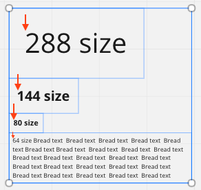
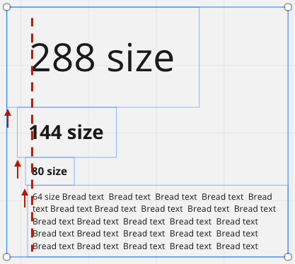
One of the things that frustrate me the most with Miro, is the left and right padding around texts that’s always relative to the text size. It basically makes it really difficult to align text blocks. Under no circumstance is the first picture below intended by a user. In stead we seem to be forced to eyeball it like in the second picture below.
Why not just do us a favour and make the left/right padding be the same no matter the size of the text. Maybe even leave it up to us to set it? :)
I generally really like Miro! Good job overall! This just feels like a mistake
Page 1 / 1
I agree. I had this problem in a presentation I produced just the other day.
Also in favor of this - I often use a manual guide to align text edges with objects to overcome the in-built margins. Not sure if there were a way to convert text to shapes, similar to Illustrator. While this would remove the ability to edit text it would address this idea
Top and bottom padding suffer the same issue. Would much prefer fixed pad sizing, rather than relative to shape size!
I’d like to see custom padding too. More control allows me to really make sure things look the way I want them to look.
This Issue Inhibits Miro’s Potential as a Design Tool
I’m disappointed by what appears to be a low amount of interest in getting this fixed. It suggests most users aren’t using Miro for design that requires any kind of visual hierarchy and layout control. I’d love to move our wireframing process into Miro, but within two minutes I found that it wasn’t possible to align different sized text objects using the align tool. This just seems broken.
In our current tool, Invision Freehand, has a small fixed padding. It’d be great see something similar here.
Yes, being able to set a padding on rectangular shapes especially is key.
Currently if you left or right align text in smaller rectangular shape the text runs right into the shape edge and makes it hard to read.
I’m not even trying to do fancy wireframes, I’d just like to left align some text in shapes used in a flow diagram, but today only center aligning shapes allows for comfortable padding in shapes with smaller text.
And even with center aligning, if the line happens to wrap in such a way where the text is almost the full width of an object, the text can run into the left and right edges, making the padding again feel uncomfortable.
Being able have custom padding is essential. Right now to be able to use left or right aligned text I'm forced to have a textbox grouped inside the shape, which is awkward to use and wholly defeats the purpose of shapes having text within them.
Would love shapes-with-text to:
• Allow greater thickness for both borders and arrows
• Allow custom margins for both individual shapes and/or local selection
• Remember-previous-margin toggle button
Love Miro!! Thank you!!!
yeah agree. totally flawed if trying to create decent documents.
This is super annoying, hopefully they fix this one soon!
YESSSSS. I want to left align my headers with the things they are above. With built in paddings, it makes me look like I don’t know how to design when it doesn’t appear to be left aligned (even though it is).
Guys, pinch me, but… it seems it has been silently fixed! I may be in some sort of test group for the change, but the paddings are gone for me. :)
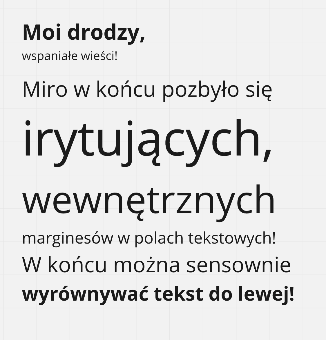
Proof in Polish below. ;)
Unfortunately not fixed yet. It does make aligning extra work and tends to get messy easily. Would greatly appreciate the option to change padding or have the padding stay the same...
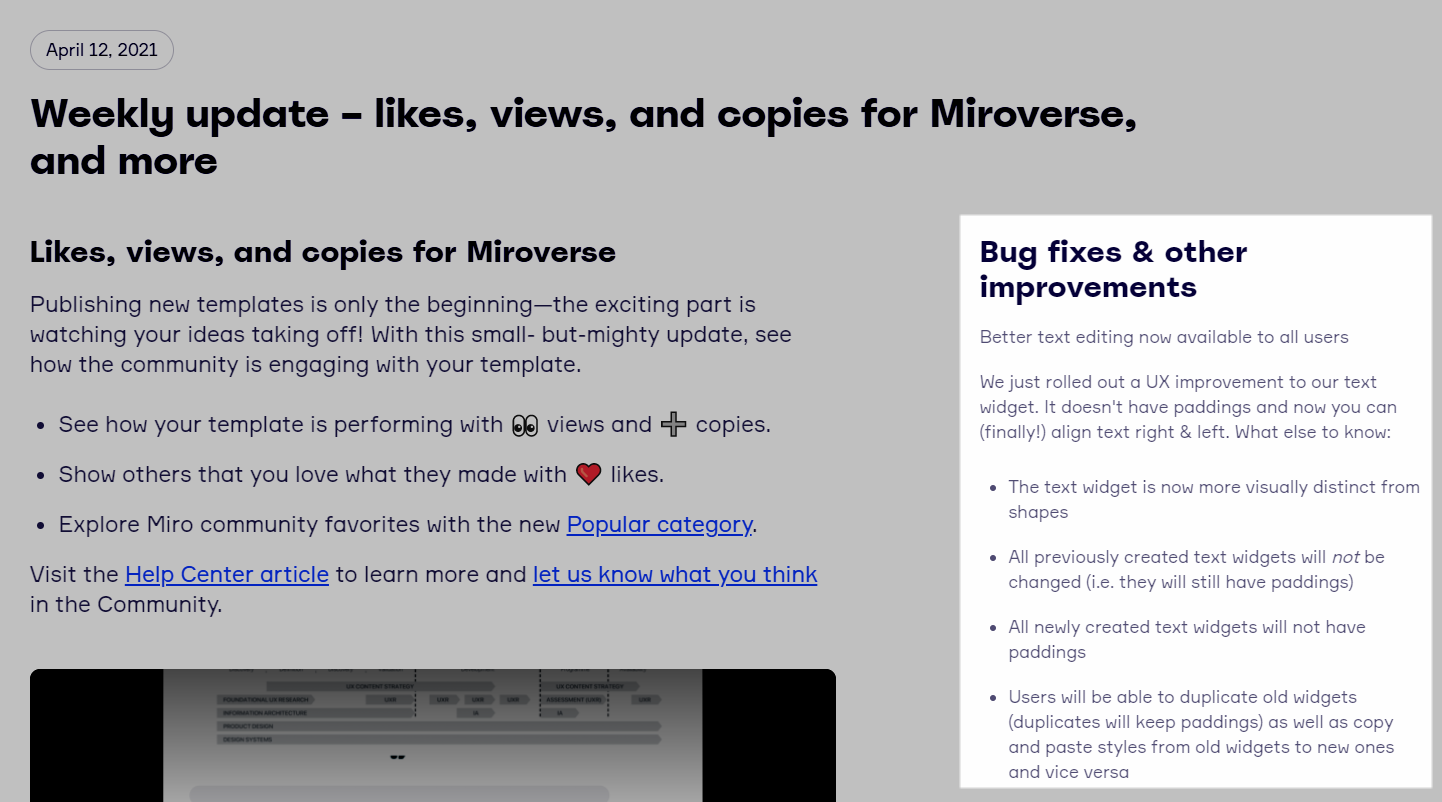
There was an update added to Miro’s official changelog - you can sign up for notifications here:
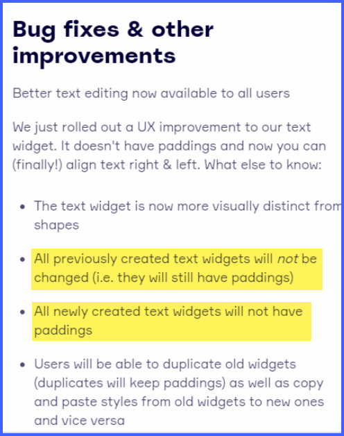
@Paula Schwabe It’s fixed, but only for NEW text fields. All existing ones maintain their paddings. It also applies to duplicating them - if you duplicate a text field with a padding, the padding will remain. You have create a new field and copy text from the old one.
On one hand it’s irritating, on the other hand - I understand the decision. If they were to update all existing text fields, ALL existing boards and templates would be heavily misaligned. So, yeah… I’m just glad they got rid of the paddings. :)
Haven’t seen this in the thread, so I wanted share a personal workaround to get zero padding, and therefore clean alignment at all sizes: paste copy into miro from another app -- it works every time for me!
It’s not fixed for me
How can this go unfixed for so many years? Does no one at Miro care about aligned text?
@Mads Pålsrud / @Marcos Pereira - please note:
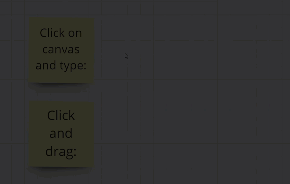
One thing to note, and something that Miro is aware of and has yet to correct, if you click-and-drag your mouse at all when creating a Text object, there will be padding.
🚨 Last chance for early-bird tickets to Canvas 25! 🚨


 I may be in some sort of test group for the change, but the paddings are gone for me. :)