I prefer to work with the wider sticky AND I like to stick to using the S size. I would love to be able to set the default to that. 

I'm guessing that the negative effect could be that someone is so zoomed out when they add a sticky to the board that they can't see it. On the other hand, as a facilitator, it allows me to give the participants some “rails”.

Please, can anybody tell me how to set the default size of sticky notes in relation to the frame or in relation to a board?


Agreed! Miro is a fabulous tool, but my #1 request is to be able to set the default sticky shape (3 x 5 format naturally!) and the default text size (before it automatically shrinks to fit).


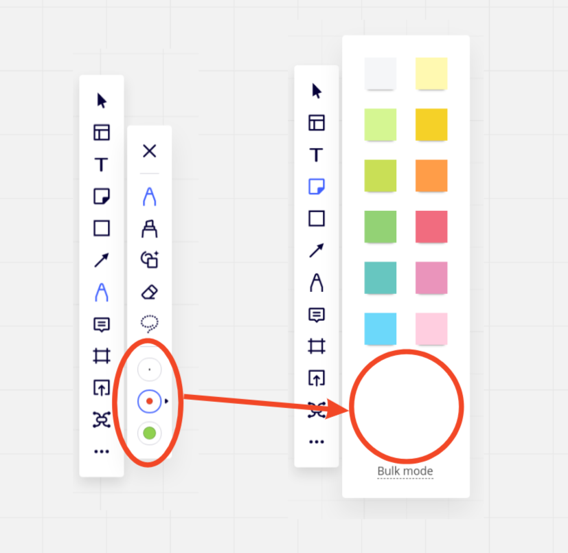
Agreed. In the meantime, I will likely instruct users to make use of the bulk tool and then update the note size all at once and/or provide one of the size and color I want on the board and show them how to duplicate it quickly using ctrl+D rather than adding new ones each time. 


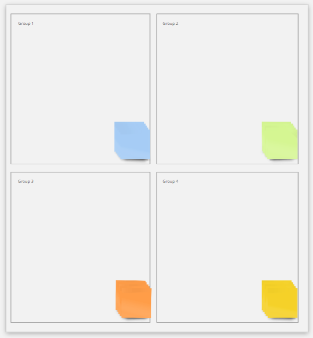
The way I have worked around this is by adding sticky notes to each section in advance. It’s a bit more work but each of our templates now has stickies everywhere. This means people can just use the post-its in the size and format that makes sense because they are already there and can easily be duplicated.

For example: 


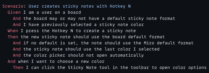
Please prioritize this feature 🙂. Another idea how it should look like


Yes, please. It’s a mess when participants start creating their own post-it sizes in a win-by-size match. I would love to be able to control the size of post-it’s and lock it for participants. Since I always work with frames, I have a size reference that I can use, - and I control the zoom level of the participant by pulling them to the frame.


Me too! Please give the possibility to preset the sticky notes in rectangular shape and “my” size - thanksalot!


+1 for having the wider sticky as default!

Merci :)


yes please!

Also, set your own defeault justification would be great. The most readeable notes are rectable, with top-left justification.


yes please!

Also, set your own defeault justification would be great. The most readeable notes are rectable, with top-left justification.

That is a must. Left aligned text in sticky notes should be default or we should be able to customize our default sticky note style.


I agree… this would make miro more user friendly: everybody works on 16:9 size screens and if you use wide sticky notes they become easy to present and read for everyone… and you get less differences between the sticky notes in font size… so if this would be possible as a default setting in your profile and/or board and/or in the tool bar: that would be great…


even changing the size of sticky notes for a selection of multiple sticky notes woudl be usefull... 


I only use the rectangle sticky notes, and I use them a lot, and it’s sooo much clicking each time. =)
I’d loooove this feature. It would save me tons of time. 🙏


Being able to customize the defaults for sticky notes (and other shapes) in MIRO would be massively helpful. Personally I want everything to have a fixed font size by default (ex: 14).

I personally think the way MIRO creates shapes with different font sizes (auto in the case of sticky notes or a zoom level dependent font size for other shapes) looks really ugly and unprofessional. I believe font size should indicate importance (ex: banners to act as headings for areas of the board) and thus NOT be set arbitrarily based on how much text is present in a sticky note or whatever the zoom level was at the time a shape was created.

*Every Single Time* I add a new shape (ie: not copied from an existing shape), I have to click to re-configure the font size which is incredibly incredibly annoying and tedious.


hey @Miro Community Team any news on making this happen? the idea was originally posted 3 (three!) years ago...


On the assumption that community interest will help drive priorities… absolutely agree this would be a useful feature. I hope Miro acts on it!


Still not available? Come on Miro team! Mural is so much better for sticky notes - you can add them with just a double click, and they automatically match surrounding ones


+1 for having the wider sticky as default!

Merci :)

Oh yes, me too!


Yes it would be helpful for me to put the smaller sticky note on frames while I am teaching online


Doesn’t look very professional doing it while teaching, and it is a distraction. Learners only contribute single points so the big sticky note is not needed


+1 for wider sticky as default. They are easier to read/parse. Our team convert or use the wide sticky for every note