"Consistency is a means and not an end for design"

  • 27 February 2022
  • 5 replies
  • 275 views

Userlevel 7
Badge +7

I recently stumbled upon this very interesting piece by Mark Parnell on Medium about consistency in design.

In short, consistency is not and cannot be the sole criterion of good design. Building a consistent design system is important, but over-zealous quests for consistency can be at the expense of other aspects of design.

I really like the Google icon redesign example of a case where consistency is actually counter-productive:
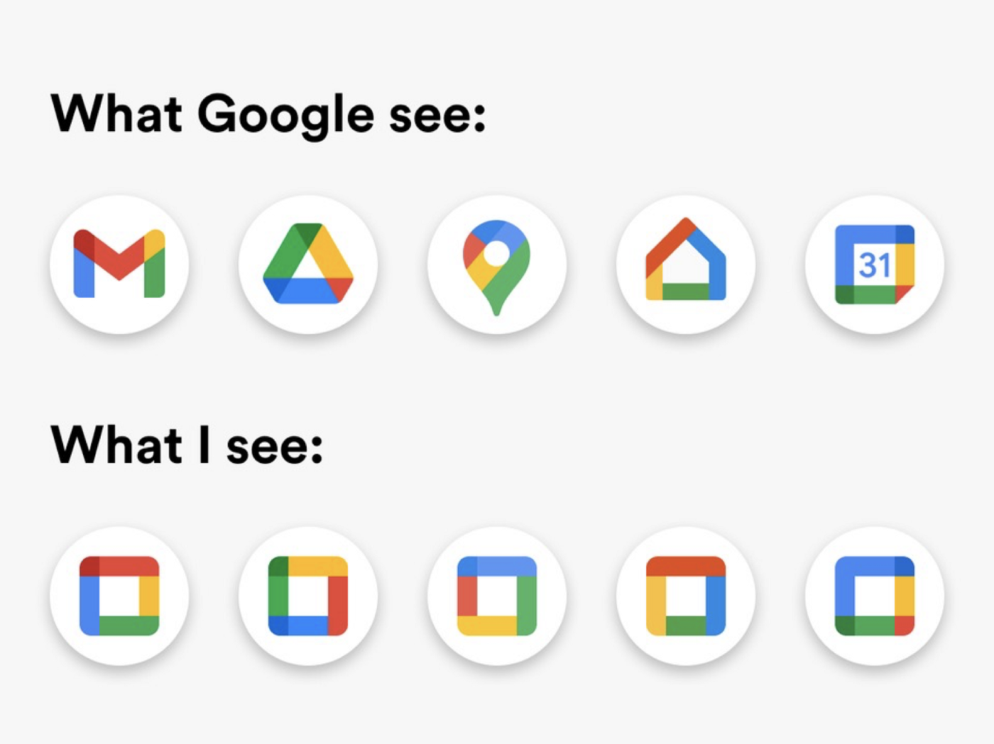
Funny ‘cause it’s true. :sweat_smile:

What are your thoughts on this topic?


5 replies

Userlevel 7
Badge

This is a great piece, thanks for sharing @Henrik Ståhl -- I STILL struggle with the google update and seek out the blue box for calendar. :upside_down:

Userlevel 7
Badge +7

Haha, me too @Colleen Curtis! I have a Google folder on my iPhone and I always have to look twice before opening a Google app. Lost count on how many times I’ve accidentally opened Google Home instead of Google Drive… :laughing:

Userlevel 5
Badge +2

Interesting read! I looked up which sides of the road Japan and South Korea drive on (I thought the indicators would be relevant to this), but it actually isn’t. I suppose here, there isn’t a ‘standard’ or ‘regulation’, this is why the indicator isn’t linked to what side of the road the country drives on which would be a better consistency. 


Definitely agree on the swipe, very frustrating! 


Userlevel 7
Badge +7

@Karen M Hehe, swipe functionality tends to be frustrating in general because it doesn’t seem to be much unification when it comes to swipe… :sweat_smile:

Userlevel 7
Badge +2

Interesting read - thank you @Henrik Ståhl! As a non-designer I found this informative and I noticed what immediately resonated with me. The word that comes to mind for me is obvious. I want design to be obvious when it’s telling me to do something. Consistency is usually a component of what makes something obvious, but as the article shows, it can certainly go overboard. With the Google icons, for example, the calendar and video icons are obvious to me, a layperson. However, the docs icon is not obvious and I have to click on it to figure out what it represents. If there were a battle of consistent vs. obvious, I’d go for obvious all the way. 

Reply