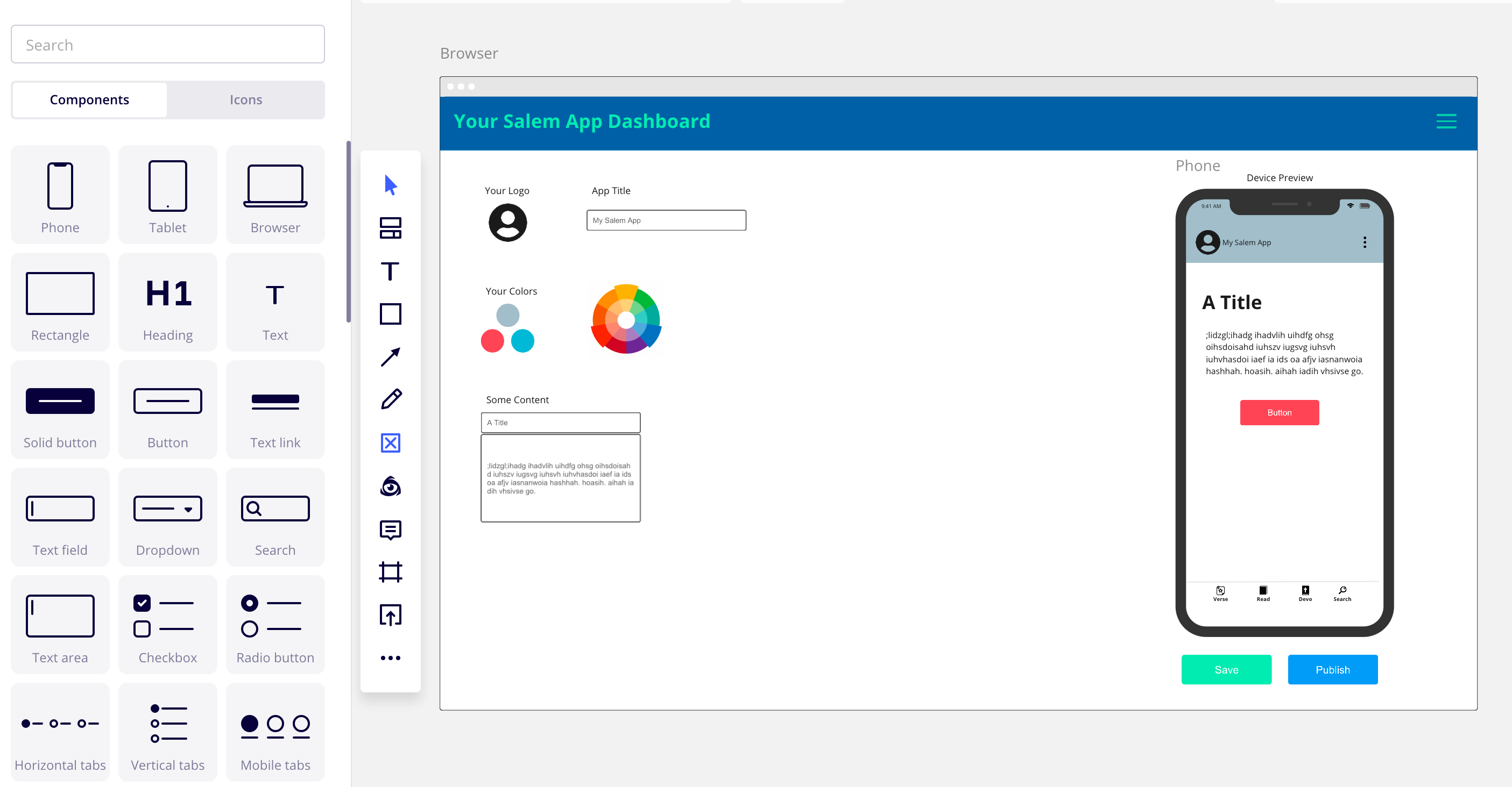
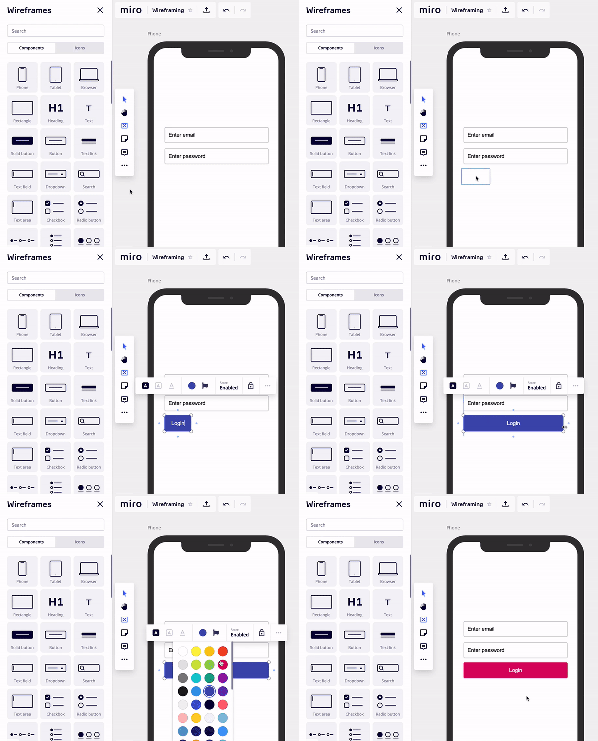
Miro updated wireframing functionality enables you to create simple low-fidelity prototypes of website pages and product screens in a matter of minutes – even if you don't have much design experience.

What changes did we make?

  • Refreshed the look and feel of devices (phone, tablet, and browser), and made them sticky 
  • Added new interactive UI components 
  • Integrated with an extensive icon library 

Visit Help Center, read the blog post and watch the video to learn more about the enhanced Miro Wireframing.
 

Share your feedback on new wireframes in the comments :wink::point_down_tone2:


YES! :clap:

I think the H1 and paragraph text options are my fav.


This framework is awesome and has a great potential...We've been using a lot on collaborative sketching sessions. Maybe an Adobe XD plugin to import these wireframes from Miro and be integrated into the design workflow. What we usually do here is...start on Miro for quick wireframing...then go to Adobe XD for navigation and finally going hi res


Thanks for your feedback @Fabio Barreiro – noted!


Wireframing functionality are great, thanks for the update. Maybe the Browsers component has a little bug: if you assign a color to the element, the color disappear if you a background colored element (e.g. a rectangle or a wireframe). Probably because the wireframes have not the Bring forward/Send backward options.


@Lena Shenkarenko -

I already tagged @Marina on this query from another user, but it looks like the wireframe container template (e.g. Phone) is not being exported when you export to PDF or JPG. Was this by design or is this a bug?

Edit: I can see @Marina has indicated this is in the backlog to be addressed… phew!

Kiron


@Lena Shenkarenko absolutely love the wireframe features!! It’s a great way to collaboratively develop low fidelity wireframes with colleagues.

I was wondering whether on the roadmap for this there was a consideration for being able to edit other states as currently it would appear we can only edit the ‘selected’ state (apologies if this already available and it’s a case of user error).

Many thanks,

George :grin:


Hey @George Sofroniou – take a look at this Loom video. I’m showing how I select various states for different components. Is this what you expect or you’re looking for something else? Please, let me know :slight_smile:


Hey @George Sofroniou – take a look at this Loom video. I’m showing how I select various states for different components. Is this what you expect or you’re looking for something else? Please, let me know :slight_smile:

Hi @Lena Shenkarenko thanks for the video however no not exactly.

For example with mobile tabs... if I set the colour of selected tab/icon to blue, I would then like to also set the default colour of the Normal icons, which by default are black but I’d like to be able to change the colour of them too. When I try to change the colour of the Normal icons it will change the Selected tab. I hope that explains it a bit better? 


Got it, @George Sofroniou – thanks for the explanation! I’ll definitely pass this feedback to the product team. It will also be helpful if you could share additional context – what will this functionality help you accomplish? 


Got it, @George Sofroniou – thanks for the explanation! I’ll definitely pass this feedback to the product team. It will also be helpful if you could share additional context – what will this functionality help you accomplish? 

Thanks @Lena Shenkarenko! Yes of course, for me I additionally start with my low fidelity wireframes in black & white/grayscale, however I then like to incorporate the branding colour into this. Currently the Normal icons only have a default of black. If for example I wanted my Selected icons to be white and Normal icons to be Red I currently cannot do this, currently I can adapt the Selected icon colour to fit branding but not the Normal. I’ve tried to showcase this with the attached Loom recording.


I honestly loved this new feature! Gone are the days where I’d have to create multiple 3-layer-deep fields and carry them around as I’m working on the design (at that time it hadn’t come to my mind to start using templates).

My biggest personal grief with this is that it acts as a frame. You see, in my process of design development I create a lot of studies on a single board; and these boards tend to grow over time-so you’d see how messy it would look once I step into the Frames Drawer. And since these templates are frames it means they don’t nest under another mother group. But instead of messing with the how frames work, could we instead have an option to turn off its visibility in the Frames Drawer?

Enhancing the Frames Drawer with the capability to hide a frame (or in this case a template) from the list would benefit board organize entirely. I immediately see its benefits on retrospectives of large ideations. 


Reply