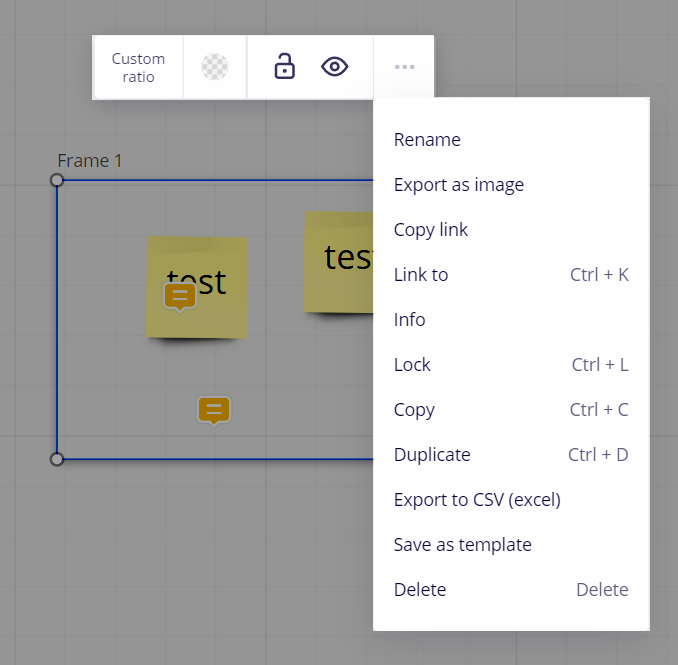
Missing Grid/Freeform buttons from Frame toolbar, no more "send to front/back"
Hi Community,
Recently, some important features from the Frames toolbar have gone missing: the Grid/Freeform buttons and the ability to send frames to the front or back of one another. This has created a serious problem in my workflow: I have a number of templates that I rely on for my students to post work in and those templates now seem locked in the SNAP TO GRID status—which makes it impossible for students to submit work in them. I notice that a new snap-to-grid feature has been added to the dotted grid, and I wonder if this change has disturbed other features. If anyone has any advice on how to get the old features back, please let me know!
David
Page 1 / 1
@David Gorin - Yes, there do appear to be options missing.
I have opened a Miro support ticket and will CC you.
I thought it was just me going crazy over this. @Robert Johnson , please communicate/share when resolved. Thank you!
Same issue on my board, all my frames are stuck in grid mode which causes content that should be static to just move around.
Same problem.
It run my workflow terrible. Please get this functionality back
Update #1 from Miro support:
I'm afraid the Grade mode feature is currently turned it off because it wasn't working as expected, and the team is now working on the next steps. We'll inform you once the final decision is made. Sorry for any inconvenience it has caused!
In the meantime, we suggest trying these workarounds:
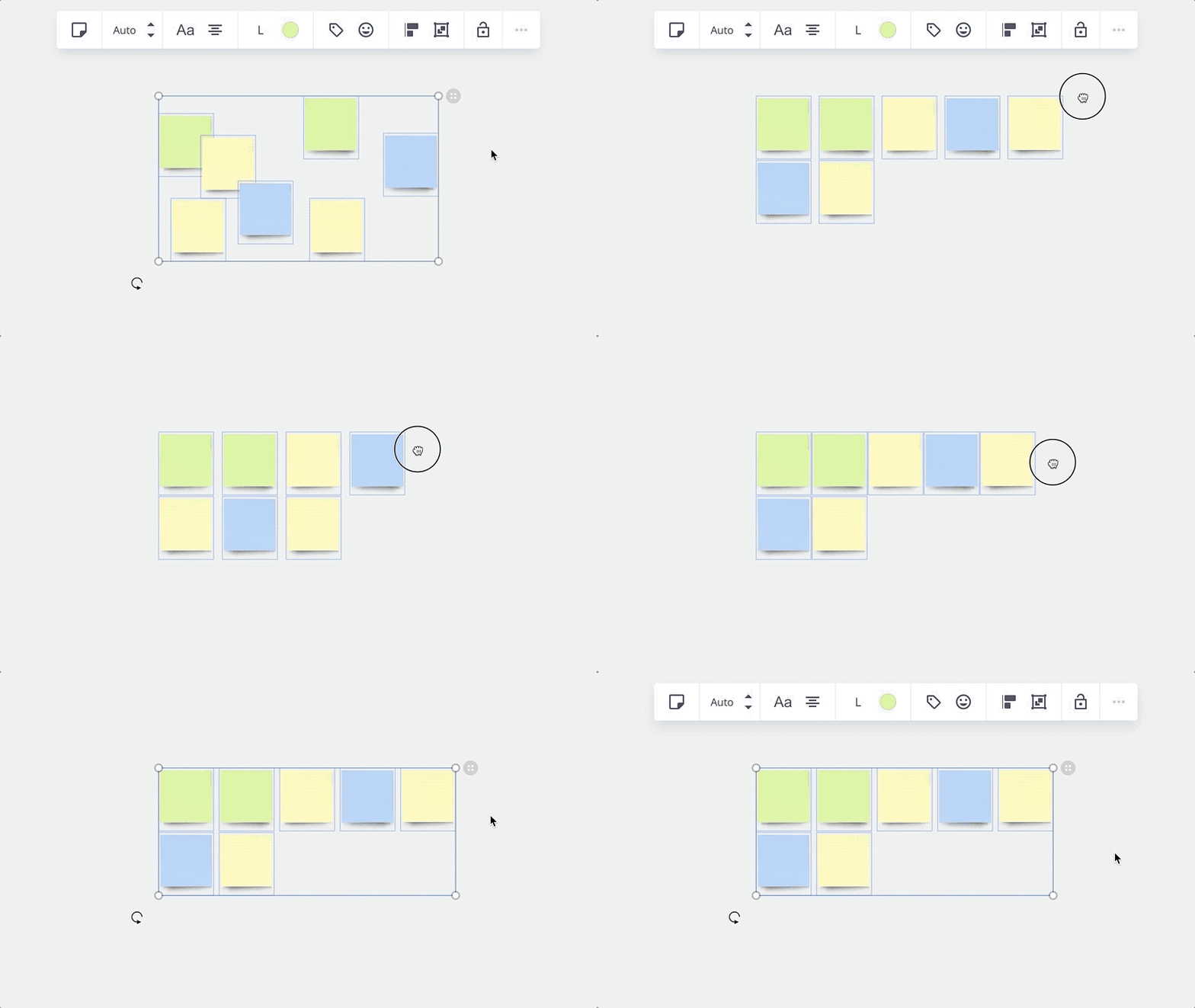
Using auto layout to align and distribute objects on boards
Click on the grey icon in the upper right corner and drag it horizontally.
Using the tables to organise content on boards
Same issue on my board, all my frames are stuck in grid mode which causes content that should be static to just move around.
With no ETR from Miro, you may want to create new frames in which grid mode would be disabled.
we should be getting a note about this on launch so we are all not wasting our time.
It is absolutely vital that we get the ‘freeform’ feature back in action as soon as possible. I only ever use this function, rather than ‘grid’, since it allows me to show specific progressions in game flow on my mock-ups. With this removed, my images are now jumbled around in no logic order whatsoever, making it impossible to show progression effectively. Using ‘auto layout’ as a possible workaround does not cut the mustard.
Our apologies for the inconvenience – Miro team disabled grid mode in frames because it wasn't working as expected, and just made the decision to start phasing this feature out.
We will be updating the Help Center to reflect the next steps in the next few days – I’ll circle back on this once it’s done.
I’m ready to share what the update is going to look like:
'Freeform' and 'grid' buttons will appear in the context menu as disabled
This update will not be affecting board content for customers who used this feature previously, but when grid mode is fully deprecated, the content on the previously created frames will be arranged in frames in freeform mode
If you are planning to use content from previously created frames with applied grid mode, we recommend to:
Create new frames and copy the content there
Use auto layout or tables to organise content in frames
Please, let us know if you have any additional questions
Hi, I’m sure the product team is expecting pushback from users, as always happens any time a feature is removed, but I’ve been stewing about this for days and feel the need to just express my passionate support for grid mode.
Frames with grid mode are a huge part of my workflow, and have been responsible for much of my heartfelt enthusiasm for Miro. They allow me to quickly group concepts without being distracted by the compulsion to manually nudge their position.
Auto-layout or tables are not at all a sufficient replacement. Auto-layout requires a manual adjustment every time content changes, and results in unsightly horizontal padding between content that’s hard to control and distracting. Tables are rigid and run against what I consider the greatest argument in favor of Miro in the first place: which is that it’s a boundless canvas that allows for creative sprawl.
I don’t expect my feelings on this to change anything, but this decision is a huge disappointment to me, and probably will result in me phasing out Miro for much of my workflow. This is exactly the kind of top-down decision that leaves users feeling powerless and unable to depend on the tools they use. Guess that’s partly my fault for investing in a closed platform, but still... very discouraging.
At my college we use Miro very simply for reviews of graphic design student work, uploaded by them.
With the freeform placement option removed from Miro, students no longer have control over object layout, and so their content just snaps into clumsy and unpredictable grid formations as it is uploaded into frames. THIS IS A TERRIBLE AND FRUSTRATING EXPERIENCE for future designers (and their professors)!!
How can we teach design using a platform that doesn’t allow user control of simple layout in frames?
Removing the freeform option is such a bad idea; Please bring it back.
Whyyyyyyyyyyyyyyyyyyy? This was one of the most useful features in Miro.
Also missing the grid feature - I used it heavily in a service blueprinting template.
Update #1 from Miro support:
I'm afraid the Grade mode feature is currently turned it off because it wasn't working as expected, and the team is now working on the next steps. We'll inform you once the final decision is made. Sorry for any inconvenience it has caused!
In the meantime, we suggest trying these workarounds:
Using auto layout to align and distribute objects on boards
Click on the grey icon in the upper right corner and drag it horizontally.
Using the tables to organise content on boards
thanks !!
Chiming in here too. This is a massive disappointment. When designing games I’d constantly throw all my Pinterest pins into a frame, then re-organize my pictures with grid mode till only my favorites were at the top of the frame. It saved me countless hours having everything snap into place on it’s own, and reshuffle as I moved something out of place. The auto alignment you suggested is good for presentation purposes to organize the final results, but doesn’t help at all when it comes to actual workflow building. This is a terrible decision. Like, make your new features that you think are better, but to just cut this feature all together makes me weary of building any more workflows with Miro.
Like I’m literally copying frames from my old boards that still have grid mode enabled just so I can continue to use this feature till you kill it completely. It’s really sad.
Chiming in here too. This is a massive disappointment. When designing games I’d constantly throw all my Pinterest pins into a frame, then re-organize my pictures with grid mode till only my favorites were at the top of the frame. It saved me countless hours having everything snap into place on it’s own, and reshuffle as I moved something out of place. The auto alignment you suggested is good for presentation purposes to organize the final results, but doesn’t help at all when it comes to actual workflow building. This is a terrible decision. Like, make your new features that you think are better, but to just cut this feature all together makes me weary of building any more workflows with Miro.
I’m hopeful the decision to remove Grid mode is a sign that a replacement is on its way.
I'm still very curious about the “didn't work as expected” argument. What was it that didn't work as expected?
I miss it as well, especially the ability to prioritize notes with the team via drag and drop, which was possible with the grid functionality. Is there another tool for this functionality?