I wanted to share a simple, yet effective technique for hiding content on a Miro board that I first saw used by Greg Kozera during his Virtual Miro User Group presentation: V-MUG03: How to add gamification to your facilitation with Miro.

Throughout his presentation, Greg kept his talking points hidden under rectangles that were the same colour as their surrounding, and only revealed the content as he was ready to talk about it. After a while, I found myself curious and excited to see what was coming next!

Not only I have started doing this when presenting my own content, but I also started using this approach to hide some objects on the board that I will use at some point, e.g., additional images or icons, but didn’t want them to make my board look “messy”.

Here is an example in action:
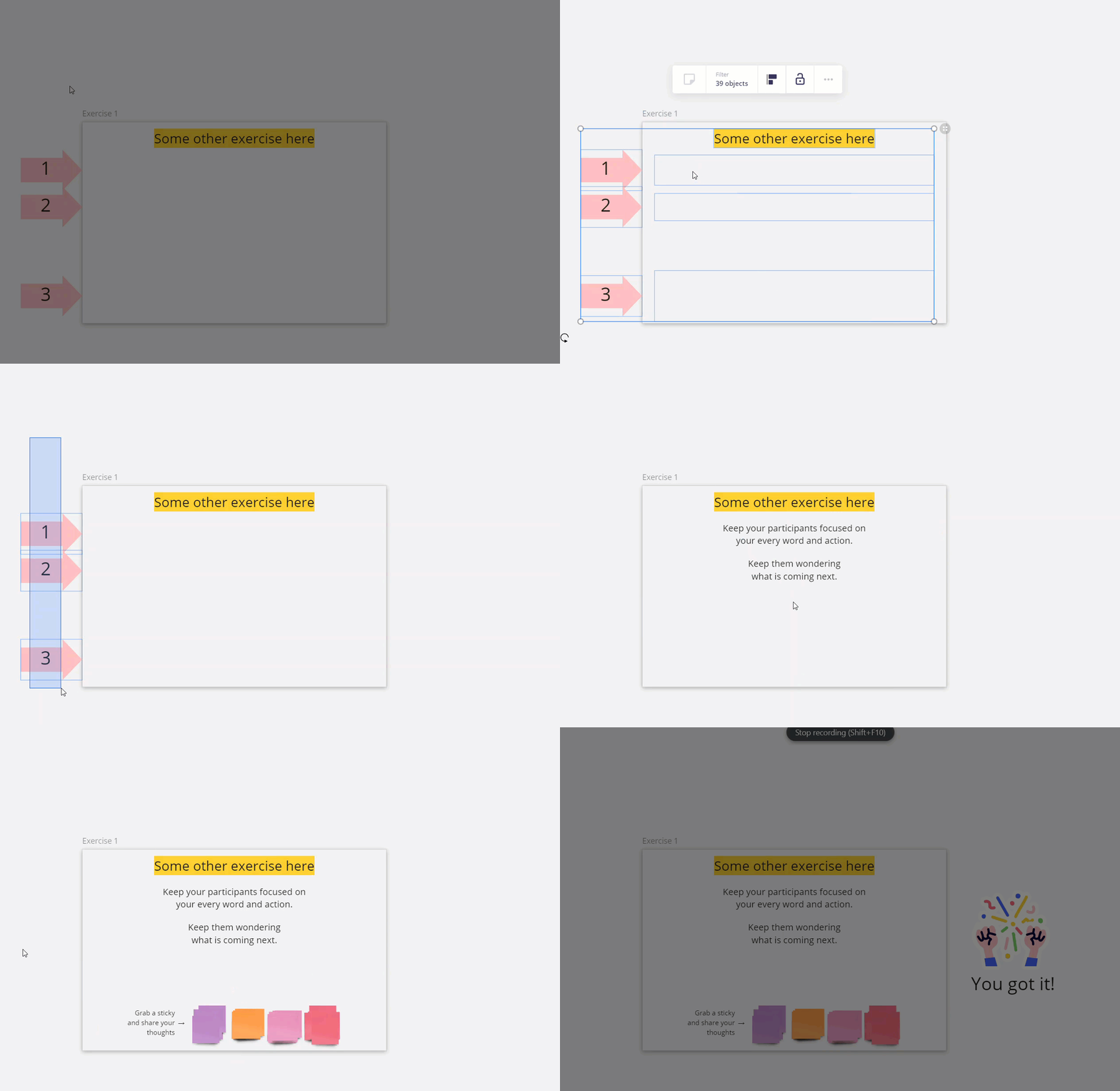
 

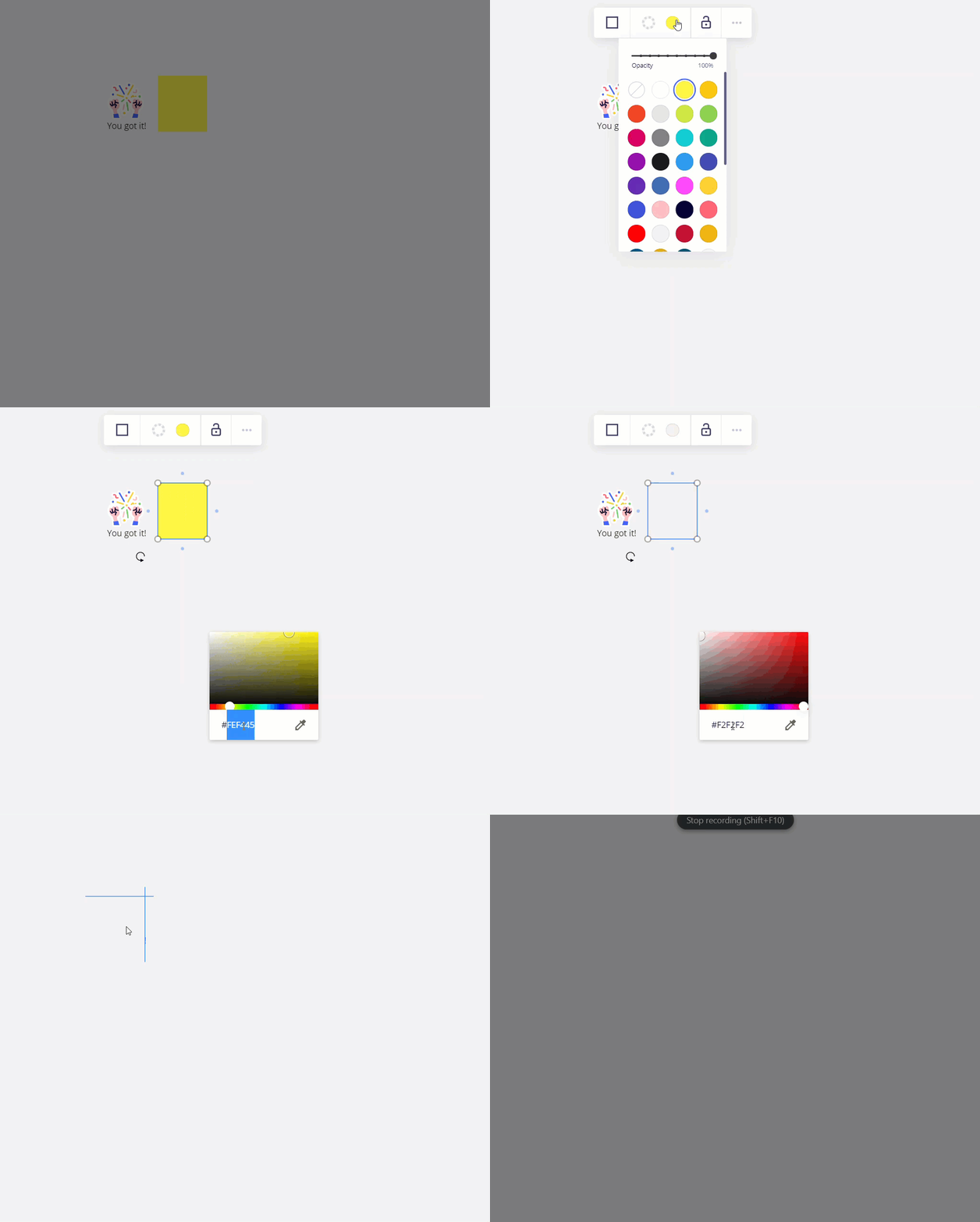
Tip: The default board/frame HEX colour is #F2F2F2 - add this to your colour swatch
 

Related links

Good ‘ol F2F2F2

I like this one better than the Hide feature because participants don’t feel they’re missing anything.

Great tip @Robert Johnson !!!


Nice tip @Robert Johnson, I've done this in the past as well. The only pitfall is that you might forget where you've put the rectangles or even how much hidden text you have, if the board is big and/or you're hiding a lot of stuff, and haven't structured things properly. 🙈


@Michael.Kadonoff Interesting! Could you explain a bit more how participants might feel they're missing something when using the Hide feature? 🙂


@Robert Johnson -

Great tip! The video doesn’t explicitly show this but I’m assuming that all you do to reveal the underlying content is to delete the masking rectangles?

I’d echo @Henrik Ståhl’s risk of forgetting where content is although if you do this within frames, that is less likely to be a concern.

Kiron


@Kiron Bondale Yes exactly, you can sort of see it in @Robert Johnson’s gif but it's more visible in the YouTube video. There you can see how Greg marks a rectangle by clicking and then deleting it (he's doing it pretty fast but you can still see the interaction quite clearly).


@Kiron Bondale - Yes, I was selecting and immediately deleting the object.

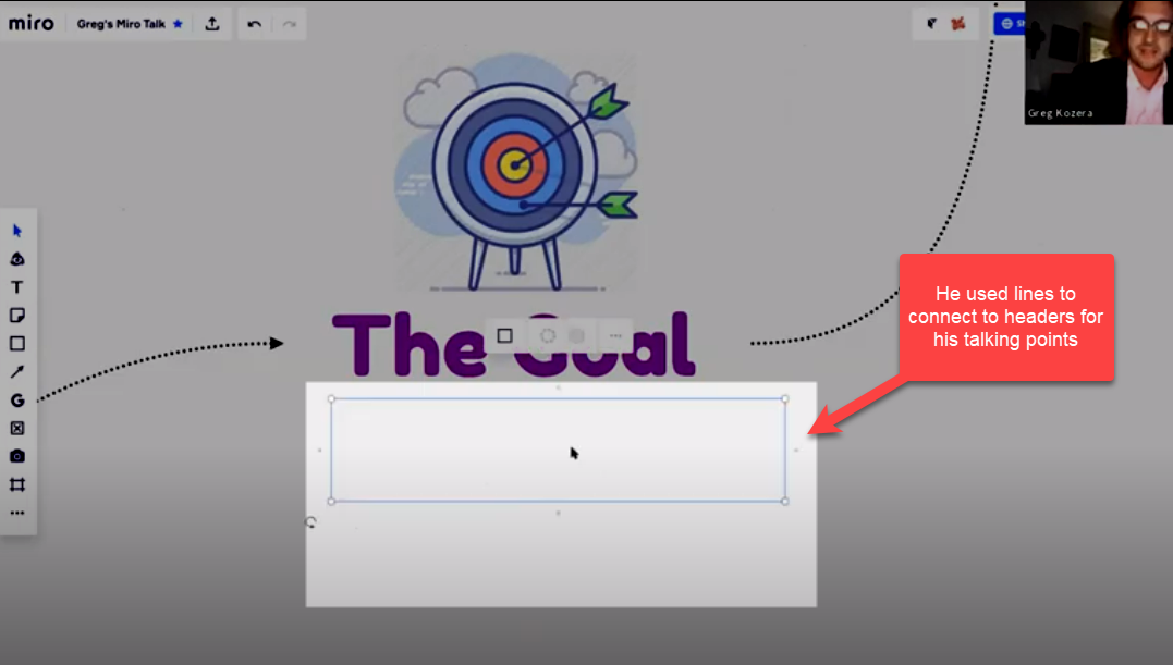
As for forgetting where your hidden rectangles are, in Greg’s video it would always be obvious to the presenter where more information is, because they have lines or frames leading to their next talking point, and they likely would have practiced a few times before presenting.

Example from the video:


Re:

@Michael.Kadonoff 

Good ‘ol F2F2F2

I like this one better than the Hide feature because participants don’t feel they’re missing anything.

@Henrik Ståhl - I believe by “Hide”, Michael was referring to hidden frames where the participants can see there is an object there with “something” under it. When there is nothing to focus on in the first place, they are less likely to be distracted.


@Robert Johnson About forgetting where the rectangles are: I meant in a general sense, not Greg's video specifically. 😊

About Hide feature: I didn't quite get the party about “feeling they're missing something,” but I guess you mean it's distracting to know that there is content you can't see, and they therefore feel like they're missing something?


About Hide feature: I didn't quite get the party about “feeling they're missing something,” but I guess you mean it's distracting to know that there is content you can't see, and they therefore feel like they're missing something?

Exactly. Out of sight, out of mind.


@Robert Johnson Got it. Good point! 👌


Reply