Zoom Transcript to Miro Layout


Made a fun Miro plugin prototype this week .. been dying to make it for a while. 
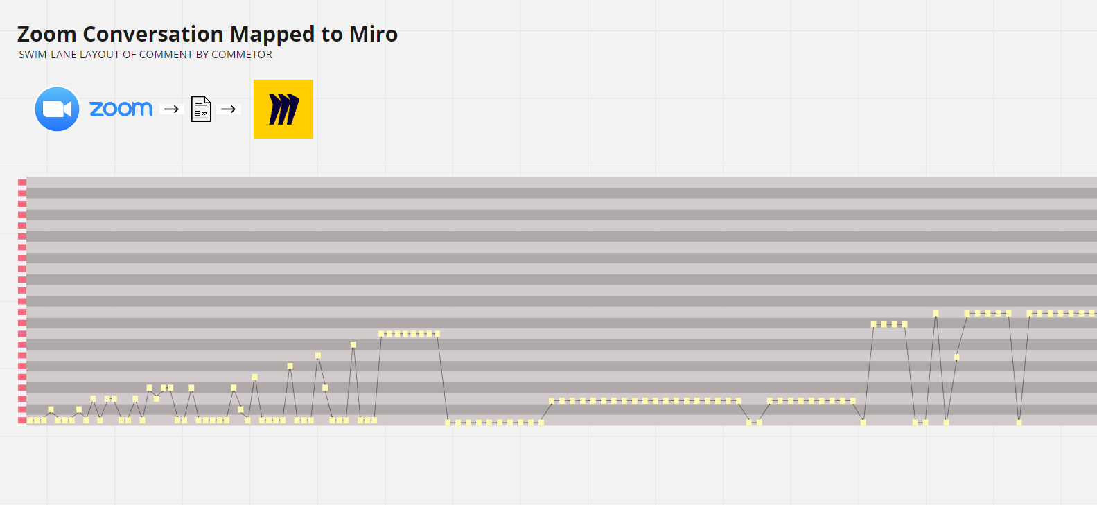
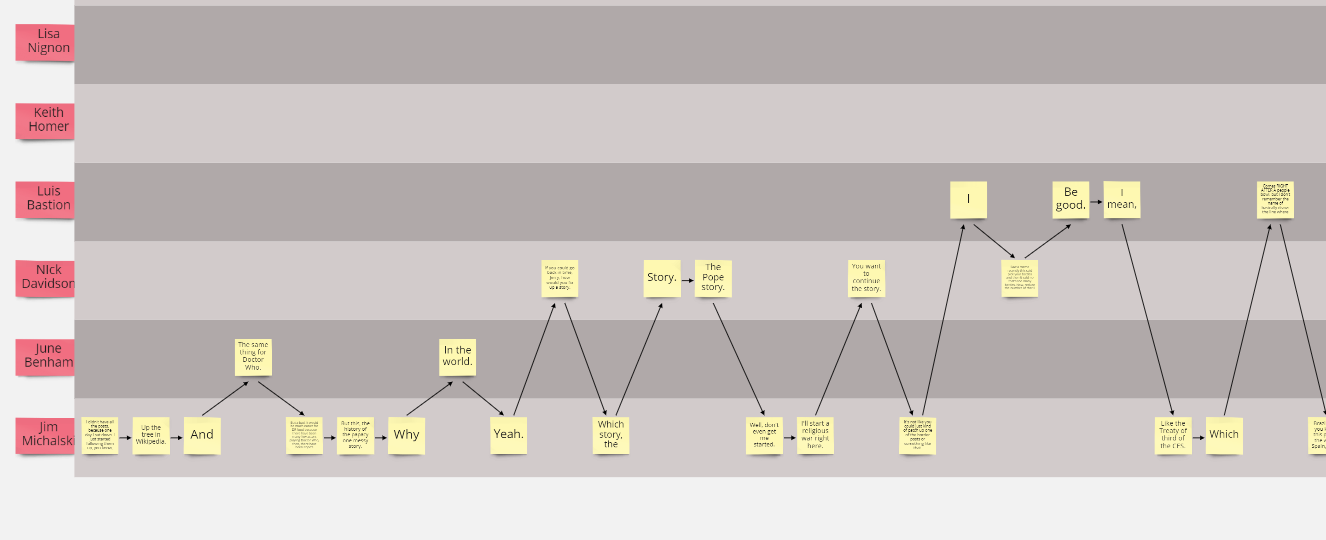
It takes a zoom meeting transcript and lays it out into a commenter-by-commenter swimlane-ish flow of their sequential comments on stickies. 


Here’s a little demo video walk-through of where I was able to nudge the prototype to this week.


Like any prototype it sheds light on the basic idea and what’s working / not working …


What do you all think?  What would you want to do with something like this? 


That is very interesting :)

How long did it take to create?

Building plug-ins is on my forward Radar - but not this week :)

I agree horizontal is more intuitive as a form of layout

Dunno if it is of interest; there are also a number of meeting analysis initiatives around (Like Kelvin McGrath’s Meeting Quality) that make extrapolations from the content to (in his case) project outcome 


Thnx for sharing


This looks very interesting Max! It also sounds very useful for user research during the user interviews to turn the meeting notes into cards and synthesize the results later on. This is basically what we do right now manually and this could be time saver :)


Regarding the layout, I also prefer the horizontal one more than vertical.


@farbodsaraf  -- Yes… “user research is perfect” !    Will mull on that.    I think we’ll experiment next with methods for automating the annotation… Have to get Tag Connector out first tho ;) 


@Simon.Harris  Time taken… on top of the tools we built this spring…actually not long.  But the SDK/API is very easy to pickup. 

5 hours-ish.  


@Max - thnx

Thats good to know

Once upon a time i was a mainframe then Unix/C programmer so I’ve some history but I’ve not done any web API stuff at all so I’ve the whole stack and workflow process to absorb - Can you recommend a start to this yellow-brick-road?


Reply