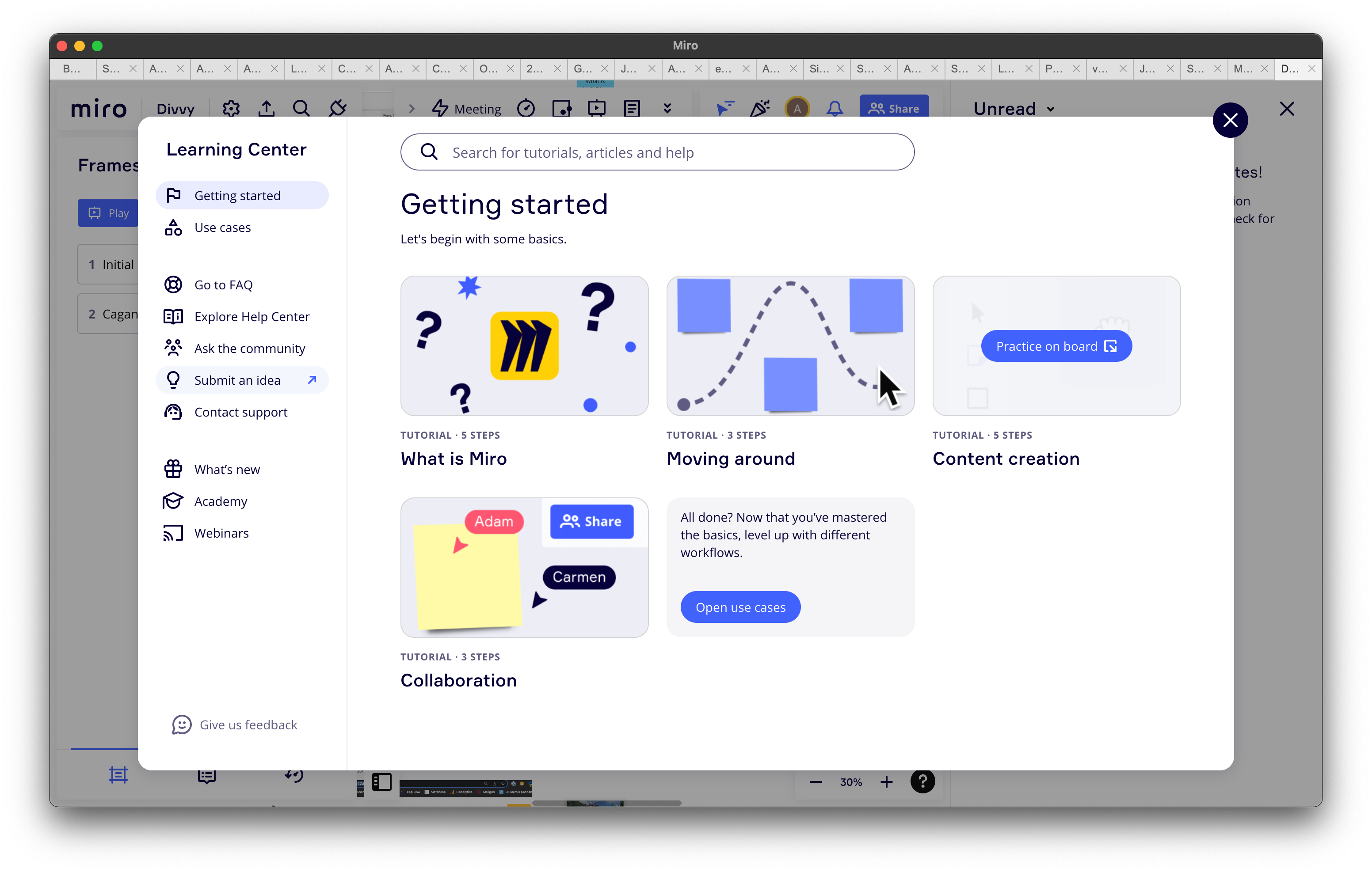
This is what the Mac app looks like w/lots of boards open….
I spend minutes a day just clicking on tabs trying to find the right board.
Only about 25% of the space in the ‘tabs’ is rendered with text and it’s all unreadable.
If the tabs were just moved to the side, it would take only a little more screen real estate but the ability to find stuff would go up like 100x.


