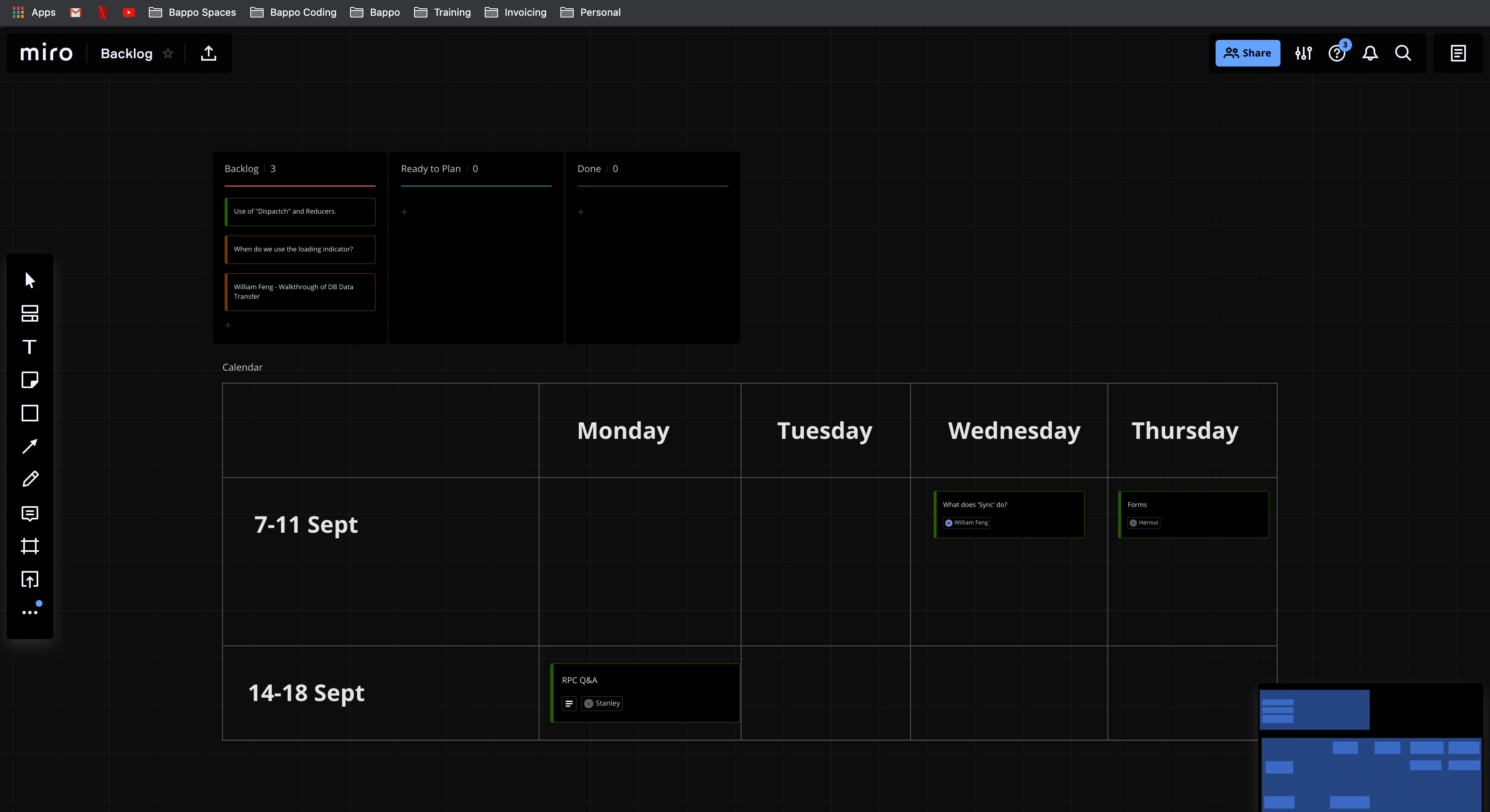
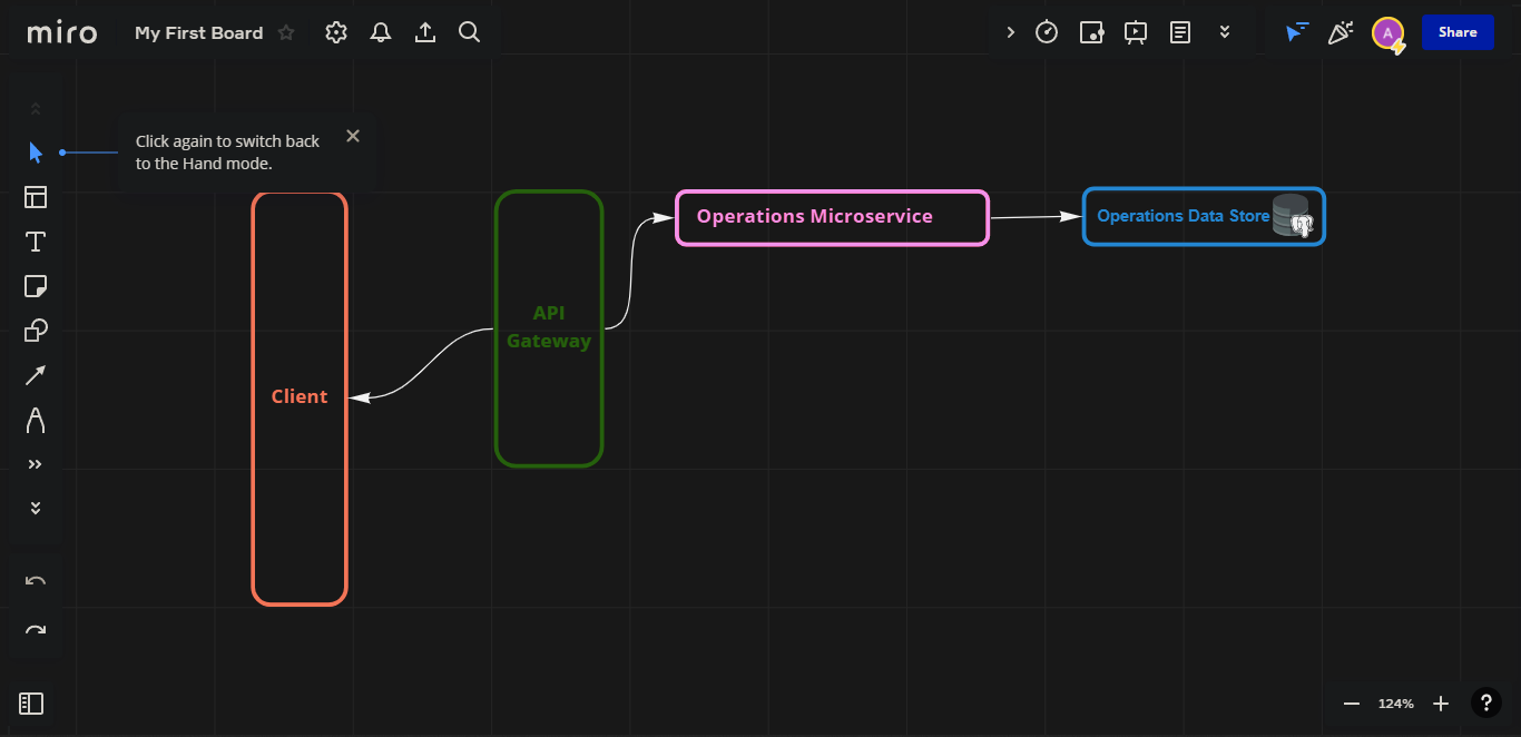
Miro is fantastic on a massive screen. It’s like you can see, arrange and rearrange your mind in 2d. The bright background and colours work well for feeling energised, fresh, and productive early in the day. For those of us who get more done during the night, however, the brightness can feel glaring and have the opposite effect, causing fatigue, especially with extended use.
It feels like a godsend to night-owls that the software industry is finally recognising our needs with dark mode being added to everything. While the implementation would understandably be no small task, I, for one, would greatly benefit from dark mode being added to what has become a fantastic tool in my work and lifestyle.
Thank you for Miro, and the Wishlist, Walter
Page 5 / 11
!!!!!!!!!! faster or wheer you developers?????????????????
How has this not happened yet? Where are the devs??
For me, dark mode is an accessibility item, regardless of whether it’s day or night. The bright glare of most websites makes my eyes hurt almost immediately, which makes for a very straining experience.
I also find that borders and checkmarks are much more defined in the dark mode designs I’ve encountered so far, the same goes for what the “Dark Reader” addon usually produces, but I’m unsure how much of that is related to monitor calibration. For the registration, I actually had the addon disabled, and I couldn’t even see the ToS checkmark.
In any case, what I really want to say is this: Dark mode is not just a fad.
So why this wasn’t implemented yet? I am getting a lot of eye strain when using Miro.
Actually I am forced to use it less and less these days. Due to being located in a Northern hemisphere, it gets dark very soon. So I am avoiding Miro because of the eye strain it creates for me.
I came here to see if the feature was available. Seems not, but for all the night owls, here’s my workaround in the meantime.
Use the web-interface rather than desktop app.
Use a browser extension like Dark Reader to change the CSS settings for your view of the board.
I do this, but Dark Reader messes up colours in embedded pictures.
If I see a competitor with a dark mode, I’ll move to it that day. I don’t understand how Miro hasn’t published this feature. It is VERY NEEDED.
Seriously no dark mode? That was a waste of 20 Minutes leaning to use Miro...
guys WHEN?
It has been a year and they still keep saying “raise the vote’s up”, isn’t this a shame ? till when we need to keep waiting ? it’s just a css configuration in the website for a dark theme !.
Yes, please! This giant white screen is killing my eyes after dark.
I suffer from migraines, so anything that can decrease the overall brightness of the screens I have to stare at is an improvement. It’s an accessibility feature, straight up.
Dark Reader, as much as it helps me stay in Miro for longer, does not replicate the items colors. In order to figure out what people mean when they--reasonably--try to describe an item by color, I need to manually search with my already over-strained eyes or two switch Dark Reader off long enough to find the item. Neither of these options are good for my poor, beleaguered eyes.
Recommendation / Work-Around
As a make-shift dark mode, I have been creating a large box (in shapes), coloring it dark gray, clicking “send to back”, and then locking it so it sits behind all other elements on my board. It’s worked well for me in the evenings in lieu of a dark mode. Hope this helps!
please I need dark mode very very much.
just allowing us to set the overall background to a darker gray would be amazing honestly.
Add dark mode please!
MY EYES.. ARE BURNING !!!
Love Miro but, searching for alternatives, its just killing my eyes
and my productivity drops because I cant stay in front of my PC for long.
Not having dark mode make you feel like you are in the 80’s.
Sad for such a good product.
Workaround ( not a complete solution, but is more then nothing )
Create a big canvas (rectangle)
Set Your Color
Lock it in place so its unselectable and you can work on top of that.
Thank me later :)
JUST ADD BLACK BACKGROUND!!!!!!! WHAT SO HARD WHY NO BODY BUILD PLUGIN FOR THIS!!!
Other workaround:
Choose a competitor … the solution seems so simple … it is easy by a mouseclick:
Michael
A vote for this feature. My current workaround is using Dark Reader, a Chrome extension.
What’s this software?
A vote for this feature. My current workaround is using Dark Reader, a Chrome extension.
What’s this software?
It’s a chrome extension, you can install it from your browser’s addons/extensions store. Google Chrome, Microsoft Edge, and Mozilla Firefox have this extension/addon. It’s pretty great, you can use it with many web sites and applications if they don’t have dark mode. The downside is that is not an actual integration, it’s kind of a filter, so of course it may skin wrong some things.
DARK MODE PLEASE!
I’m changing my theme throughout whole setup of tools each and every day, dark mode would be appreciated. I tend to not use bright tools at all when it’s dark. At winter, days mostly dark in this place :(
Please, dark mode is the best way for me to maintain my eye health. It is an essential accessibility feature.
dark mode is an important accessibility and usability feature. these days, people spend more time than ever before working on projects at night, and are more conscious of the negative effects of bright monitors on health. please stop sleeping on this important feature