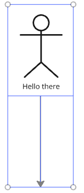
I really like Miro for making diagrams. Each shape in a diagram can have text set for it, but for some reason, that text does not count as part of the shape. This means that any connecting lines go through the text, which looks ugly and is hard to read. Also, if you delete the text, there doesn’t seem to be any way to add new text.

I want the diagrams to look like the right hand side, but currently it looks like the left.
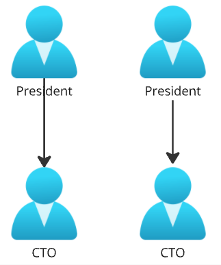
Left = ugly, hard to read; Right = beautiful


Hi @Gordon Leigh 


Thanks so much for taking the time to submit this idea, and include your diagrams. We appreciate the feedback. 


Should our team have any other questions, they will be sure to follow up.  For those coming across this idea, if you feel it's helpful to have or have additional suggestions, please be sure to vote for it and leave a comment about your use case to help our team scope this request.


I just started using Miro today (like it overall) and this line-over-text issue is the first annoying thing I was futzing around trying to fix. I found this feature requested because I was searching for advice about how to have connectors look like the right hand side of Gordon’s diagram or as an alternative move the text out of the way of the connector (which I also do not think is possible). Would love to see this update.


Trying to create an architecture diagram and this was getting on my nerves. Would love to see this resolved.


I see the issue present on other tools like Lucidchart, so I’m not sure what the planned resolution is for this. For now I am reducing the connector thickness.


Until this gets resolved, I created a rectangle shape (with no apparent border) around the image and the text I wanted to connect to. Then, I connected the line to that rectangle. It really is a workaround and takes time. But, might be useful for some.