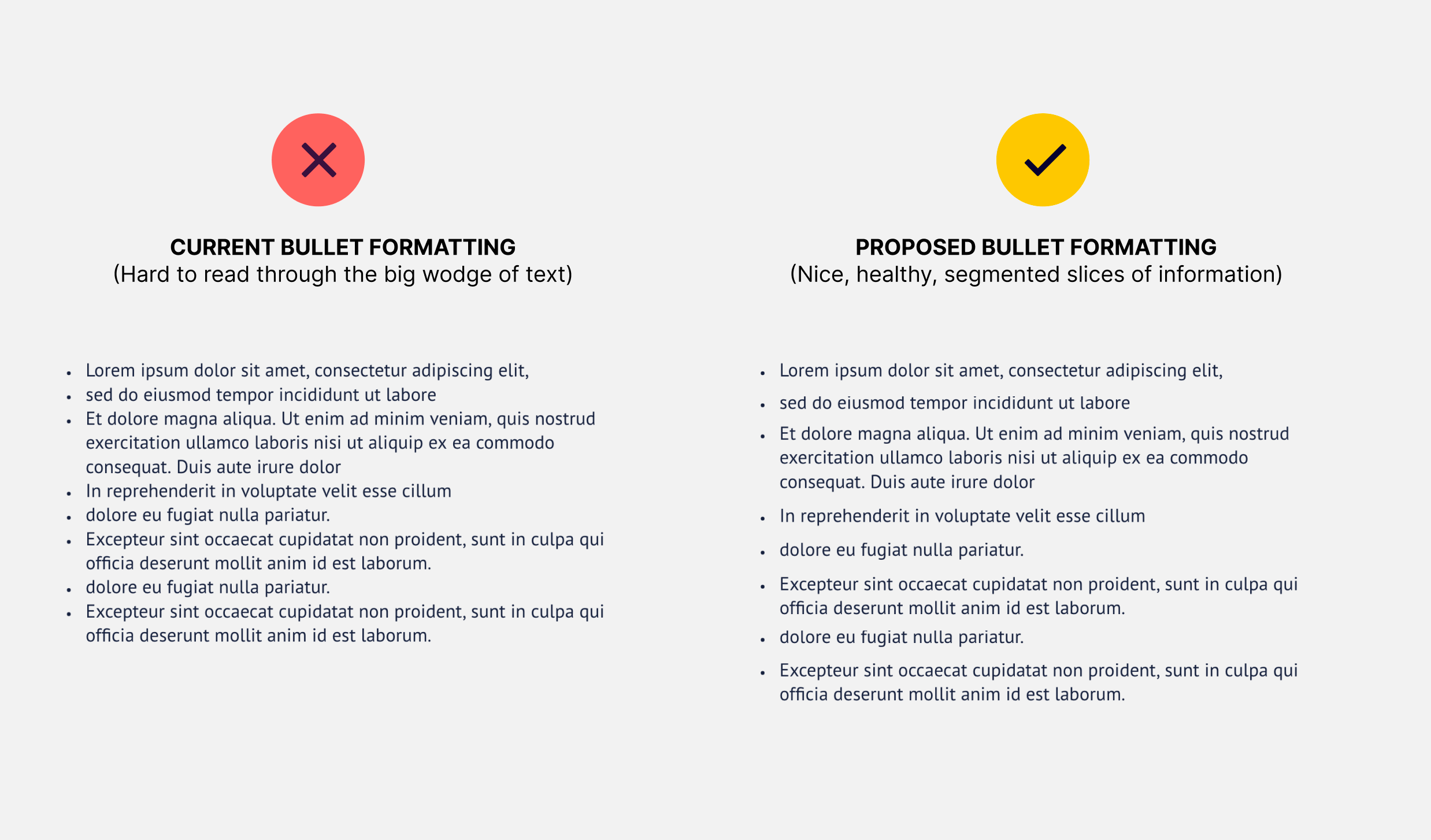
Currently bullet lists can be hard to read as there’s no spacing between the points. Especially hard to read on bullets that are longer in length, they display like very long head-melting paragraphs
Would be great to add padding between the list items so they are easier to read


