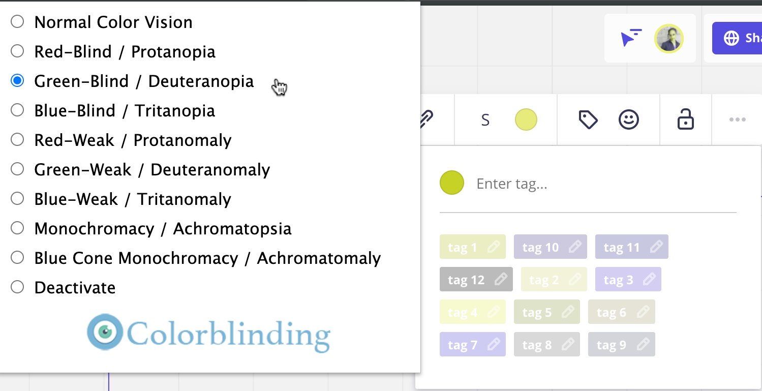
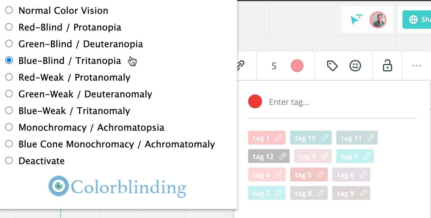
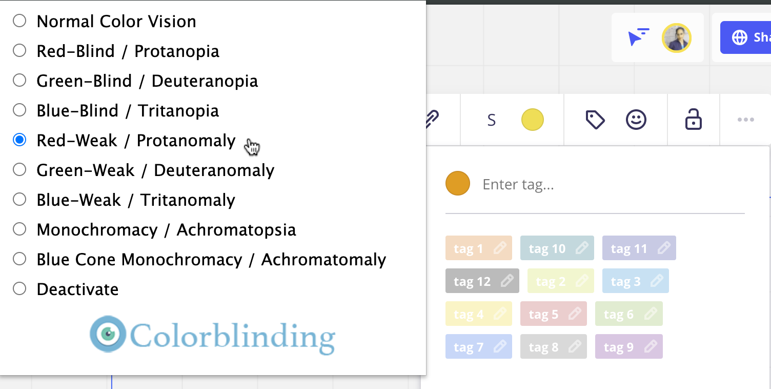
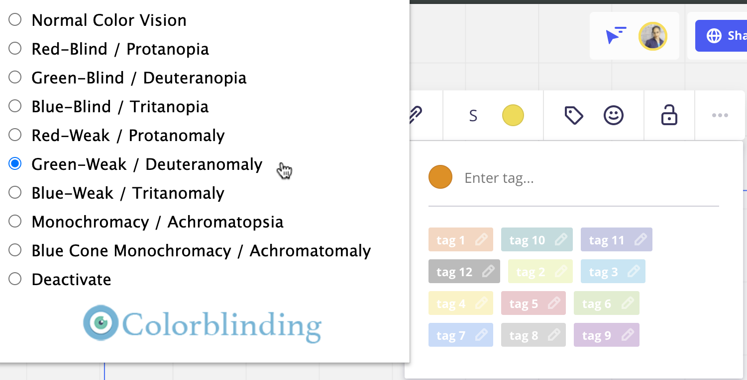
The text on a lot of the tags is hard to read if you have any sort of colour blindness because it’s all white even on light colours like lime green.

Add an option to change the text colour on tags as well as add hover/first tap text that appears above to show the text when tags are disabled. It’s hard to pick a tag when it’s disabled and you can’t read it because it’s white text on lime green and the opacity has been reduced!

Currently, I can only use 4 (maybe 5) colours offered in tags because of accessibility issues. It’d be great to be able to use them all and even add my own colours!

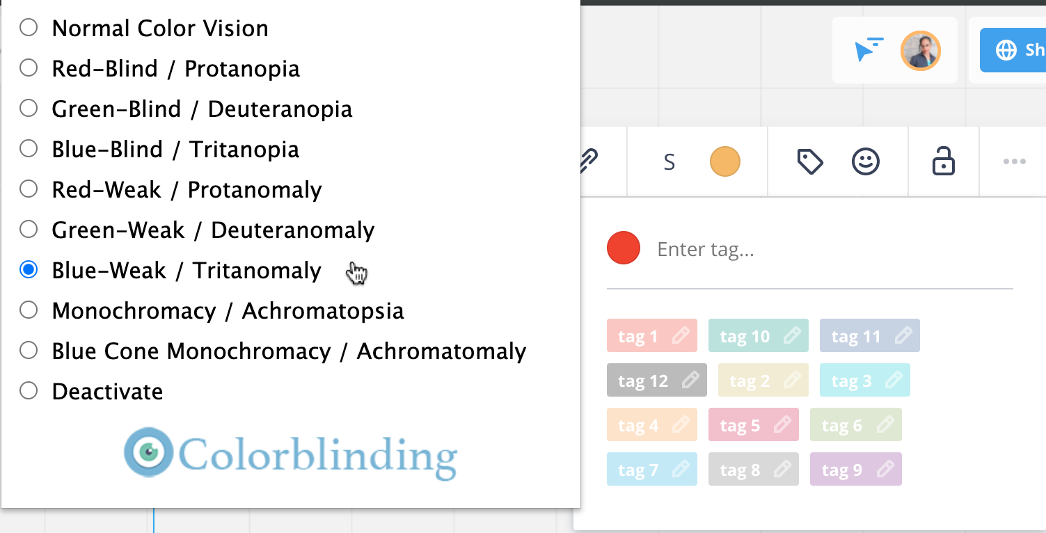
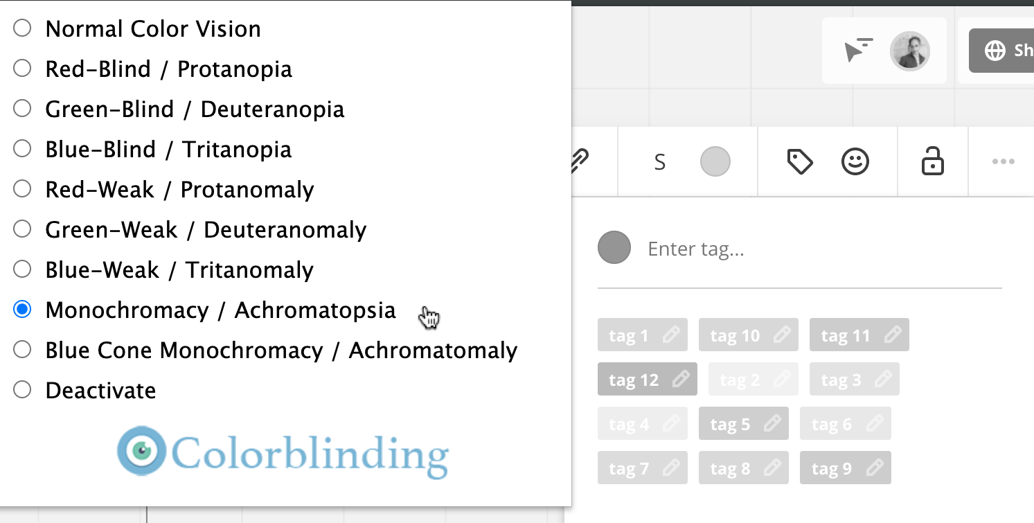
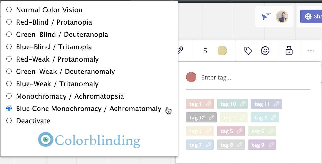
Here are the results when using Colorblinding, an accessibility checker. You can see that even with normal colour vision, the text and pencil icon are hard to distinguish.
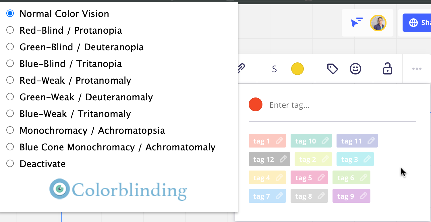
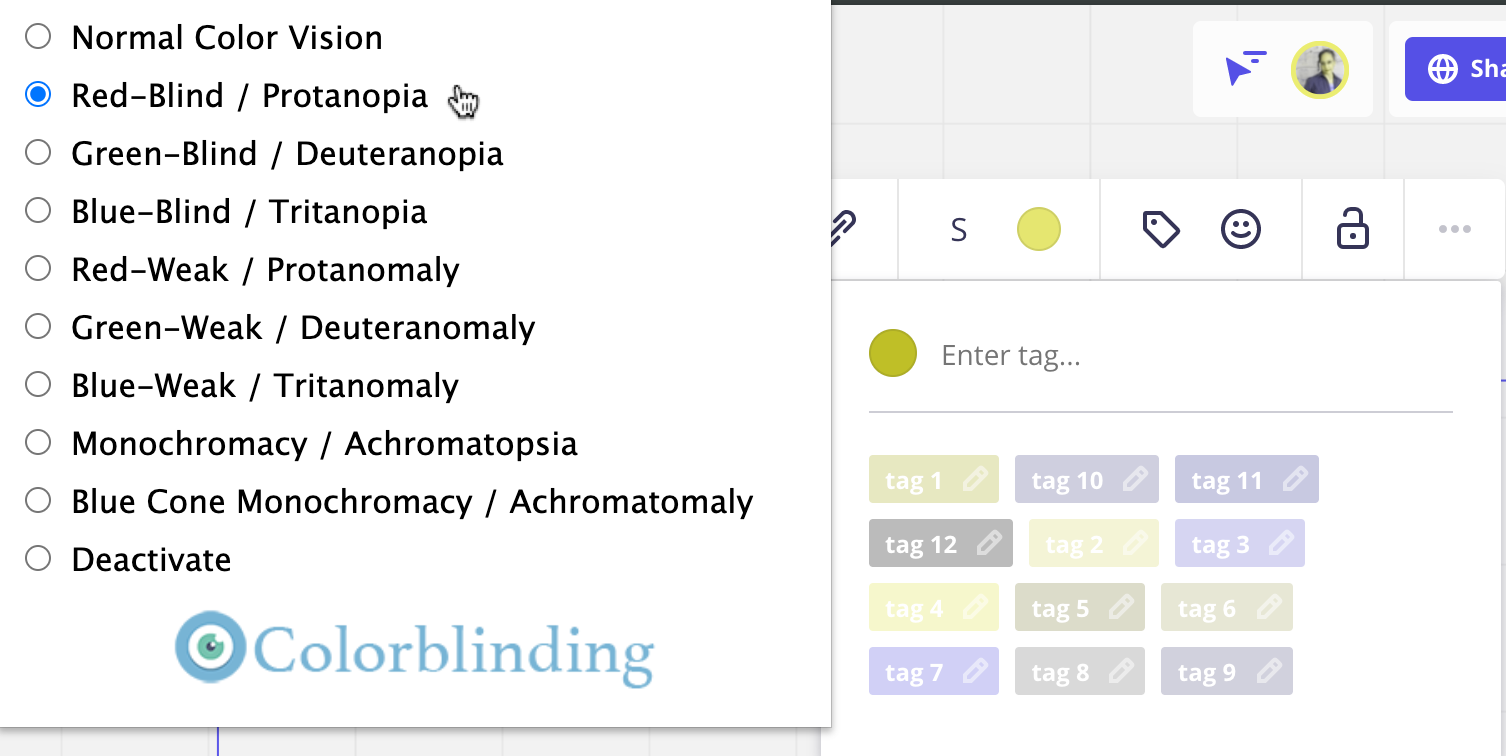
 

Normal Color Vision, tags disabled
​​​​​​
Red-blind, tags disabled


Green-blind, tags disabled


Blue-blind, tags disabled


Red-weak, tags disabled


Green-weak, tags disabled


Blue-weak, tags disabled


Monochromacy, tags disabled


Blue Cone Monochromacy, tags disabled


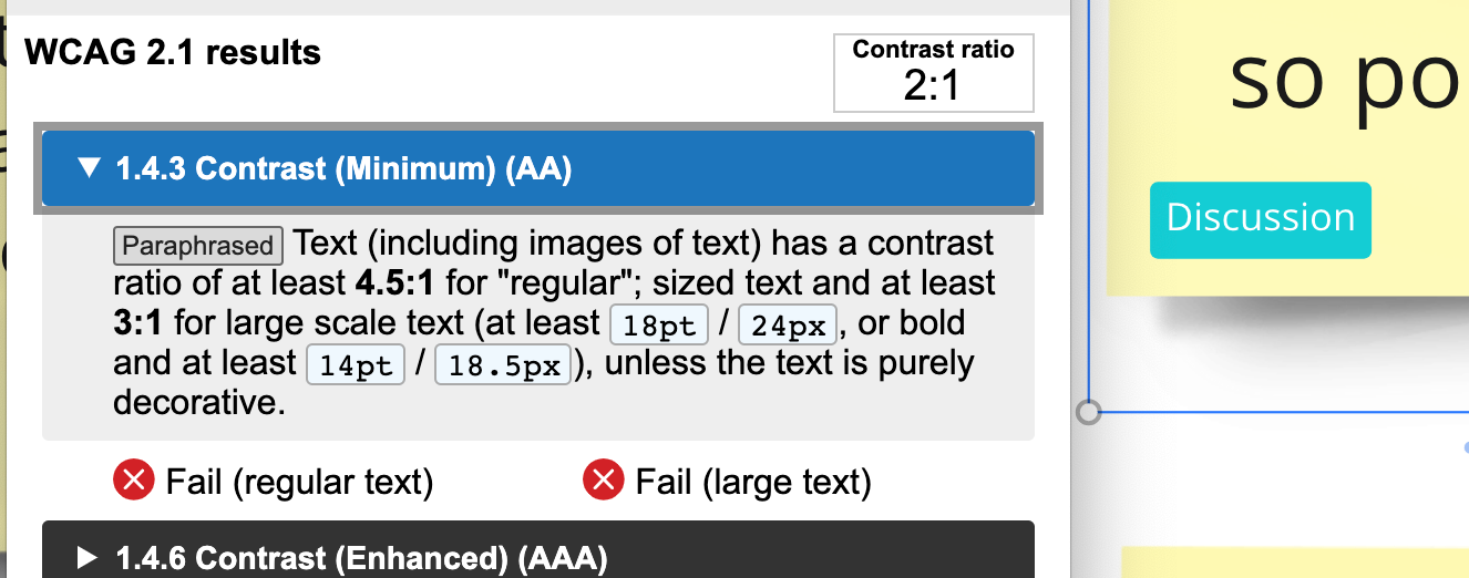
This limitation makes me want to avoid tags altogether. Adding to the color blindness concerns, I noticed some of the backgrounds color options fail basic color contrast ratio checks in general. It’d be great to see movement on this issue! 


Thanks so much for taking the time to comment about this feature. We understand the frustration and appreciate your patience. Our team is reviewing this idea as it continues to be open for votes and comments.

For those coming across this idea, if you feel this would be helpful for you or your business, please be sure to vote for it and leave a comment about your use case to help our team scope this request!


Thank you,

Miro Community Team